Summary / TL;DR
Creating a landing page that converts involves combining strategic design, clear messaging, and user-centric features to guide visitors toward a specific action. The article outlines critical elements such as a compelling headline, a singular and prominent call-to-action, and a clutter-free layout that emphasises relevant content and visual hierarchy. Fast loading speeds, mobile responsiveness, and simple navigation improve user experience and reduce bounce rates. Including elements like social proof, video content, and user feedback boosts trust and engagement. Businesses are encouraged to test variations using A/B testing, refine SEO structures, and continually adapt based on analytics and customer input to sustain conversion rates.
Are you finding it difficult to attract buyers despite changing your SEO strategy?
While SEO architecture proves handy, you need additional elements to support it and make the site stand out. One technique is pages that convert, also known as landing pages, which boost brand value and convert visitors into buyers.
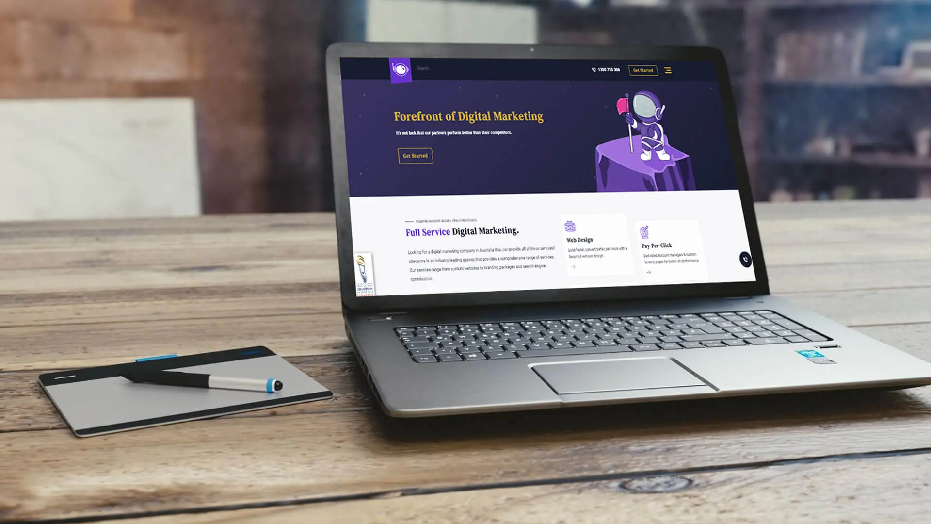
It is a digital marketing strategy that promotes a specific campaign or product by encouraging people to take your desired action. Understandably, a landing page directly impacts search engine rankings and determines whether the web page is relevant to consumers.
However, working to build a landing page that will improve conversion rates requires time and patience. If you want to create a perfect landing page, several intricate details must be kept in mind to ensure they fulfil buyers? needs and create landing pages that convert.
In today?s guide, we?ve provided everything you need to achieve a good conversion rate for landing pages. If you?re ready, let?s get started.
Want to receive updates? Sign up to our newsletter
Each time a new blog is posted, you’ll receive a notification, it’s really that simple.
What Is A Landing Page?
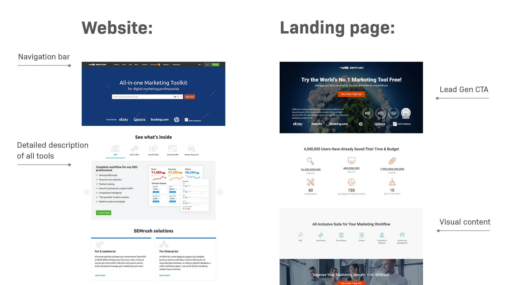
Before we get into the nitty-gritty of designing an effective landing page, you must know what it?s about. A landing page is a crucial website architecture that helps attract potential customers and increase sales.
SEO professionals have the landing page designed based on the company?s business model with the primary purpose of converting site visitors. It can be any page, provided you meet the aforementioned criteria.
Web designers sometimes create a stand-alone landing page depending on the marketing campaign or for specific products and services.
How To Choose Landing Pages?
Towards the end of the last section, we discussed how anyone can use any suitable page as a landing page, which is the basis of good landing pages. Some landing page examples perform better than others, so how will you decide on a landing page template?
You must note that visitors often confuse the landing page with other pages; studying landing page examples can help avoid this confusion, which can negatively impact the business. The site design must account for two things: how easily the target audience finds the landing page and its relevance.
The basic difference between finding a landing page example and a home page is consumer experience. For example, visitors can locate the former by searching for the right keywords, making a purchase, or using higher-ranked search engine results?both organic means.
On the other hand, the latter can be found on social media or through word-of-mouth interactions with family and friends. Interestingly, having the home page as the landing page may lead to more conversions than using the two separately.
Landing Page Elements
Promoting the landing page through Google Ads is vital to making it stand out. However, you need to keep in mind other key elements of the website.
For example, if you own a cooking website, we suggest using the homepage as the landing page.
It must be spot-on to create a great first impression and convert visitors, especially if you want them to engage more. Some design elements feature a clear call to action (CTA) button, which is essential to giving visitors a clear next step to ensure that customers can search for their favourite recipes.
The main headline should be bold and catchy, describing an upcoming campaign or the purpose of the business. If you can hook visitors at first sight, it may lead to an average conversion rate higher than the industry standard.
How To Create A High Converting Landing Page
Now that you have a basic idea about landing pages, let?s discuss some of the best practices for creating the best landing page with high conversion rates. You can note the following factors to make your landing page successfully.
You can always download landing page templates from the internet or use a landing page builder online, such as Unbounce or LeadPages, some of which offer free trial.
1. Purpose Of The Landing Page
It would help if you started by discussing the purpose of the landing page, especially about your marketing campaigns, with the marketing team. We had spoken about ensuring that all web pages should be relevant to attract the target audience.
Everyone knows a landing should lead to more conversions, but remember, one size doesn?t fit all. However, the definition of a successful conversion varies from one company to another, so you must have clarity about the business model.
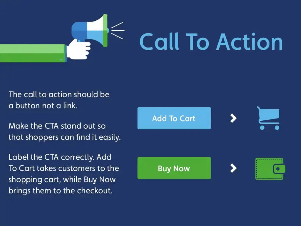
Once you better understand what the page should achieve, it will become easier to design a suitable call-to-action button and, thus, create a perfect landing page. For example, several organisations look to increase sales while others aim to generate user interaction.
Similarly, some industry professionals look to register more people for a new product or service. Irrespective of your choice, all these criteria are met if you create a landing page that makes sense.
2. Lend A Personal Touch
One of the best ways to create a high-converting landing page is to add a personal touch, ensuring visitors feel at ease. The key is to use a friendly tone to express the brand?s purpose, which grabs visitors attention, hopefully encouraging website visitors to take action.
However, striking the right balance is essential because you would not want to sound too market-oriented, thereby overwhelming customers. Visiting the website must be worth their time and effort to enhance user experience, making them more likely to convert.
We also found that you can try humour if it complements the business. For example, there is no point joking around if it?s a law firm?s website. Conversely, adding a joke in between may not be the worst idea if you aim to attract more millennials.
3. Light Design
We understand that people tend to go overboard when designing websites, as there is an array of content and numerous website design tools. However, this may prove detrimental to the business model.
High-converting landing pages often use a light design with plenty of negative space, ensuring visitors aren?t overwhelmed and can easily navigate the content. Think of a landing page like an entrée; it whets the appetite for what?s coming next.
Filling up on the entrée would make it difficult to enjoy a belly full of spaghetti or lasagne. Similarly, there is no point in having a long line of texts or images if it distracts from the primary content.
Web designers must discuss with the company representatives and find the best way to direct people towards the content. So, we?ve highlighted some tips and techniques to bring the page up to speed.
A. Fast Loading
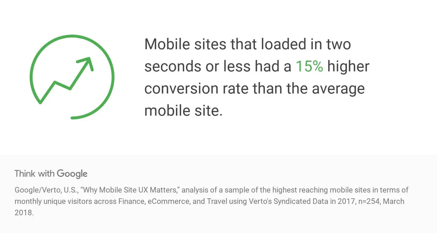
Make sure that the page loads fast for a smooth experience. If you keep people waiting too long, the chances of making conversions go down significantly if the page doesn?t load right away.
Understandably, irrelevant on-site elements will increase load time, leaving visitors frustrated.
B. Use Speed Tools
We suggest you review the site using page speed tools to determine what is causing it to slow down. You can tweak the SEO architecture to stand out on the market.
C. Mobile-Friendly
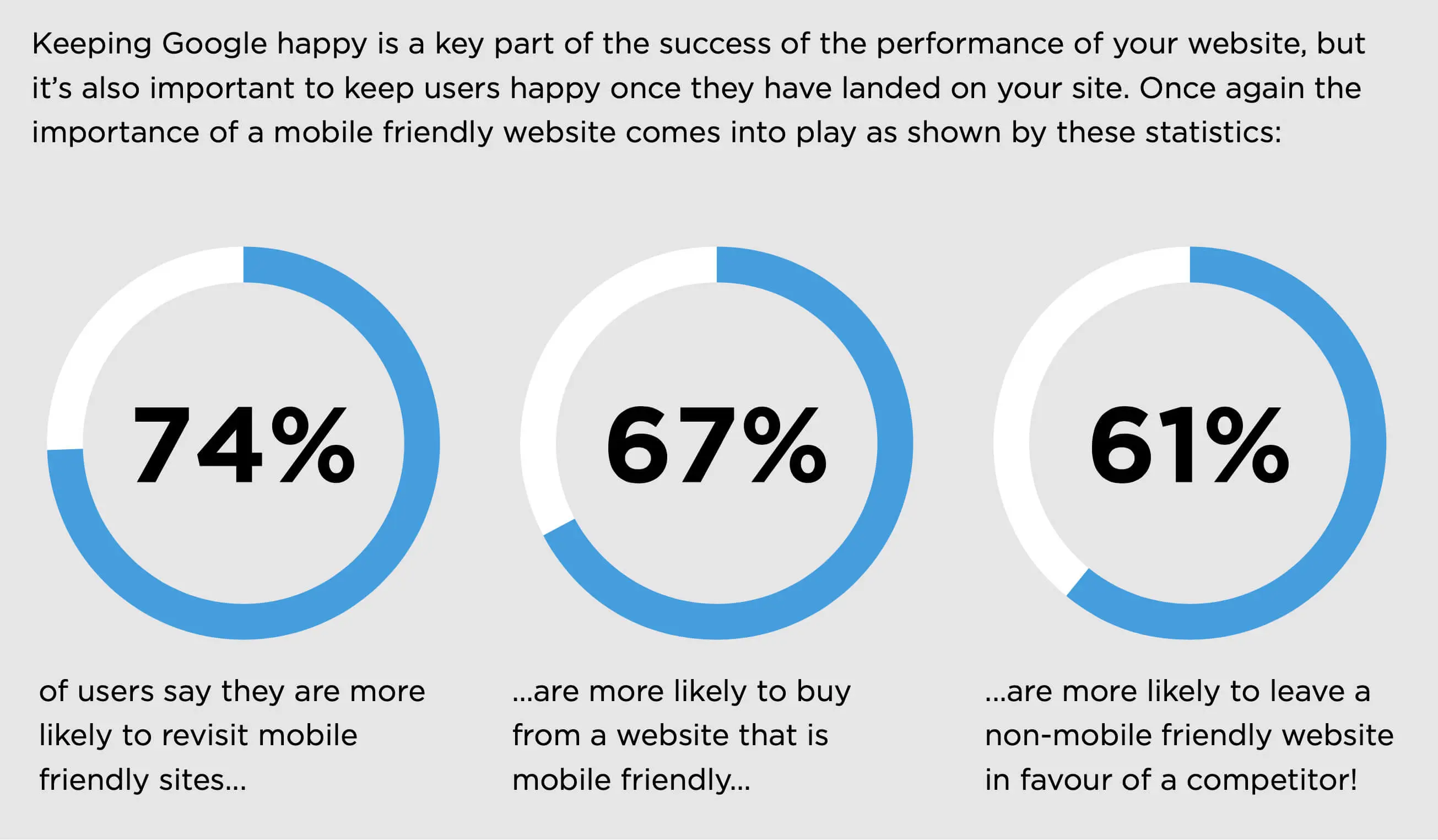
The mobile landing page must be user-friendly for maximum customer satisfaction and user-friendliness. In our experience, all desktop elements don?t look good when viewed on a smaller device, meaning you must adjust and make the necessary changes.
D. Site Maintenance
Hiring a professional team who can quickly fix most problems with the pages and ensure the privacy policy is up to date is important. Also, it would be best to keep a tab on how long the site stays down on average to improve the marketing strategy.
Long story short, the longer it stays down, the more loss the company incurs.
4. Call-To-Action
A clear call-to-action button is imperative, which is only possible if you know the company?s objective. Depending on the organisation?s goal, web designers can alter the function of the CTA button to generate more traffic, effectively implementing calls to action.
You must note that the duration between a visitor logging into the page and making a decision is short. The site must have easy-to-skim-read content, ensuring that it grabs visitors? attention and that people can make fast decisions for a seamless experience; this is an effective way to attract visitors.
On the other hand, the content marketing team is responsible for providing all the necessary information without filling the page with text. If you grab the audience?s attention, they will click the CTA button and take the desired action.
It will help to have one CTA option per page while ensuring it?s direct and to the point. As a result, the landing page will appear focused, leading to a higher conversion rate.
5. Loud And Clear
Regarding focus, let?s discuss why the web page needs a clear message that is easily understandable to the audience. Also, why do most brands struggle to get their idea across?
Available marketing space can vary between sites, which creates a challenge—fitting all relevant information without cluttering the page or compromising SEO.
This is when the designing team has to explain the need for white space and images because the client will be pushing to include most things. We have found that a great example of sending a clear message is through storytelling.
The brand?s stand and end goal would be best considered in terms of the marketing strategy. Following this, you can ask content marketers to formulate a simple story that makes it easy to identify with the brand.
6. Record A Video
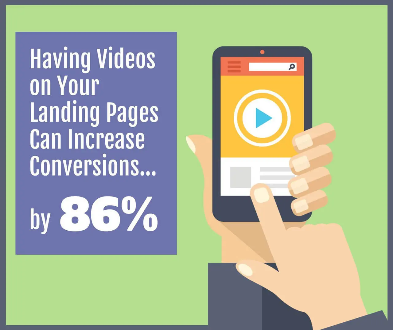
When our team researched the best online landing pages, some sites recorded a video for user engagement. It is an interesting concept, something seen on social media platforms, allowing customers to interact with each other.
In this case, the brand is launching the video to generate more conversions. Instead of asking visitors to take time out and read paragraphs full of content, adding a visual medium will help them understand the message better.
For example, people remember moving visuals easily rather than reading about them in text. That?s just how the human brain works. However, keeping a few pointers in mind would be best.
A. Clear Audio
Remember to record clear audio for the voice-over to make it easy for people to understand the content. It would be best to find a quiet spot and ensure that there is no disturbance.
B. Use Relevant Images
We can?t stress this point enough. Whether creating written content or video messages, ensuring that the visuals match the words is crucial. If not, the landing page?s purpose will remain unfulfilled.
C. Hire A Production Team
If you find it challenging to make the video, we suggest hiring a professional team who will do it for you. You will still have control over the content and can curate how it turns out before it goes live.
Understandably, having video content is a fantastic way to generate more traffic. Ensure it?s a short video, not more than three minutes long; no one would want to watch an extended clip.
7. Keep Innovating
You mustn?t revel in the glory once the site is live and all the elements are in place. Pat yourself on the back, congratulate your team and move on because there is still lots to do.
Successful landing pages keep improving their on-site elements to meet consumer demands. You will encounter new problems; therefore, monitoring rival brands to see what they are doing well is essential.
What?s more, you can take the help of web applications like Google Analytics to research data, tweak the SEO strategy, look into case studies and change the landing page design. This will add value to the content, thereby leading to more traffic. Google Analytics allows you to track the effectiveness of the entire landing page and customer journey. Analytics can also give you the ability to track the visitor intent, add them to your sales funnel and gain insightful data to help drive conversions through optimisations.
8. Take Visitor Feedback
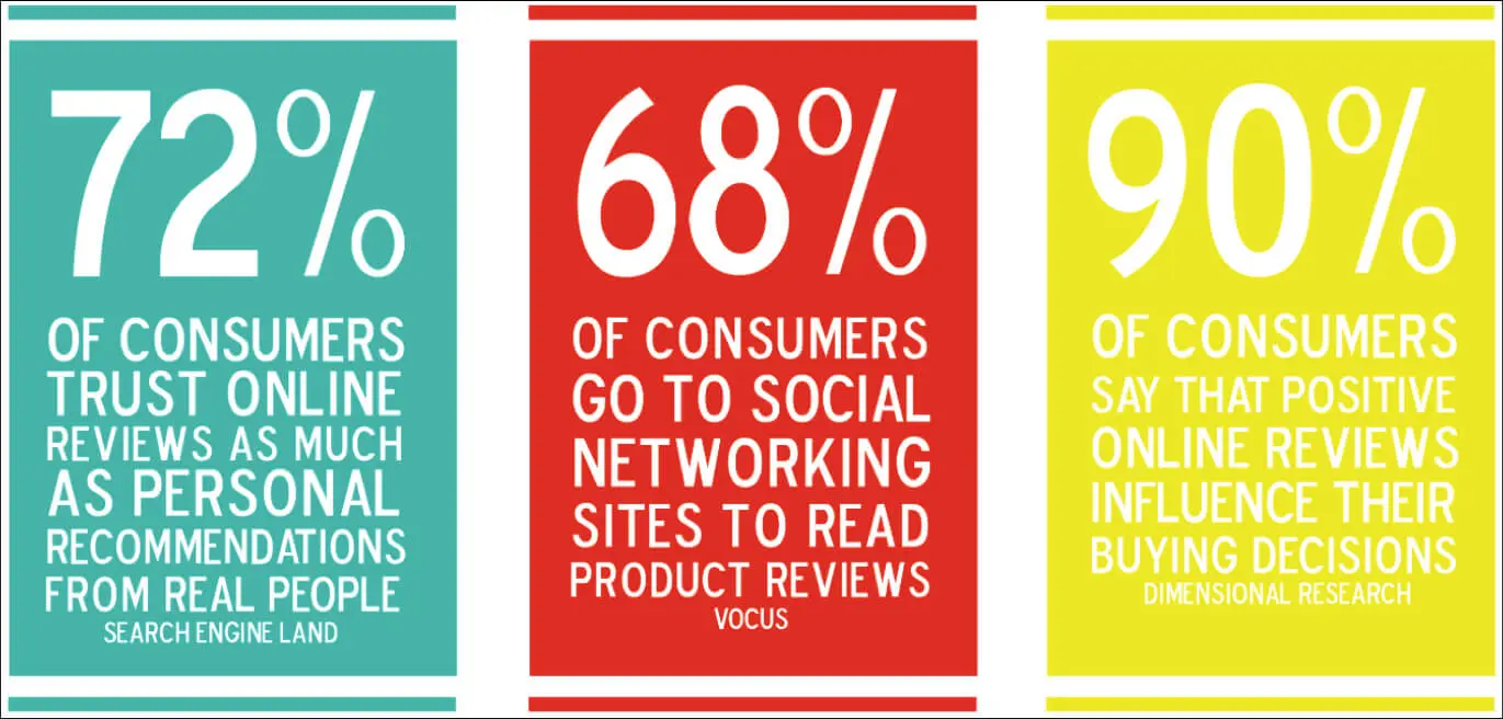
If you find consumers enjoy a certain product or service, remember to take their feedback by asking why the particular business model works for them. Similarly, take reviews if a service doesn?t meet the demands.
Since the site is for customers and to help them meet their needs, there is no better way to increase rankings than by asking people for suggestions. Also, it makes them feel connected to the organisation and shows they are valued.
You can also display the top reviews on the web page to influence more people and increase the conversion rate.
9. Write A Catchy Headline
Like the landing page, the headline sets the tone and determines how visitors perceive the site. Although we are talking about an online medium, have you ever wondered why news agencies spend time thinking about a headline?
Irrespective of the quality of the content, if the headline doesn?t grab readers? attention, many people will not read the rest of the article. So, we recommend that while brainstorming, you should come up with a concise, relevant, and simple headline for efficient brand promotion.
We have found that limiting the range to 20 words would be best because it should be a precursor to the content. There is no point if the headline is extended; its purpose is to guide the visitors towards their desired product or service.
10. Images
Once you have a catchy headline, the next step is to include the necessary images to make the web page stand out. There?s nothing better than adding a hero image to break up the text for better SEO architecture.
The image helps hook consumers, so several landing pages add the CTA option below. This makes it impossible to miss.
Also, you should only use a relevant image and have as few words as possible on the lead capture page.
11. Sub-Headings
We mentioned how the headline needs to be short and crisp to serve its purpose and improve conversion rates. But what will you do if you need to fit more content?
Rather than adding words to the main heading or reducing the size of the landing page image, we suggest making room for sub-headings. Hence, you can explain the product or service?s purpose without affecting the landing page?s appeal.
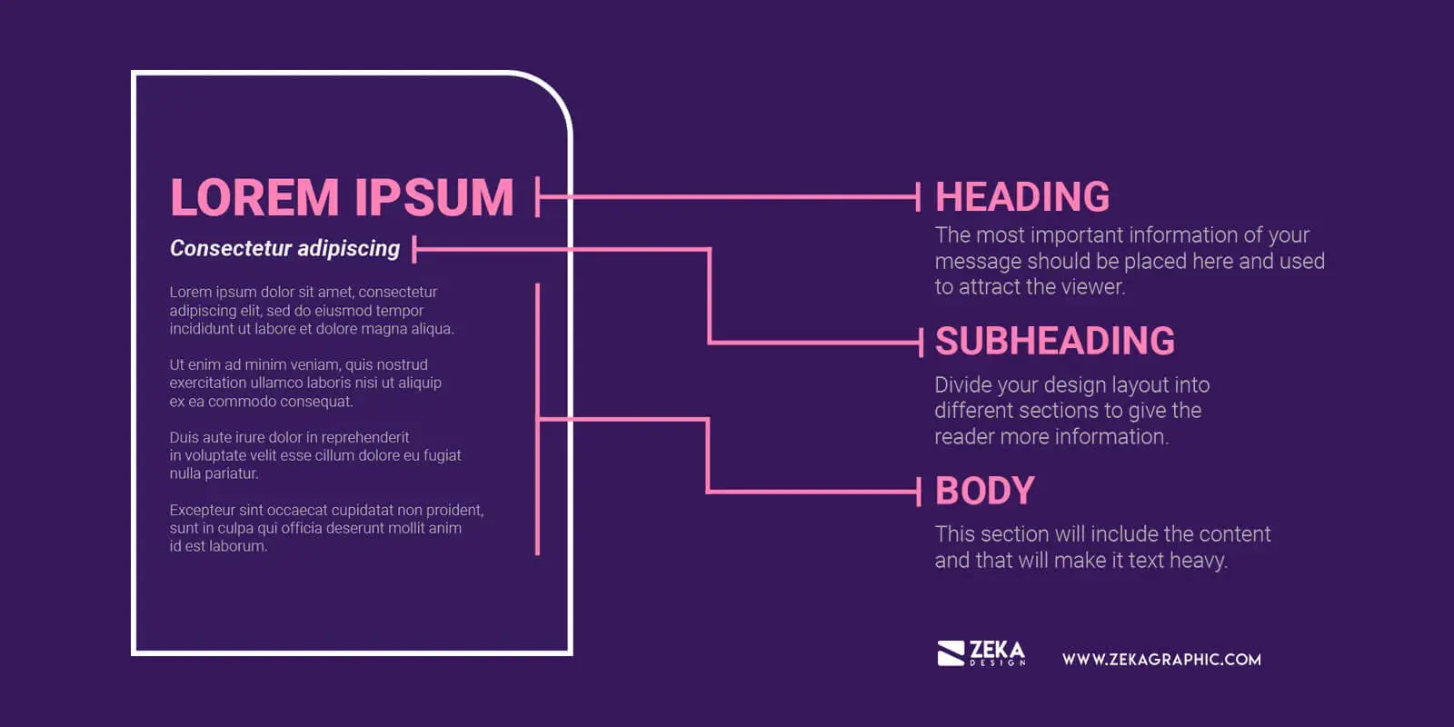
It allows brands to retain the clean design of landing pages, ensuring that visitors get value for their time. In other words, while the headline draws in consumers, the sub-heading should make them stay.
12. Feel Free To Experiment
Although the headings need to be convincing by offering more details about the organisation, their positions can be interchanged for visual hierarchy.
For example, a remarkable landing page often places the subheading first, followed by the bigger main headline. Even if readers focus on the large font, as is natural, they will still understand the company?s primary goal.
Meanwhile, the smaller font will contain necessary information related to the service, resulting in efficient content marketing. Consequently, it would help if you asked the design team to experiment with various ideas while creating the landing page copy.
13. Pleasure And Pain
It would be best to ask why customers should choose your site when so many others exist. If you answer this question, you?re on track to create a conversion-friendly landing page.
However, struggling people can use a combination of pleasure and pain references to make a great landing page. For example, rather than talking about what visitors will gain, you should throw in concerns about what they are likely to lose.
We have seen that combining these two aspects leads to higher conversion rates because people have an inherent fear of losing out. If you tell someone how they might miss out on quality service, it will encourage them to act faster than discussing the benefits.
That?s how the human brain thinks because everyone wants to avoid pain and enrol in the campaign. Long story short, you will have an effective landing page that converts most visitors.
However, be careful not to make the page sound too negative; otherwise, it will drive people away. Something like -?You will be losing out on our maintenance service at a 25% discount? should be enough.
14. Social Proof
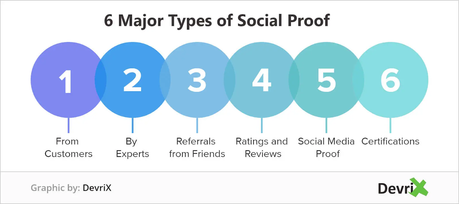
It?s no secret that the internet has many fake sites, leaving visitors in doubt about the authenticity of the web page. Hence, you must divulge social proof about the brand?s policies and answer queries to assure people that it is an ethical organisation.
We found that all great marketing companies value customer satisfaction, making it a point to focus on transparency. Unsurprisingly, verified landing pages often have a phone number, contact form, and email address.
Users can fill out the form and connect with customer representatives to learn about these options. Also, it allows the company to engage in email marketing, thereby expanding its avenues to increase the conversion rate.
Not to mention, checking on the consumer to see if they enjoyed the product helps build trust. You can encourage suggestions about the business to make people feel at one with the company.
15. Audience Experience
No brand can hope to flourish without guaranteeing a smooth user experience. Consumers make or break the business?s reputation, meaning you can?t afford to neglect their demands.
That said, it?s challenging to strike the right balance between managing conversions and profits and satisfying the target audience. So, it would help to mention a ?money-back guarantee? to ensure that people invest in the product or service without worry.
Interestingly, placing the CTA option close to the guarantee statement may help drive sales and increase landing page conversions.
16. Value Proposition
The value proposition is any innovation that makes the business more appealing to site visitors. If a visitor asks why they should visit the web page, the landing page must provide the answer to make it clear.
Now, there are a couple of things to keep in mind while using value proposition with other site elements:
A. Highlight The Benefits
We suggest shortlisting the product or service?s benefits for a compelling value proposition. This will increase landing page conversions.
B. Make The Visitor A Priority
No one likes a company that talks about itself; instead, the attention should be on the audience, and the content should give visitors relevant information to meet their demands. Although we mentioned highlighting the benefits, you must market them to ensure they appeal to visitors.
17. Testing Landing Pages
Another critical factor when creating landing pages is testing your landing pages after launching the site. You need to monitor the number of conversions to meet targets, leading to a continuous traffic inflow.
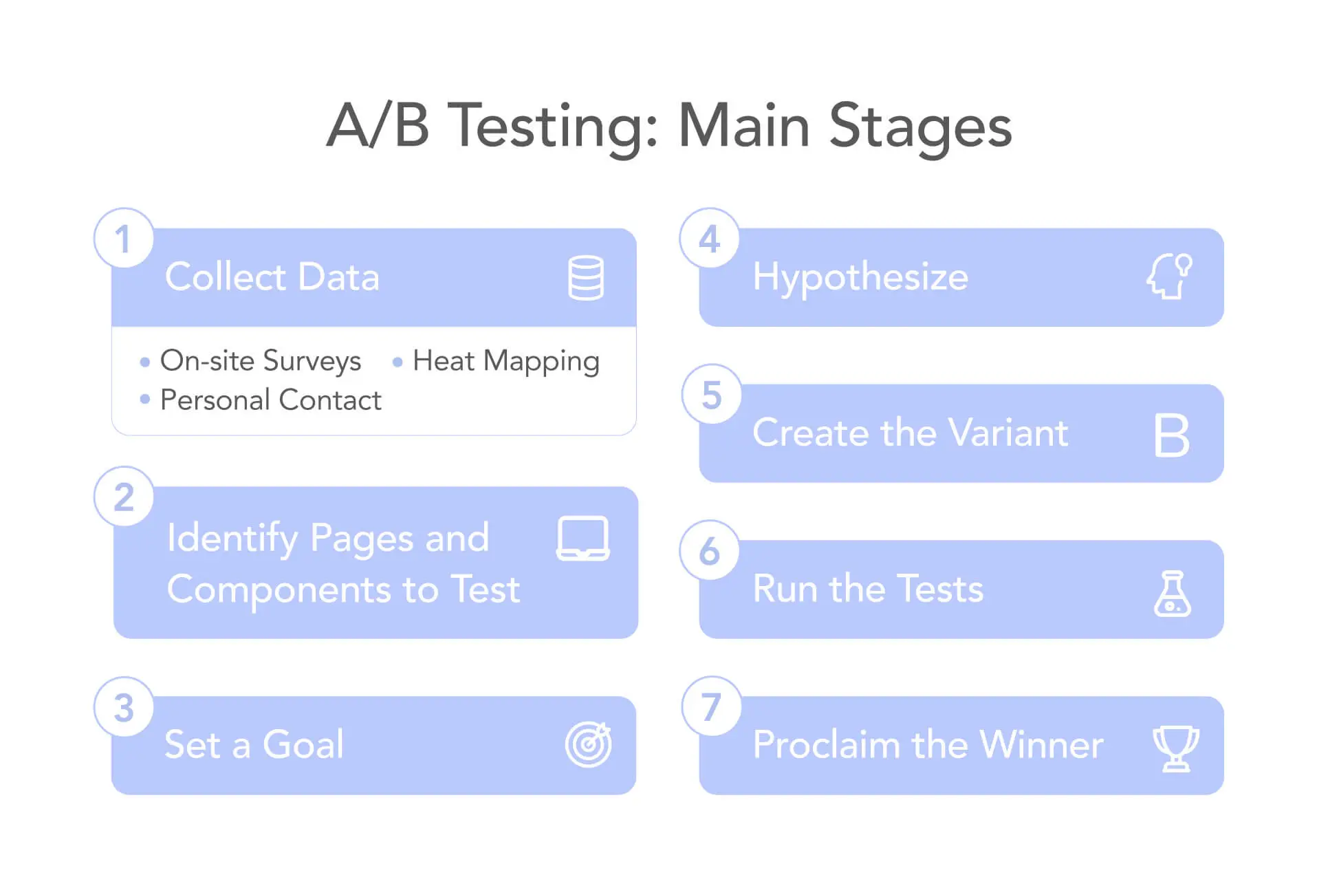
One of the best ways to do this is through A/B testing. It allows you to track the conversion rate of landing pages by studying heat maps, customer feedback, recording sessions, and scroll maps.
Additionally, you can refine the site by making several landing pages and seeing how consumers react to them. Consequently, you can choose the best one after conducting thorough research.
18. Don?t Add Navigation Elements
All effective landing pages make it a point to include the site elements on a single page to make it easily navigable for visitors. They shouldn?t have to click numerous options to reach the desired content.
Additionally, ensure that all on-site features follow a logical pattern, leading the visitor to the CTA option. In our experience, we have seen that you can accomplish this in four simple steps: explanation, benefits, feedback, and CTA.
The above structure proves extremely persuasive and saves you the trouble of trying to be subtle. Instead, dividing the landing page into separate sections is possible without damaging the SEO architecture or the visual hierarchy.
It proves ideal for brands with long landing pages to share all the information. Even though it would be best to limit the content, it shouldn?t be a problem as long as you organise the page.
All the features must be coherent, ensuring that the page design remains intact. You can also have multiple CTA options on the landing page, provided they?re simple and don?t affect the flow.
It offers more chances for people to convert and avail of the services.
Benefits Of Using A Landing Page
Now that you know how to create a conversion landing page, we should tell you its possible benefits. Note the following points to make an informed decision.
1. Ranking
All great landing pages are part of a suitable SEO architecture that takes them to the top of the search engine rankings. In other words, since a landing page helps users search for specific products or services, you can use different techniques to make the site relevant.
So, whenever people search for a particular merchandise or marketing campaign, the landing page design ensures that a higher-ranked page will generate more hits.
2. Efficiency
Unsurprisingly, having a relevant landing page promises greater efficiency in meeting consumers? demands. One of the best ways to increase landing page conversion rates is to allow visitors to navigate quickly and channel them towards the CTA option.
That?s why it?s crucial to make the CTA noticeable, ensuring that visitors face no issues while subscribing or signing up for the services.
3. Brand Promotion
Web designers will tell you that the purpose of landing pages is to promote a specific marketing campaign. As a result, it aims to deliver a focused message to the buyers that will encourage them to make the purchase.
If you want to promote a specific campaign, a landing page will bring it to the foreground and give it precedence over other site features.
Not to mention, it?s challenging to monitor all the services, which makes landing pages all the more necessary. You can use them to track customer response and judge whether the product satisfies users? needs.
Creating A Profitable Landing Page
That?s all there is to know about creating landing pages with a high conversion rate.
We recommend you discuss with the designing, content, and marketing teams to formulate the best strategy to launch an efficient landing page. Also, the data must be monitored, and feedback must be taken to make changes based on the market trends.
On that note, we?ll leave you to it. Until next time, bye!

