Summary / TL;DR
Designing a website based on human behaviour focuses on creating user-centric experiences by applying psychological principles to web design. The article explains how understanding user emotions, cognitive biases, and behavioural archetypes can improve engagement, trust, and conversions. Key strategies include tailoring visual elements like colour, imagery, and typography to evoke specific emotions and align with target audiences. Designers should conduct in-depth user research, maintain consistency in design themes, and use storytelling to convey brand identity. Common cognitive biases such as loss aversion and herd mentality are addressed to optimise user decision-making. The guide emphasises the growing complexity of web design, requiring knowledge of UX, UI, marketing, and human psychology to meet evolving user expectations and maintain relevance in a competitive digital landscape.
Meeting user expectations in web design is more important than ever, even as technology starts to replace jobs across various industries. Our inherent understanding of human psychology means our role remains vital, especially in crafting engaging website designs.
A website can be a business’s most powerful selling platform; therefore, you should find a reputable web design and development expert.
At the end of the day, only humans can truly empathise and understand the behaviour and reactions of others. By incorporating client ideas and website design concepts, like sans-serif fonts, we enhance online engagement and marketing. But remember, behaviour isn’t limited to online actions; it’s deeply rooted in the science of emotions and decisions.
This makes the study of psychology website design and people’s behaviour necessary in designing a website. It helps understand the perceptions and actions of website visitors and creates an engaging website. All this... just with a click of a button!
How to Design a Website with Human-Centric Principles?
While “website designer” is the common term for someone who handles digital design, it is becoming unclear with growing technology. Simply put, it is an umbrella term that includes UI, UX, IA, and more. It deals with but is not limited to design principles, as it touches on the user experience and psychology of website design, business, and marketing techniques.
Web designers should be as informed about business concepts as possible, as they must understand colour schemes and sans serif typefaces. Further, a designer skilled in the psychology of how users process information and web design has a clear upper hand with the current shift towards emotion-triggering content.
Want to receive updates? Sign up to our newsletter
Each time a new blog is posted, you’ll receive a notification, it’s really that simple.
How to Design a Human-Centric Website?
Like any critical project, a human behavioural-based website design should include some essential elements that highlight the importance of user engagement and improve its marketing value in the long run. Designers must avoid making multiple, faulty prototypes of the same design!
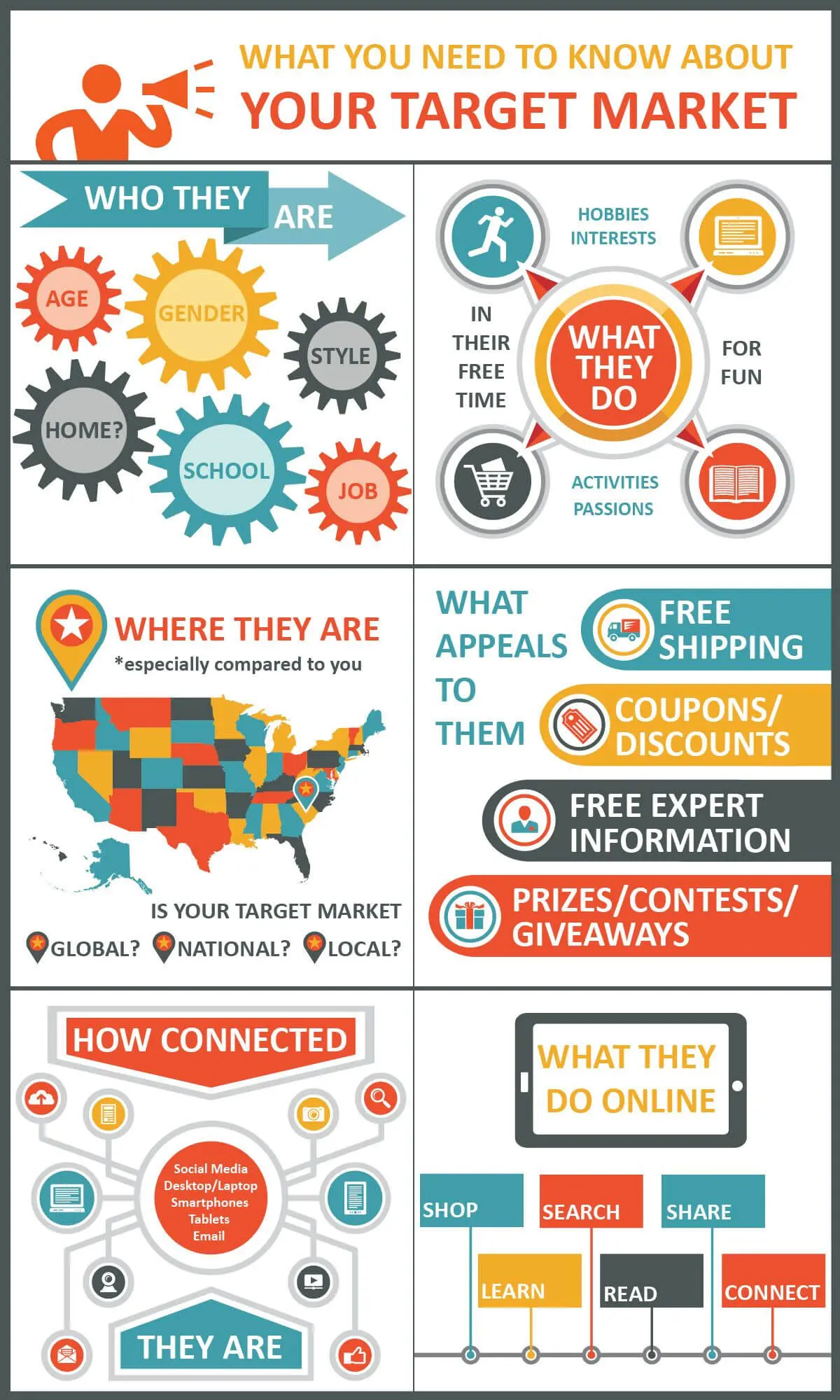
1. Identify the Target Audience
Conduct in-depth research that identifies the number of viewers and collects user data like age, sex, occupation, etc. By pinpointing the audience, it gets easier to put their requirements first.
Further, decoding complex information with serif fonts like their preferences, goals, values, and problems helps design a website that caters to customers and effectively promotes the brand.
2. Use Complementing Visuals
An image can make any written matter more readable. Think about how kindergarteners had books with tonnes of pictures to grab their attention. Similarly, if coloured images accompany a website, it attracts more viewers than a web design that fails to capture users’ attention.
Additionally, a relevant image can boost the viewing rate by 94%. But that does not mean a web designer can carelessly use any image for its sake. If the design does not include suitable pictures, the website loses the effect it’s trying to create in the first place. Ultimately, viewers will get confused and lose trust.
3. Know Colour Psychology
Understanding colour psychology is crucial for web designers. It allows them to tap into user emotions and behaviours effectively. As we’ve mentioned, using visual elements to evoke feelings can illuminate how users respond and act.
For example, different colours like blue and green depict reliability and freshness. On the other hand, red and black evoke passion and sophistication. But with specific combinations and shades, the same colours can trigger fear and dread.
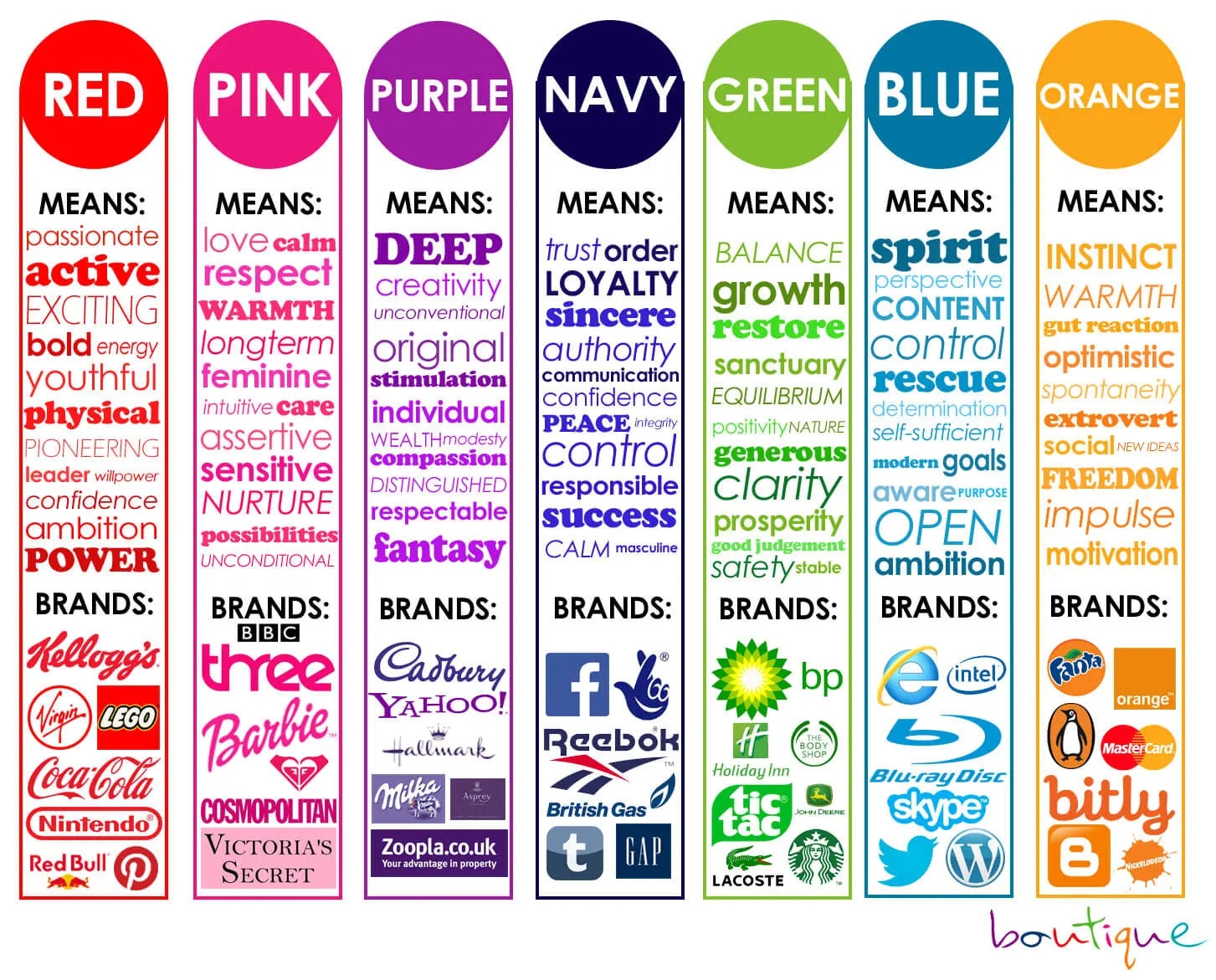
In addition, the bright colours and cheerful models evoke a sense of joy and belonging in the potential customers who will be more likely to buy the products in this clothing line. You can also use emotionally charged symbols – take mascots, for example – on your website to encourage users to take the desired action, follow the intended path, interact with the interface, and Spend more time on your web page.
Website designers can choose the ideal colour scheme for a website by considering the age group and interests of the users.
4. Tell a Story
Besides visually attracting users, a website needs compelling content that can make users pause, read, and spend more time on it. The written matter should project your brand’s personality from the header title to the concluding line.
Depending on your brand or product and target audience, create user-friendly websites with a tone that can be formal, friendly, or even sarcastic! The choice of words, phrases, different colours, and designs should employ the Von Restorff effect, be coherent, and portray the same emotion throughout.
5. Pick a Constant
Why do you think content creators on social media platforms like Instagram stick to one theme or aesthetic for their feed? First, it is visually appealing, and second, the viewers get an idea of what the brand or public figure is trying to portray at one glance.
A website design should pick one emotion, brand, and colour palette. A significant blunder designers can make is providing many options to broaden the market.
Designers who create balance with adequate strategic use of white space can draw attention to critical areas on your site, portray the right vibe, and make a lasting impact.
How to Study Human Behaviour?
Designing websites around human behaviour patterns doesn’t always follow a simple, quantitative path. Instead, grouping users by their SEO analyst archetypes offers insight into their actions and needs.
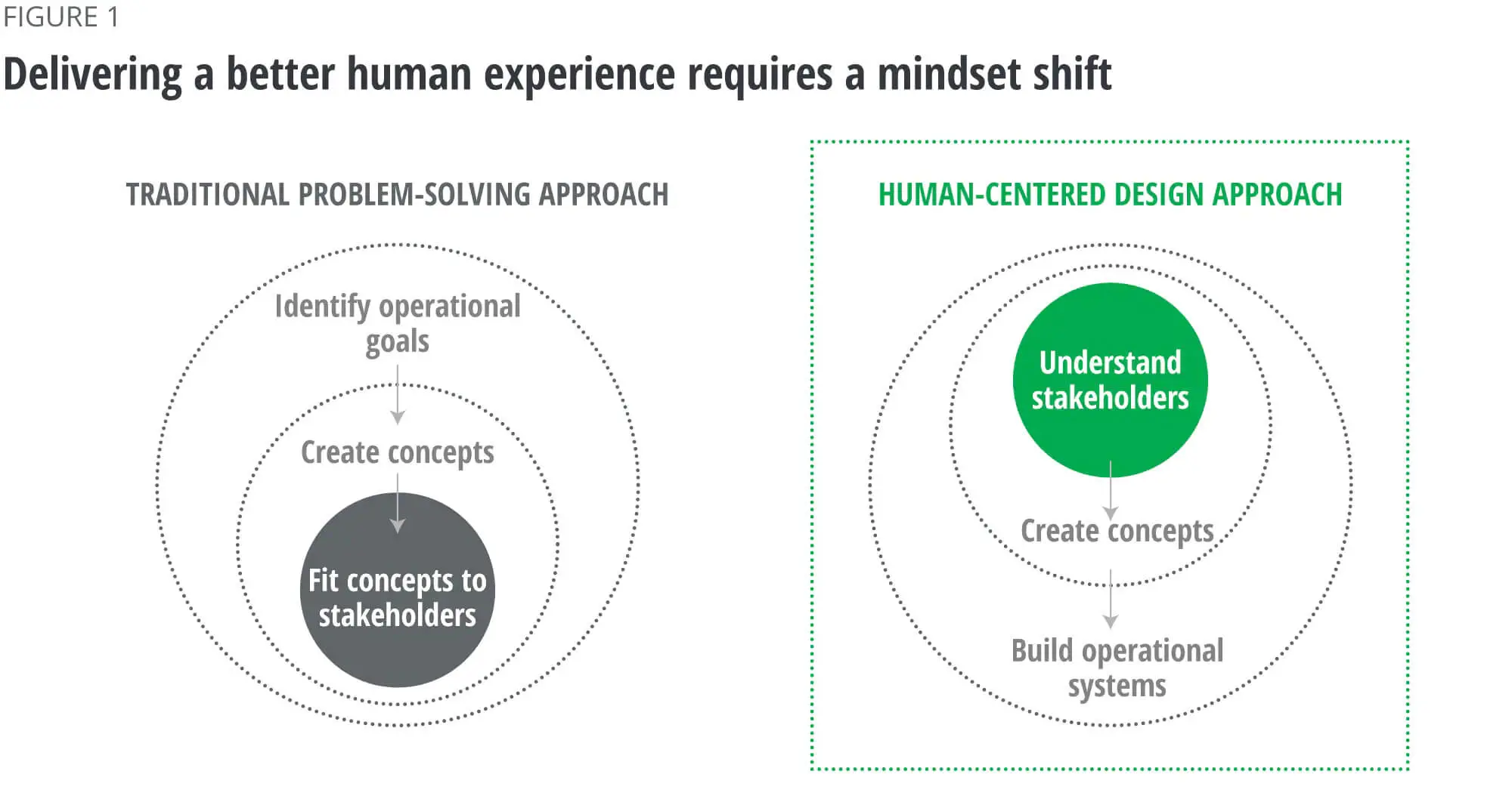
Studying the archetypes involves researching users and their actions in a particular situation to help designers understand their point of view. So, hopping into their shoes won’t be much of a problem!
Further, studying archetypes provides an almost practical learning experience of human behavioural insights. In the long run, a human-centric web design will understand the users’ needs and provide a solution that results in complete user satisfaction.
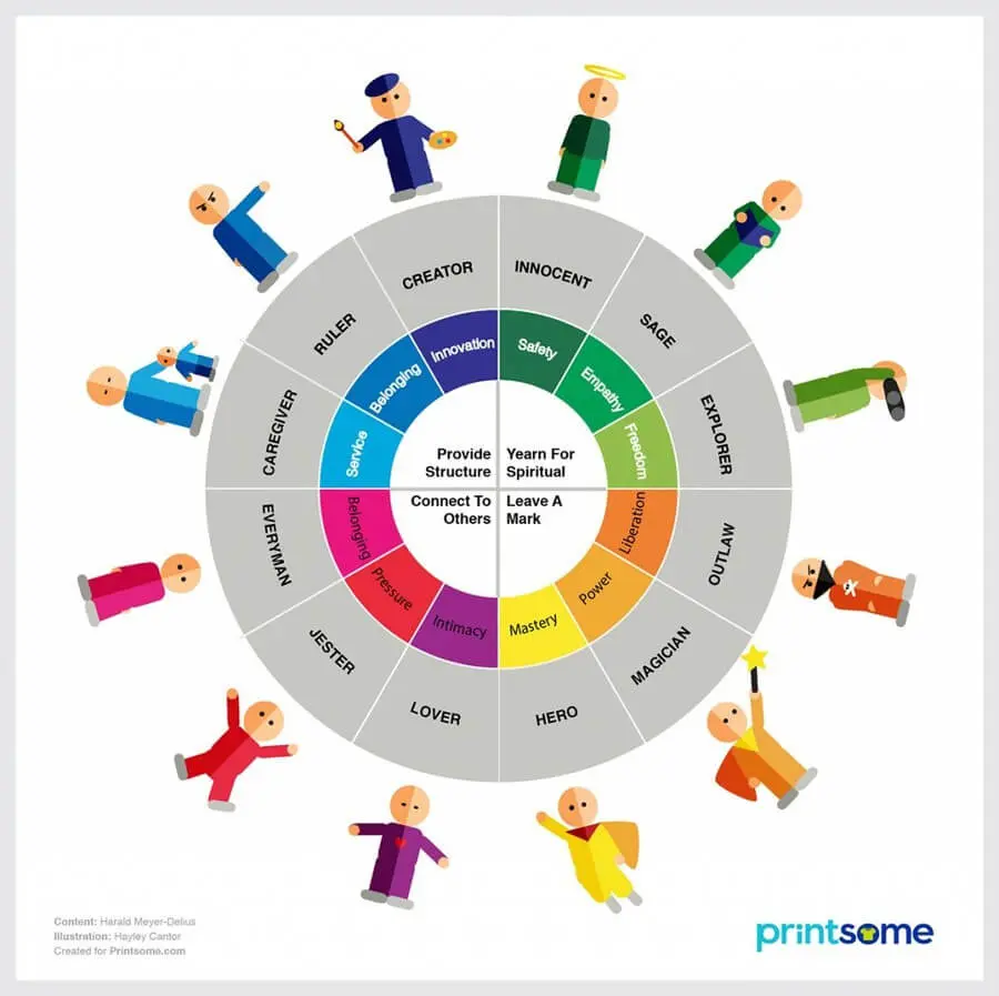
Archetypes
While the website is still in the initial stages, it is essential to conduct market research to understand the behavioural patterns of your potential clients. Designers can take the analysis further by adding questions between the profile setups. Allowing customer reviews is also helpful in understanding their reactions and producing better products and services.
Have you ever noticed how Google keeps displaying Amazon ads for that dress you looked at a week ago? Or how Instagram’s Explore feed curates content that perfectly matches your style? It’s all due to the data these platforms gather from your online activity. Believe it or not, your devices have a pretty clear picture of your job, relationship status, and more.
Moreover, while personas help us learn the primary user group, archetypes paint a clearer picture of a person’s thinking.
Cognitive Bias
Designing a website without expecting change is a considerable risk. The world is dynamic, primarily online. Trends and preferences are bound to change, and this logic must be applied to web design to be prepared for unpredictable circumstances.
Visitors subconsciously judge your site through what’s known as the attractiveness bias theory. Simply put, a visually appealing design can greatly influence whether they’ll return. That first impression, good or bad, really sticks.
Usually, when users act or think differently from what they would, the change is caused by cognitive bias. The psychology of web design consists of many cognitive biases that create complex behavioural patterns when coupled with archetypes.
Hence, a designer’s job in decision-making is to create a website, blog, or post strategy to help users navigate and minimise cognitive deviations accordingly. Here are some major bias groups that must be considered to improve the design of web pages.
1. Herd Mentality
Also known as the Bandwagon Effect, users resort to this behaviour when they want a sense of belonging. A prime example of using social proof, a human tendency, as a marketing technique is a shopping website showing the sales of a particular product.
The actions of a group of users influence the rest’s actions, thereby boosting the value of a website.
2. Status Quo Bias
Clients with a status quo bias are not easy to influence. They need a solid reason to change the way they think and behave. However, once they feel convinced to try something out of their comfort zone, they help achieve a website’s or brand’s long-term goals.
3. Hyperbolic Discounting
Offers like “Buy 3, Get 3 Free” are common marketing strategies brands and shopping websites use. Another example is suggesting add-ons to a user’s purchase at a discounted price.
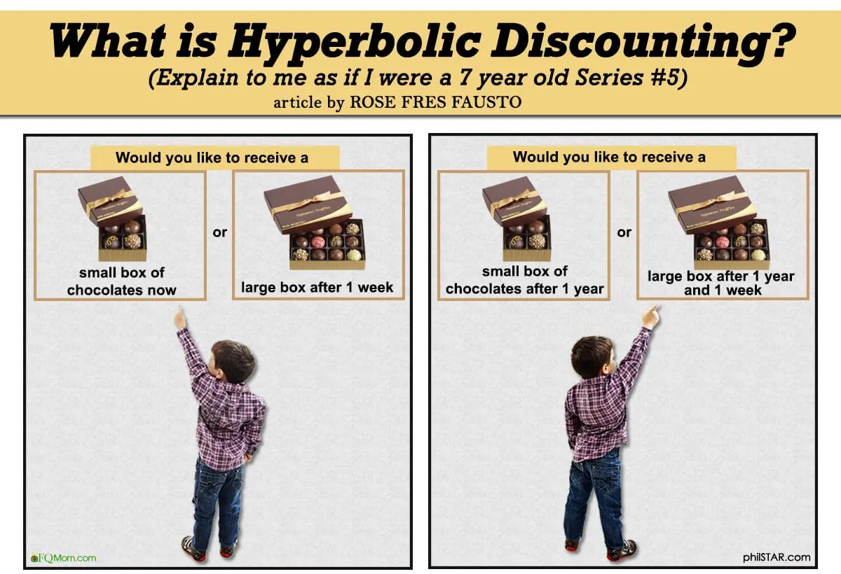
No one expects to buy anything else before adding a product to the cart. With hyperbolic discounting, most users succumb to the temptation to buy something new or miss out on a steal-worthy deal! By falling for this “FOMO” or “fear of missing out”.
However, the ultimate decision of the user depends on various factors like the reason for their purchase and their budget.
4. Availability Heuristic
The availability heuristic or availability bias establishes a sense of urgency in the user’s decision-making process, which thrives on immediate memory. When a user can recall one product or brand compared to its competitors, it’s assumed to be more important, and the user makes a choice accordingly.
Those in this biassed group use the latest news to influence their opinions.
5. Loss Aversion
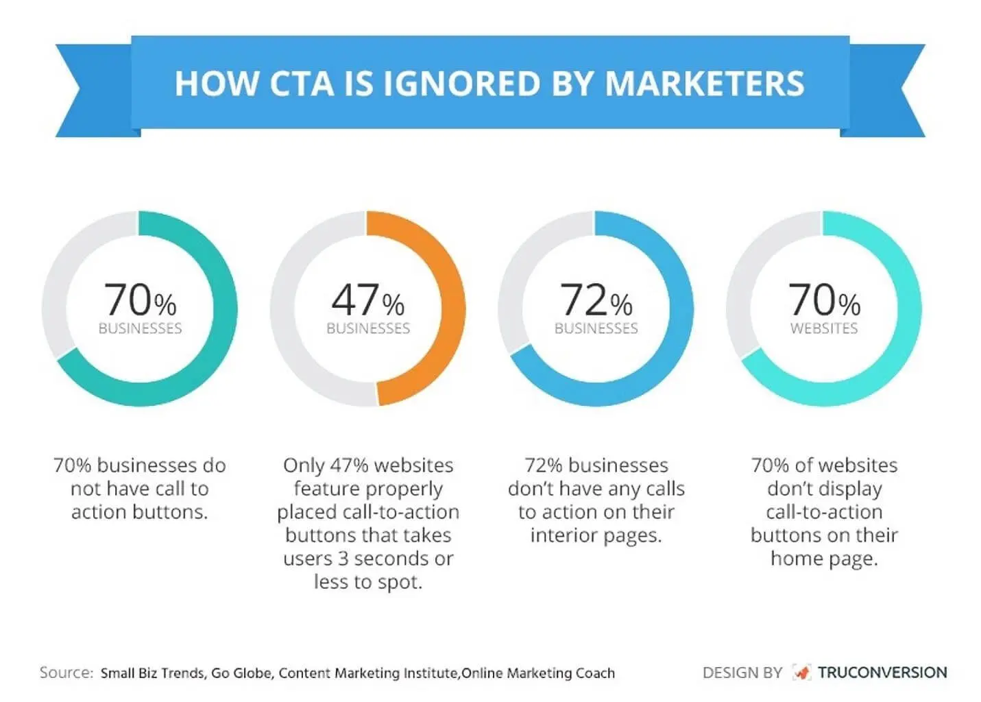
Another bias group that triggers FOMO (fear of missing out) and loss aversion promotes a brand or product by establishing a strong visual hierarchy in a compelling call to action. Examples include limited trial periods and limited pieces of a particular product.
Why Design a Website Based on People’s Behaviour?
As humans, we feel various emotions throughout our lives. Not a single day goes by that we don’t feel a mixture of emotions. Why do you think certain movies do better than the rest, so much that it wins an Oscar? While this may not be the case, most movies do well when they trigger a rollercoaster of different emotions in the audience. Think Disney and Studio Ghibli!
Psychology and emotions influence user behaviour to increase traffic regarding website design. Applying psychological principles is vital in creating a successful website design.
1. Human-to-human Interaction
People feel a sense of security and reliability that may lead to making a purchase when they are sure it’s genuine human interaction. After all, a human can understand another of its species better than a machine.
2. Benefits for Humans
A website design catering to people’s behaviour is bound to perform better than that, considering only search engine optimisation algorithms. Ultimately, a human will read a post, buy a product and click a button on your website.
3. Influences Opinions
As mentioned before, striking the perfect blend of colours, images, and text while designing a website helps influence the decisions of potential customers. Emotions of fear, sympathy and desire are a means of improving your digital marketing campaign.
4. Builds a Rapport
Online users rely heavily on website design to judge a brand or product. With good web design practices, your landing page can trigger and use human emotions and behaviour. This may sound like a typical antagonist move, but design elements like tweaking the button’s colour can enhance its desired actions.
Research on a person’s behaviour and bias helps build legitimacy and build trust with users regarding website design. As a result, users will stay on your site longer and eventually interact less with competitors.
5. Makes an Impression
The online community is full of opportunities to go viral overnight. Especially with the attention span of humans decreasing to just 8 seconds, the first impression is, in fact, the last impression.
A website has just a few seconds to capture user attention, understand user psychology, and increase engagement and interactivity. By incorporating interactive elements such as interactive features into a human-centric website, your brand will appeal to the user’s emotions and make a lasting impression. So, a web design based on user behaviour positively influences the audience, making your products and services likely to be remembered.
Hence, incorporating UI and UX will significantly enhance user engagement, increase customisation, and improve navigation while managing cognitive load to reduce user bounce rates.
Deciding How To Build Your Website
Today, a website designer’s profile requires more than providing relevant and aesthetic visuals and texts. From making the overall design compatible with different devices to using high-quality images that leverage web design psychology, a designer must wear various hats to get the website up and running.
With the advancement in technology and the growing demands of digital consumers, the importance of behavioural research in web design is at an all-time high. Since our behaviour patterns are subject to change, this design field is vast and complex.
However, every cloud has a silver lining. A website design and web development that applies various principles to guide users of user behaviour will significantly increase ultimately increasing user engagement and overall sales. What else can a brand ask for?
