Summary / TL;DR
The fundamentals of logo design cover key principles that help create a memorable and effective brand identity. These include originality, simplicity, versatility, brand relevance, and timelessness, as demonstrated by logos like Coca-Cola, Nike and McDonald’s. A strong logo should communicate a business’s values clearly, remain recognisable across mediums, and serve its branding long-term. Designers are advised to avoid trends, ensure readability, and understand the brand’s target audience. Techniques such as sketching in black and white, researching competitors, and playing with wordmarks or mascots support the creative process. Logo types include brand marks, emblems, combination logos, and abstracts, each suited to different brand strategies.
A logo is essentially the face of your business; it’s how people see and remember you, so it should be distinctive for all the right reasons. Creating a versatile and memorable logo helps a company stand out from the crowd, but it’s not always easy! In this post, we’ll explore the essentials every designer should consider when crafting a brand’s logo.
Designing logos is exciting and one of the most effective ways to help a brand grow; here, we will cover how to develop your logo and a brand strategy to accommodate, ensuring all rights are reserved.
What is logo design? Logo design is the process of creating a unique visual symbol that represents a brand’s identity, values, and services through strategic use of typography, colour, shape, and imagery. A well-designed logo serves as the cornerstone of a company’s visual branding and helps establish instant brand recognition.
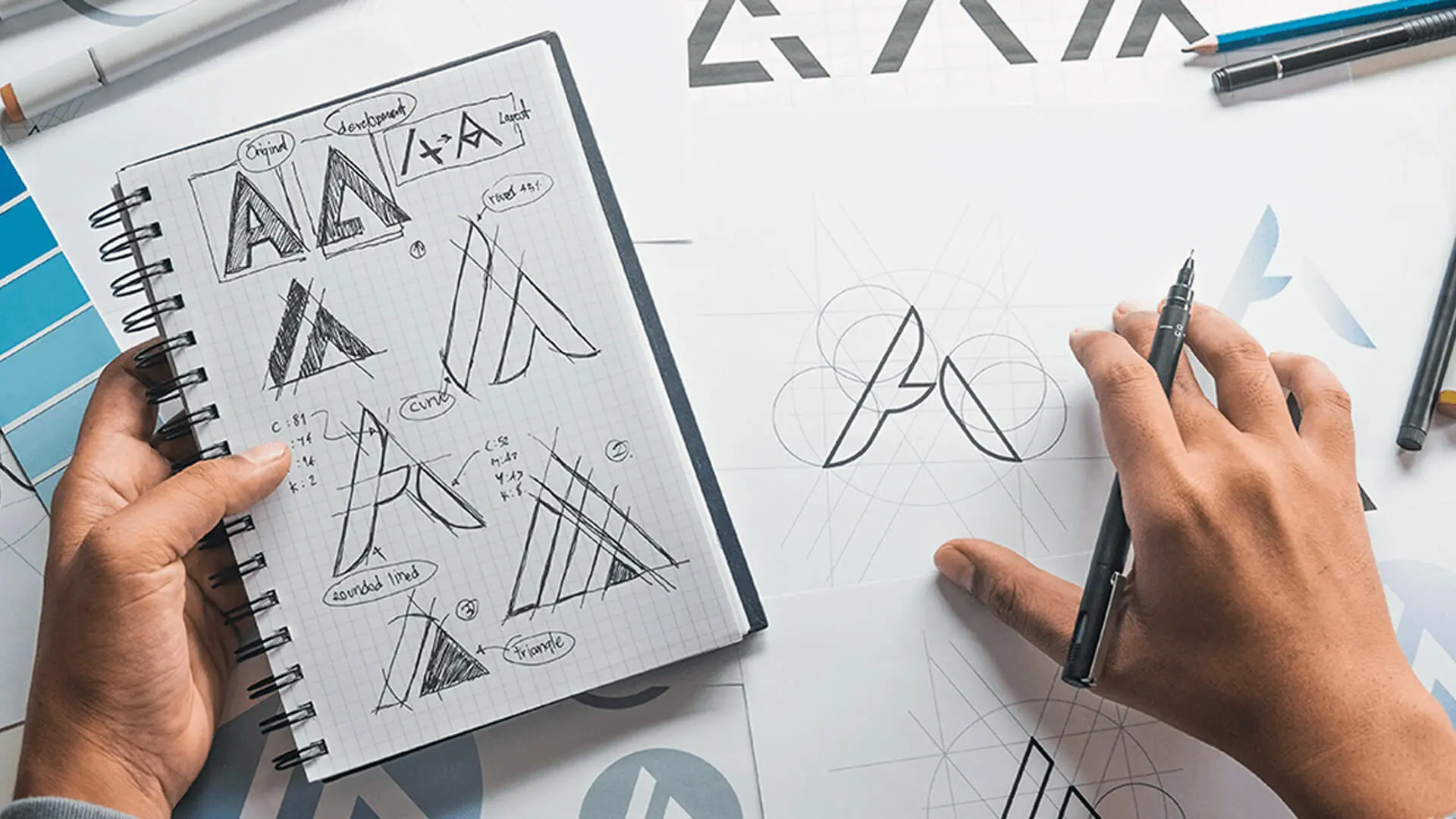
Key Takeaways: The 5 Principles of Logo Design
- Simplicity: Clean, uncluttered designs are more memorable and versatile across all applications
- Originality: Stand out from competitors with unique visual elements that capture your brand essence
- Versatility: Your logo must work across all sizes, mediums, and both colour and black-and-white formats
- Timelessness: Avoid trends in favour of classic design elements that remain relevant for decades
- Relevance: Ensure the design is appropriate for your industry, audience, and brand values
Creating an eye-catching logo is far more effective than traditional door-to-door promotion. It’s often the first thing people notice about your brand, and it should function well across various platforms, similar to a versatile business card, making it an accessible way to engage with the wider audience.
The most effective logos are timeless, beautifully conveying the business’s values through shapes, symbols, and words. However, crafting such logos isn’t simple; it requires significant effort and creativity to build something truly memorable.
Today, we’ll discuss the intricacies and fundamentals of logo design so that your organisation can stand apart from its competitors. This comprehensive logo design guide covers everything from basic logo design principles to advanced techniques. Without further ado, let’s begin with the fundamentals of logo design.
5 Principles Of Logo Design
There are several ways to design an effective logo, but we have narrowed down five principles for your benefit. You can note these points to design a logo that will mark the audience.
1. Being Original
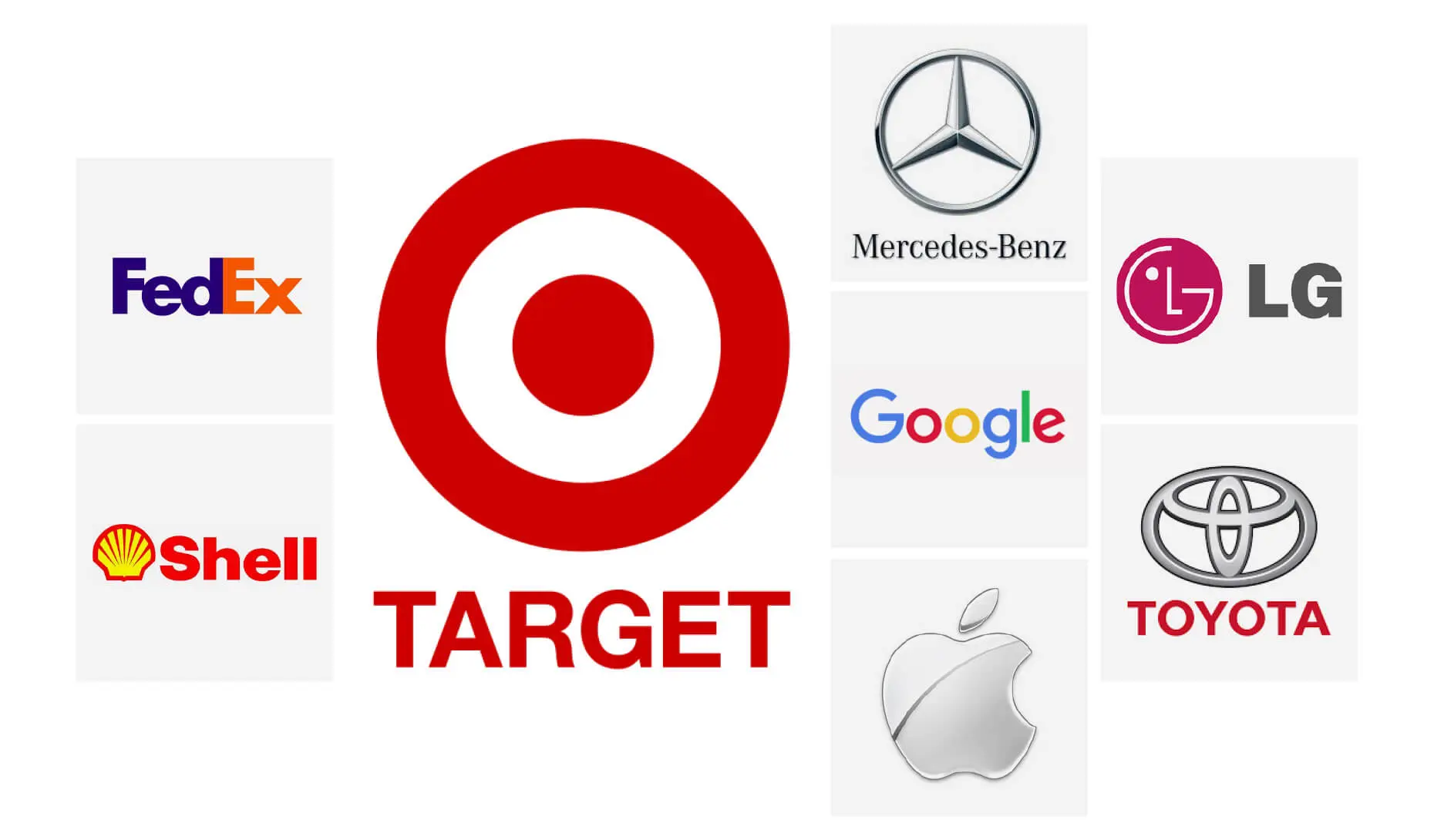
To design memorable logos, it’s important to be original. You can take inspiration from a good logo, but it’s essential to stand out to create a brand identity and brand personality.
The graphic designer must consider the brand’s style to use symbols and images that are recognisable and timeless. This will promote brand recognition, whereby customers can identify with the website and business by simply looking at the logo.
It’s beneficial to ensure your company logos aren’t too similar to others, as this can lead to confusion. Strive to be original, while observing what sets the leading brands apart.
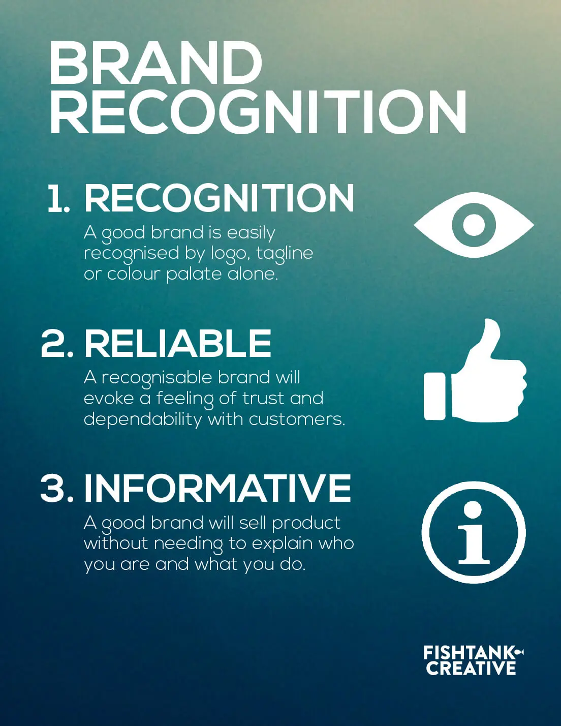
2. Simplicity
As a graphic designer, you might go overboard while designing a unique logo. Working with different logo ideas and essential elements may inspire you to be creative, but it’s essential not to lose sight of the big picture: communication.
The logo must give an immediate and clear sense of the message of the brand. For example, the simplicity of the Coca-Cola logo has made it one of the most popular brands worldwide. The company name is in the design, creating an identity that allows the audience to relate to its services.

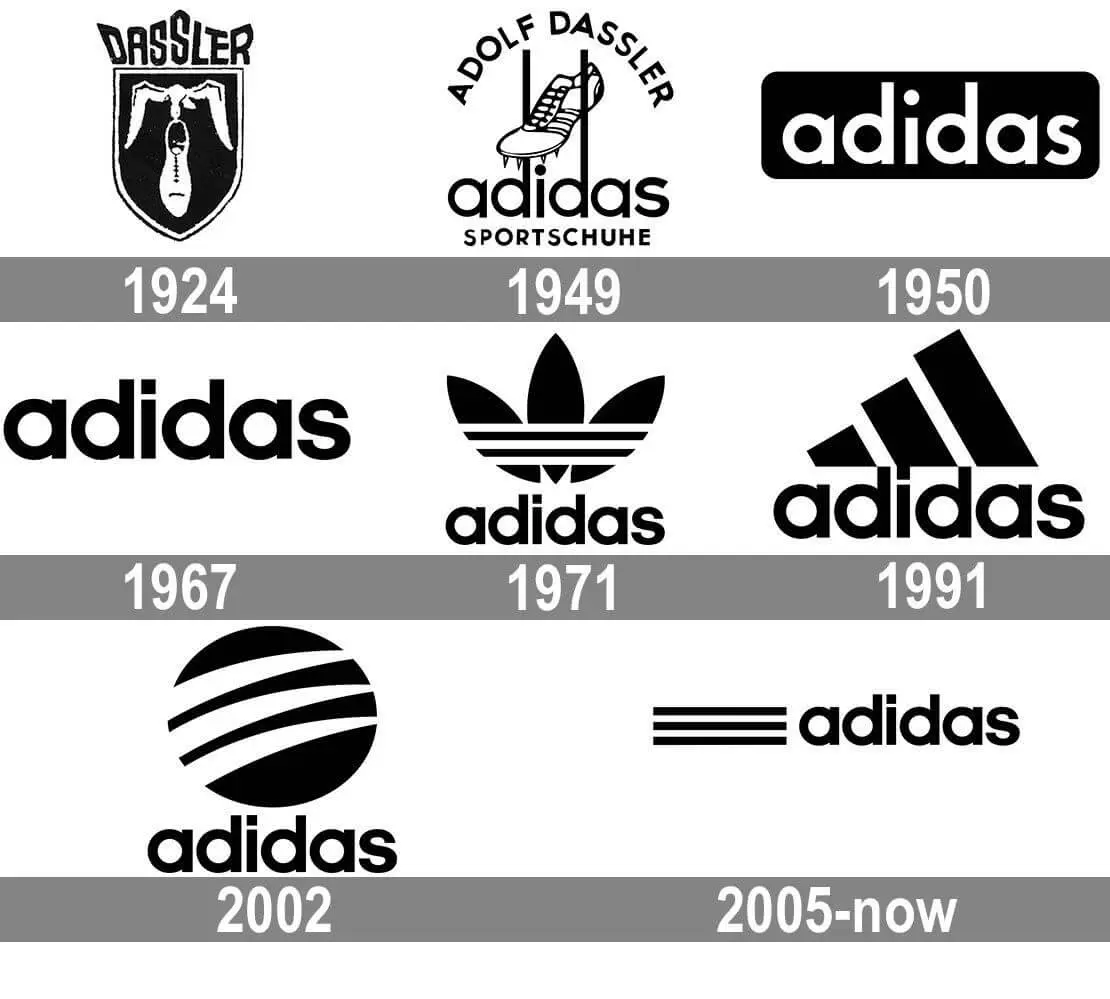
Similarly, Adidas has a great logo. Even if it doesn’t have a designated area for the brand name, the visual of the three stripes immediately makes the business recognisable.
So, focus on simplicity and create fonts that effectively represent the organisation.
3. Versatility
In addition to being meaningful, a great logo design must be versatile. Be it on shirts, mugs, marketing materials or business cards, the logo must look good everywhere to spread the company’s message.
You’ll need to design an eye-catching logo that works well in both black and white and colour. If it’s visually memorable, the design principles are spot on, and you can add colour to the font.
Moreover, changing the size and colour of the logo, like the golden arches of McDonald’s, shouldn’t impact the brand’s idea. A responsive logo must satisfy the client and benefit the business.
4. Brand Appropriate
The basic principle of graphic design states that the logo should be appropriate. For example, car logos like Mercedes and Audi should be modern, incorporating logo style elements and excellence synonymous with their vehicles and services.
On the other hand, logos for baby products need to be colourful with symbols of playfulness to communicate images of a happy baby. Hence, it’s essential to develop an appropriate logo that meets all your logo needs, depending on the business and the company’s values.
5. Timeless
Another critical aspect of designing a successful logo is to create an element of timelessness. A memorable logo design should be etched in the customers’ minds, ensuring they know it.
The design process must account for the longevity of a business, meaning the logo has to look good even several years later. This will promote a visual message every time a consumer views the design. So, it would be best to opt for a classic idea to make the company stand out.
You need to focus on brand identity and the designing process. A company can change substantially after a couple of years, but the logo must project the principles and policies of the business without any difficulty.
If your own logo can project organisational values, it will become a symbol of its identity, making it timeless.
Want to receive updates? Sign up to our newsletter
Each time a new blog is posted, you’ll receive a notification, it’s really that simple.
Rules Of Logo Design
Let’s now proceed to the rules of logo design, explaining how best to use the resources at your disposal to satisfy the logo requirements of the client.
1. Brand Identity
The logo must hold value both for designers and the company. It’s the first thing customers notice about the brand, leaving a lasting impression on their minds.
It would help if you thought about the logo’s purpose and helped attract the target audience. As a rule, the design process should communicate the company’s message to the customers. This will determine whether they take an interest in the services and functioning of the business.
2. Seeking Inspiration
It would be best to have the inspiration to create a logo because it’s impossible to wake up one morning and start designing. So, we suggest brainstorming with the graphic design team and writing all thoughts on a board or notepad.
This is the part of the design process where you can have fun, as there are no good or bad ideas. You can even draw inspiration from related articles. By asking everyone to come up with suggestions, the little grey cells in the brain start working overtime to design a new logo.
Once all ideas are in, you can verbally spell them out, which might spark an idea. You may also get creative and start thinking about customers, their needs, and expectations. Try understanding why people might invest in the business and how the logo aligns with their principles.
Also, don’t hesitate to push the boundaries of logo design, encouraging everyone to share their thoughts. Even ideas that initially seem flawed can contain the seeds of a perfect logo.
3. Take Notice Of Rival Brands
People get so caught up in establishing their brand’s identity that they disregard rival businesses. However, looking at what another company has done well may work in your favour.
This is especially necessary if two businesses have the same target audience. So, you can consider what creative elements a rival uses to attract customers.
What’s more, it’s essential to be aware of the visual trends in the market so that the logo stands out. For example, if a rival organisation has a modern logo, it would help to opt for a classic design. Also, experiment with colours, shapes, and fonts, thinking about how the brand portrays itself.
The brand designer must be aware of taking inspiration and copying someone else’s idea. The latter is stealing and a strict no.
4. Unique Style
Top designers cultivate a distinctive logo style to forge something unique, deftly applying design principles to meet the brand’s goals. It’s vital to consider various elements individually to effectively craft a new logo.
Be it fonts like serif or sans serif, colours, shapes, or appeal, work on the specific elements separately rather than as a whole. This will make the designing process more manageable. For example, a logo for a law firm will have a classic style with solid colours, while a soda company like Coca-Cola will have a vibrant design.
5. Letters Or Mascots?
You can use letters and mascots to design a logo, provided it’s not overdone. For example, having a lion crest conveys a sense of pride and power, but it won’t work for a vegetable company. Hence, talk to the client to understand the visual aids.
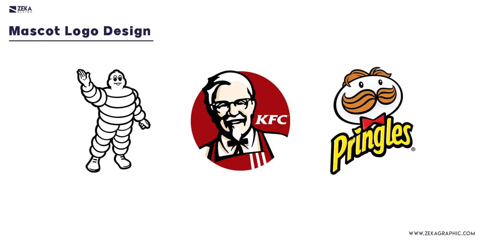
Similarly, handcrafted logos lend a personal touch, creating a bond with customers. Knowledge about the enterprise and its services can provide valuable tips for the designer. It would help keep things simple, as the logo must communicate the brand’s meaning, which is its priority.
Golden Rules Of Logo Design
Taking the discussion forward from the rules of logo design, let’s now look at the golden rules for producing good logos. These logo design tips will help elevate your work from adequate to exceptional.
1. Laying A Foundation
Logo designing is much like constructing a building; you need a blueprint to plan a course of action. Instead of worrying about how the finished project will look, proceeding step-by-step is important. So, the first step is laying the foundation, ensuring that the building stands the test of time.
Similarly, in logo design, you need a base for the designing process, keeping in mind that every business is unique. So, using the same strategy for different brands is not feasible.
It would be best to ask the client about their demands and convey them to the graphic designers to get everyone involved. This creates a foundation for developing an effective logo that promotes brand identity design.
2. Start Sketching
The best way to get something done is to start; the same holds in logo design. Encourage your graphic design team to draw whatever idea pops into their head. You can take the best bits of different sketches to create an effective logo.
Using digital tools or drawing on a notepad, the designers should play with shapes and ideas to communicate the brand’s value. You can present these ideas to the client, showing how much work has progressed while welcoming logo design tips about the project.
If the company recommends changes, you can tweak the design accordingly, saving time and effort.
3. Staying Relevant
The primary aim of the logo is to create a visual impression in the minds of people. Hence, it’s essential to focus on more refined logo design elements like typography, fonts, symbols, etc. These are also part of the design principles that help align the logo with the brand identity design.
For example, Amazon has the company’s name written on a white background, but the addition of the arrow makes the difference. It points from the letter ‘a’ to ‘z,’ highlighting its business model. In other words, it’s a creative way of telling customers they can find everything on the website.
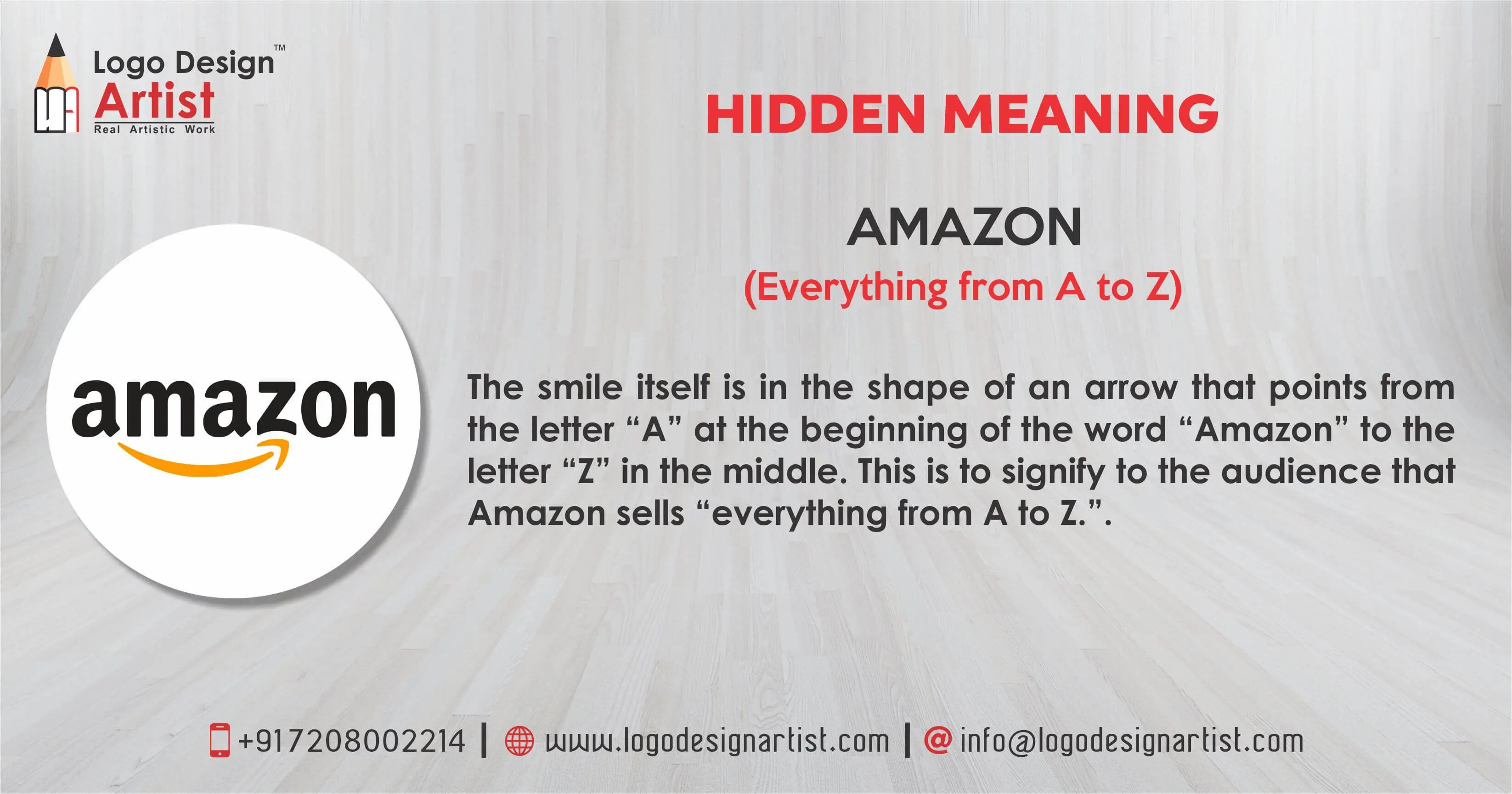
Even if the business changes with time, the Amazon logo will stay relevant, thanks to its simple and modern design. The consumer doesn’t have the time to ponder over the meaning of the logo, so it must be crisp and relevant.
4. Five-Second Rule
Another critical factor in the logo design fundamentals is using the five-second rule to judge the logo’s effectiveness. Any symbol, font, shape, etc., must be easily recognisable to people, ensuring that they understand the design and recognise the brand within five seconds.
All visual elements must convey what the organisation stands for, encouraging consumers to explore the services and business opportunities.
5. Don’t Colour Until The Very End
Initially, it would help sketch a black-and-white logo, focusing on the basic design principles. Adding colours won’t hamper the brand identity if the logo leaves a mark on the consumer’s barest form.
That said, the purpose of colours should be to give the logo a refined look. You won’t need many resources; simple shades will help create a visually striking design that customers can relate to. Usually, a maximum of two colours is enough to design a logo, ensuring it’s attractive without appearing overdone.
Characteristics of Creating A Logo
We’ve discussed the rules and principles of logo design, but specific characteristics will help you design better. Read on to find out.
1. Avoid Trends
It would be best to avoid the latest trends in logo design. We’ve discussed simplicity and being original, so designers mustn’t do what everyone else is doing. You must focus on something fresh and stay relevant for several years to stand out.
In other words, consider the long-term objective rather than a short-term goal, making the logo designing process memorable for yourself and the client. This is how a designer can leave their mark on customers.
2. Should Be Readable
Ensuring that the logo is readable is an essential principle of logo design. Graphic designers need to discuss with the client all possible products where the logo is likely to appear, be it on shoes, mugs, or a website.
Irrespective of the place, the logo must be clear and easily understandable. So, it would be best to use a serif or sans serif font, meaning that changing the size won’t obscure the company name or tagline. As with other logo design elements, simplicity is the key even here.
3. Can The Logo Communicate?
Imagine writing a long description about a brand, explaining its business model and available resources. But hardly anyone will have time to appreciate the brand value by reading a long, tedious write-up.
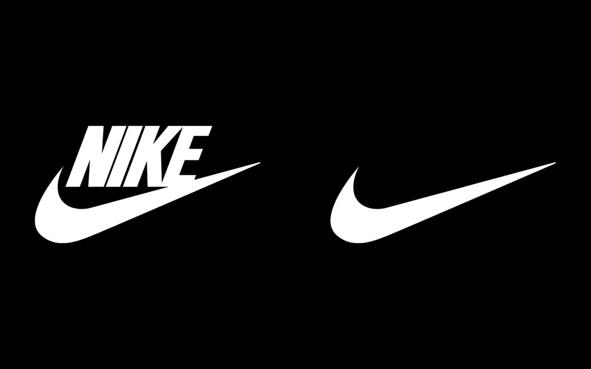
A logo is the opposite, helping people identify with the brand through its trademark symbol and design. For instance, if you see a black swoosh on a t-shirt or shoe, it immediately reminds you of Nike.
The simple design has left a mark on customers, meaning people relate at once to Nike’s products.
4. Animation
If the logo appears on television, it might be an animation. Understandably, there will be a lot of colours and moving visuals to grab the audience’s attention.
The logo design team must discuss what changes to incorporate with the client, ensuring it doesn’t lose meaning even on a visual medium. This is important, considering that more brands are pushing for state-of-the-art technology to unveil a new product.
Also, television helps spread the brand identity to a large population, so you must adjust to the changing demands of logo design principles.
The Golden Ratio In Logo Design
One of the most powerful logo design best practices involves using the golden ratio, a mathematical principle represented by the number 1.618. This ratio appears throughout nature and has been used by artists and designers for centuries to create visually harmonious compositions.
Many iconic logos incorporate the golden ratio in their design. Apple’s logo uses golden ratio circles to achieve its perfectly balanced shape. The Twitter bird (now X) was constructed using overlapping circles based on this proportion. Pepsi’s globe design also follows golden ratio principles in its circular elements.
To apply the golden ratio in basic logo design, start with a shape and multiply or divide its dimensions by 1.618 to create proportionally related elements. This creates visual harmony that feels naturally pleasing to viewers, even if they can’t consciously identify why the design works so well.
While the golden ratio isn’t mandatory for every logo, understanding this principle gives designers another tool for creating balanced, aesthetically pleasing marks that stand the test of time.
Negative Space In Logo Design
Negative space, also known as whitespace, refers to the empty areas surrounding and within design elements. Mastering negative space is one of the most important logo design guidelines, as it can transform a simple design into something clever and memorable.
The FedEx logo is perhaps the most famous example of negative space in logo design. Look closely between the ‘E’ and ‘x’, and you’ll discover a hidden arrow symbolising speed and precision, a brilliant visual representation of the company’s delivery services.
Other excellent examples include the NBC peacock, where negative space forms the bird’s body between the coloured feathers, and the WWF panda, which uses white space to create the animal’s distinctive markings. The Spartan Golf Club logo cleverly uses negative space to show a golfer’s swing within a Spartan helmet.
When designing with negative space, consider what secondary shapes or meanings can emerge from the areas around your primary elements. This technique adds depth and cleverness to logos, giving viewers a moment of discovery that enhances memorability.
How To Design A Logo
Although we’ve spoken about logo designing principles, discussing how a graphic designer can sketch compelling logos is essential. So, let’s get started.
1. Background Research
Proper research into the organisation, the client’s requirements, and the business model will help produce eye-catching logo designs. You can welcome suggestions regarding what fonts to use or which symbols to avoid, creating a blueprint in your mind.
Note down everything the company tells you, making it easy to join the dots later. We assure you that having a physical copy of the design principle is better than guesswork. Hence, gather all the necessary information and share it with the designer.
2. Look Beyond A Specific Industry
Please don’t limit yourself to examining the logos of rival companies; it would be best to explore outside the industry.
You never know where the next source of inspiration might come from. Many websites have top-notch logos that might align with the client’s objective, or you might stumble upon a stunning design while walking down the street.
We’ve also spoken about avoiding trends, but don’t forget to explore an obvious idea as it’s still relevant. You can refine this thought later to develop a brand-new logo.
3. Play With Words
It will help play with words if you want to add the brand’s name to the logo. For a car business, the words “vehicle”, “motor,” and “engine” communicate the brand’s meaning and what it stands for. This allows a designer to innovate while aligning with the organisation’s principles.
4. Fine-Tuning
Sketching logos is just the beginning, as it’s important to fine-tune the design. Incorporate all available inputs from the client to ensure that the logo has a memorable visual impact on consumers.
Moreover, considering what colours to use as shade defines how people perceive the logo. For example, green is usually associated with eco-friendly or vegetarian products, while red is fiery and aggressive.
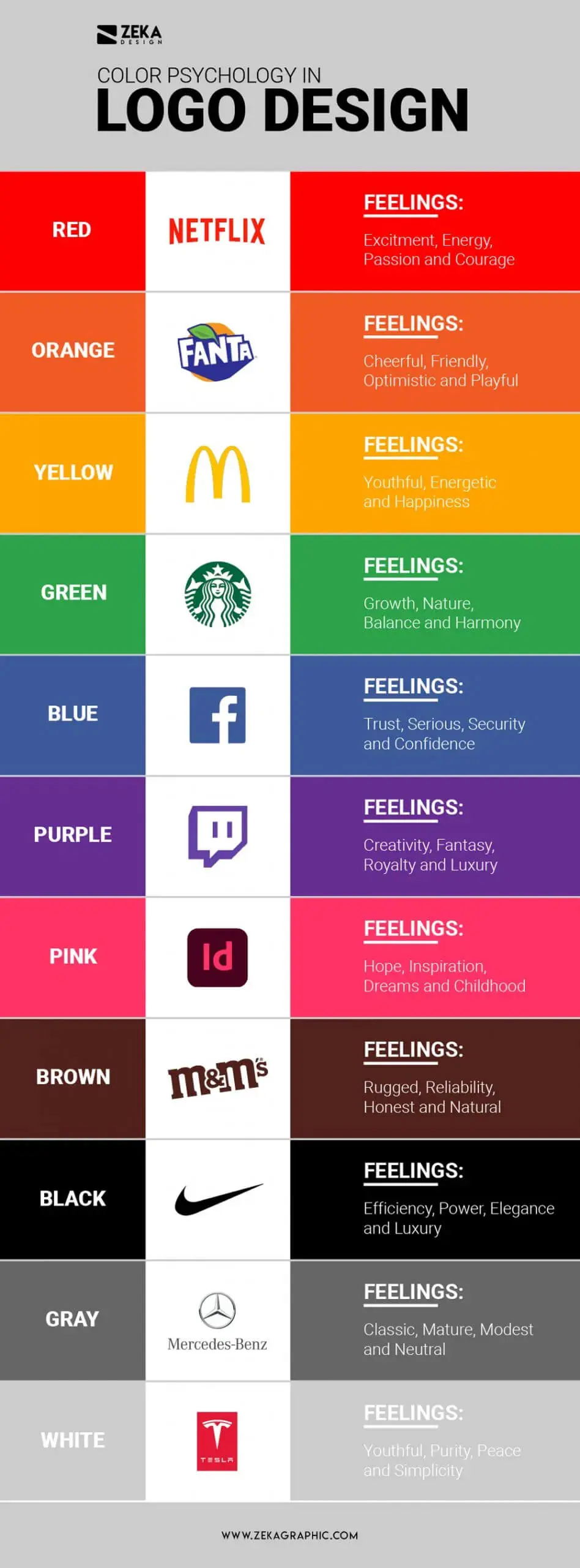
Similarly, a groovy font might work for a clothing line, but classic fonts work best for a financial organisation. So, once you finalise the initial design, fine-tuning it with the brand’s representatives ensures that the logo serves its purpose.
Types Of Logos
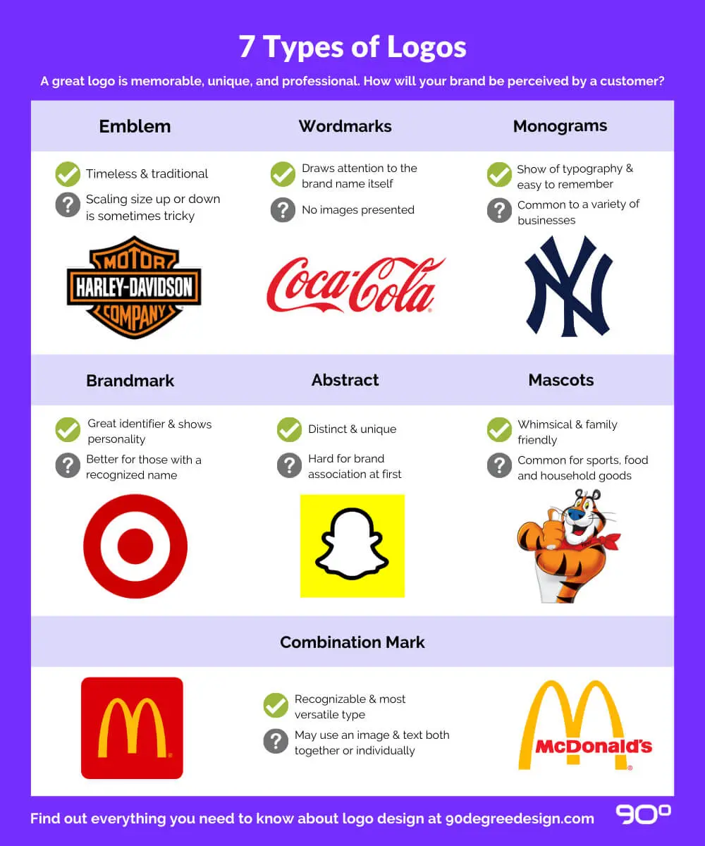
Understanding the different types of logos is essential for any logo design guide. Each type serves different purposes and works better for certain brands. Here are the seven main categories that form the basics of logo design:
1. Wordmarks (Logotypes)
Wordmarks are text-only logos that display the company name in a distinctive typeface. This type works best for businesses with unique, memorable names. Google, Coca-Cola, and FedEx are prime examples of successful wordmarks where the typography itself becomes the brand’s visual identity.
The advantage of wordmarks is immediate name recognition. However, they require careful font selection and may need modification for small-scale applications like favicons or app icons.
2. Lettermarks (Monogram Logos)
Lettermarks use initials or abbreviations to represent a brand. IBM, HBO, NASA, and CNN all use lettermark logos effectively. This approach works well for companies with long names that would be cumbersome as full wordmarks.
When designing a lettermark, typography is paramount. The letters must be distinctive and work together as a cohesive unit while remaining legible at various sizes.
3. Pictorial Marks (Logo Symbols)
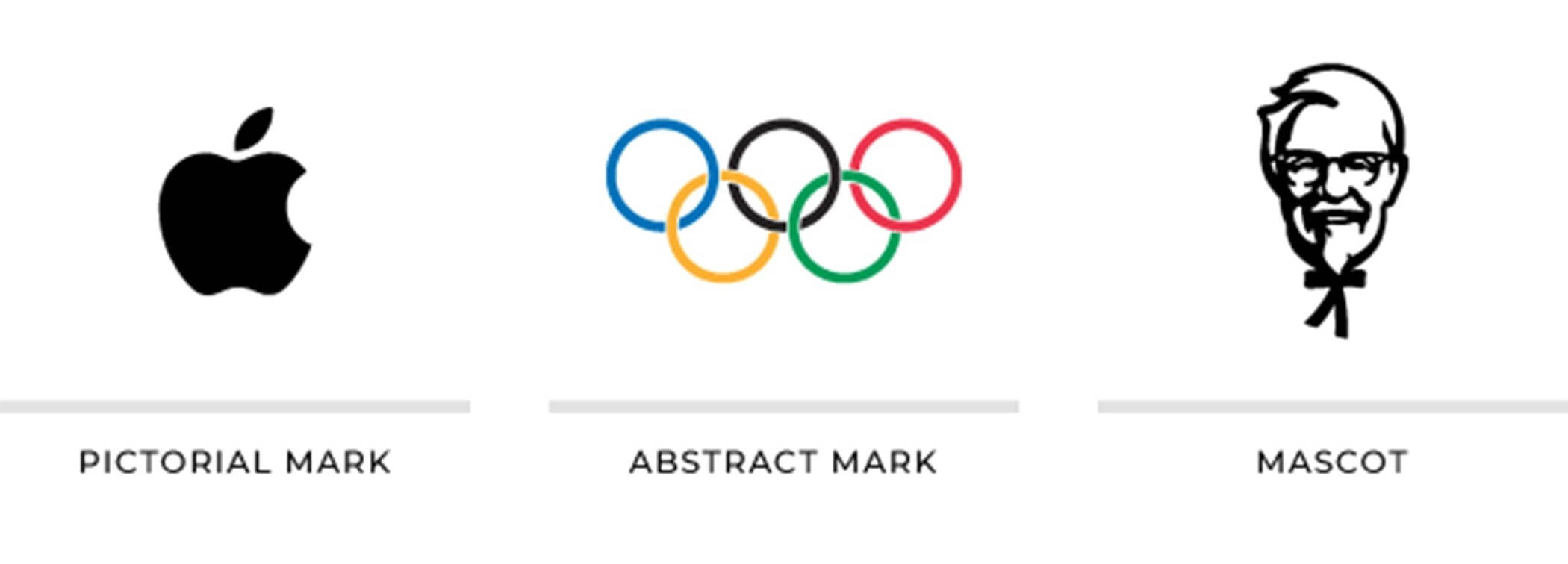
Pictorial marks are icon-based logos that use a recognisable image to represent the brand. Apple’s bitten apple, Twitter’s bird, and Target’s bullseye are iconic examples. These logos can transcend language barriers, making them effective for global brands.
The challenge with pictorial marks is that new businesses may struggle to achieve instant recognition without accompanying text until the symbol becomes established in consumers’ minds.
4. Abstract Marks
A brandmark is a visual representation of what the company stands for, such as the logo of a vegetable for an organic farming business. Initially, the brand mark will appear alongside the organisation’s name until people learn to associate the business with the logo.
With time, using only the logo will be enough to attract consumers.
5. Abstract Logos
Usually, abstract logos are difficult to understand, meaning people may not find geometric shapes and patterns appealing. However, they possess a uniqueness that, if refined, will help promote brand value, allowing the organisation to connect with more people. Examples include the Pepsi globe, Adidas trefoil, and BP’s sunburst design.
6. Emblems
Emblems are signs of pride and prestige, appearing selectively. People already identify with the history and tradition behind such logos, so the designing team need not do much. Harley-Davidson, Starbucks, and most football clubs use emblem logos effectively.
All the colours and patterns hold significant meaning, so it would be best to keep the original logo design intact even if the brand wants to reinvent itself. Hence, please don’t make too many changes as it might rub people incorrectly. Instead, add to the logo’s glamour, making it relatable for a contemporary audience.
7. Combination Logos
Combination logos incorporate the best of two logo designs: symbols and wordmarks. The former includes a shape or style that best represents the organisation’s values, while the latter is the brand name.
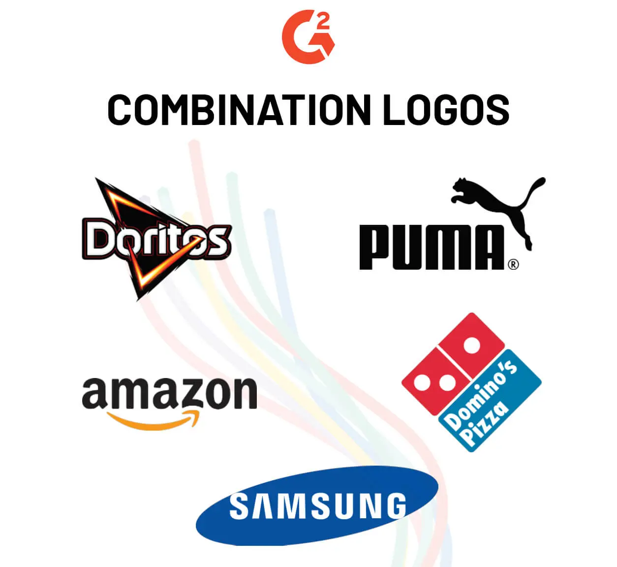
Combining the symbol with the name helps communicate the services on offer, making it easier to recognise the brand. For example, a law firm named “LAWYERS” can replace the “Y” with the image of a tie so that people realise that the firm is serious about its profession.
Moreover, it adds to the image that the organisation is well-versed in legal proceedings.
Logo File Formats: A Complete Guide
Understanding logo file formats is an essential part of logo design 101 that many designers overlook. Different formats serve different purposes, and providing clients with the right files ensures their logo works across all applications.
Vector Formats (Scalable)
- SVG (Scalable Vector Graphics): The most versatile format for web use. SVG files maintain perfect quality at any size and can be edited with code. Essential for responsive websites and modern digital applications.
- AI (Adobe Illustrator): The industry-standard working file format. Contains all layers and editability. Always provide this to clients for future modifications.
- EPS (Encapsulated PostScript): A universal vector format compatible with most design software. Ideal for print production and professional applications.
- PDF (Portable Document Format): Can contain vector data while being viewable without design software. Excellent for sharing with clients and printers.
Raster Formats (Fixed Size)
- PNG (Portable Network Graphics): Supports transparency and works well for digital use. Provide at multiple resolutions (at minimum 500px, 1000px, and 2000px widths).
- JPEG/JPG: Does not support transparency and uses lossy compression. Generally avoid for logos unless specifically required for certain applications.
Always create logos in vector format first, then export to raster formats as needed. This ensures scalability and future flexibility.
Common Logo Design Mistakes To Avoid
Even experienced designers sometimes fall into these traps. Understanding common mistakes is crucial for anyone learning the basics of logo design:
1. Overcomplication
Adding too many elements, colours, or effects dilutes the logo’s impact. The most memorable logos are often the simplest. Remember: if you can’t describe your logo in one sentence, it’s probably too complex.
2. Following Trends Blindly
Trendy design elements quickly become dated. While it’s important to stay aware of current aesthetics, timeless design principles should take precedence over fleeting styles.
3. Poor Font Choices
Using multiple fonts, overly decorative typefaces, or fonts that don’t match the brand personality are common errors. Stick to one or two complementary fonts maximum.
4. Ignoring Scalability
A logo that looks great on a billboard may be illegible on a business card. Always test your logo at various sizes, from favicon (16×16 pixels) to large format print.
5. Relying Too Heavily on Colour
If your logo only works in colour, it’s not versatile enough. Design in black and white first, then add colour as enhancement rather than crutch.
6. Copying Competitors
Taking inspiration is fine, but creating something too similar to competitors leads to brand confusion and potential legal issues. Strive for differentiation.
7. Neglecting Research
Designing without understanding the brand, target audience, and industry context results in logos that miss the mark entirely.
Frequently Asked Questions About Logo Design
What are the 5 principles of logo design?
The five core principles of logo design are: simplicity (keeping designs clean and uncluttered), originality (creating unique visual elements), versatility (ensuring the logo works across all sizes and mediums), timelessness (avoiding trends for longevity), and relevance (matching the design to brand values and audience). These logo design principles form the foundation of effective brand identity creation.
What makes a good logo?
A good logo is memorable, simple enough to recognise quickly, versatile across different applications, appropriate for the brand’s industry and audience, and timeless rather than trendy. It should communicate the brand’s essence at a glance and work effectively in both colour and black-and-white formats.
How much does professional logo design cost?
Professional logo design costs vary widely based on designer experience and project scope. Freelance designers typically charge between $300 to $2,500, while design agencies may charge $5,000 to $50,000 or more for comprehensive brand identity packages. The investment reflects research, multiple concepts, revisions, and deliverable file formats.
What file format should a logo be in?
Logos should be created in vector formats (AI, SVG, EPS, PDF) for scalability, then exported to raster formats (PNG at multiple sizes) for digital use. Vector files allow unlimited scaling without quality loss, while PNG files with transparent backgrounds work well for websites and documents.
How long does it take to design a logo?
Professional logo design typically takes 2 to 6 weeks, including research, concept development, revisions, and final file preparation. Rush projects are possible but may compromise the thoroughness of the creative process. Quality logo design requires time for exploration and refinement.
Should I use a logo maker or hire a designer?
Logo makers can work for very early-stage startups with minimal budgets, but professional designers provide strategic thinking, originality, and craft that template-based tools cannot match. For businesses planning long-term growth, investing in professional design typically offers better return through stronger brand differentiation.
Final Thoughts: Mastering Logo Design Fundamentals
Understanding the fundamentals of logo design is essential whether you’re a designer crafting brands for clients or a business owner seeking to understand what makes logos work. The principles we’ve covered (simplicity, originality, versatility, timelessness, and relevance) form the foundation of every successful logo.
Remember these key logo design best practices:
- Start with research and strategy before touching design software
- Design in black and white first to ensure the concept works without colour
- Test your logo at multiple sizes from favicon to billboard
- Seek feedback from people unfamiliar with the project
- Deliver final logos in both vector and raster formats
Whether you’re creating a logo for a startup or refreshing an established brand’s identity, these logo design guidelines will help you create marks that stand the test of time and truly represent the brands they symbolise.
Ready to create a logo that captures your brand’s essence? Explore our professional branding services or get in touch to discuss your project with our experienced design team.
