Summary / TL;DR
The history of web design traces the development of internet aesthetics and functionality from 1991 to 2026, beginning with Tim Berners-Lee’s launch of the first website using basic HTML. With advancements like CSS, JavaScript, Flash, and responsive frameworks such as Bootstrap, web design progressed toward greater interactivity and performance. Landmark innovations include the rise of search engines in 1993, WordPress in 2003 enabling user-generated sites, and the mobile-first approach post-2007 iPhone launch. Design trends shifted from skeuomorphism to flat design, prioritising user experience and accessibility. Recent developments emphasise micro-interactions, AI-driven personalisation, voice interfaces, chatbots, and 3D design, reflecting a focus on engagement, functionality, and privacy.
Around 4.72 billion people use the internet every day. That’s more than half the global population!
Whether to find out what’s happening worldwide or in your friend circle- we cannot go a day without using the internet. But how did it all start? Was there a time when kids didn’t simply use search engines to find all the answers and complete their assignments?
In this extensive guide, we’ll be travelling back through the era of web to unearth the history of web design and how web developers and designers have shaped the internet that we experience today.
The History Of Web Design
World Wide Web
Just about three decades ago, the World Wide Web was born, thanks to Berners-Lee, an English computer scientist. He crafted the foundational website and launched it as a global hypertext project on the notable day of August 6, 1991.
Although he began working on the website for CERN (European Organisation for Nuclear Research) in 1989, it was only in November 1992 that the entirely text-based web page was ready to be published.
Here’s the link to the world’s first web page: https://info.cern.ch/hypertext/WWW/TheProject.html
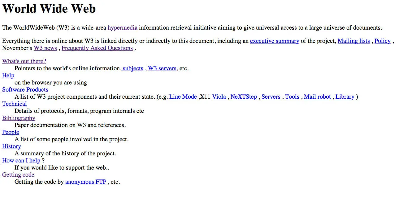
The earliest websites were pretty bare-bones, usually devoid of styling, and built just to share straightforward information.
HTML
Tim Berners-Lee further revolutionised the internet by creating HTML, the fundamental code behind the CERN website. Shortly after, he established the World Wide Web Consortium, an open-source project that still plays a crucial role in developing web standards today.
Back then, web designers used HTML tables, essentially creating table-based designs, to organise various visual aspects of a website. However, “web design” was limited to basic black-and-blue text, nothing close to what we see on most websites today.
HTML and HTML tags have come a long way, from simple to advanced HTML5 tags used today. Modern design and the mobile era have revolutionised the online experience for more people to find what they’re looking for quicker than ever before.
Want to receive updates? Sign up to our newsletter
Each time a new blog is posted, you’ll receive a notification, it’s really that simple.
The First Search Engine
Back in November 1993, ALIWEB made its debut as the first search engine. Unlike Google Search today, it was different but groundbreaking, offering useful links for categories like research and shopping. Notably, ALIWEB was the first to use colour, featuring a yellow table to grab attention and highlight key areas.
But In 2000, web browsers such as Internet Explorer were released for Mac, with the latter being the first to support HTML 4.01 and CSS 1 fully. This was also the first browser to support PNG images fully. Microsoft’s campaign to popularise Internet Explorer by 2001 resulted in 96% use of Internet Explorer as the leading web browser, signalling the end of the first browser competition.
The Beginning Of Landing Pages
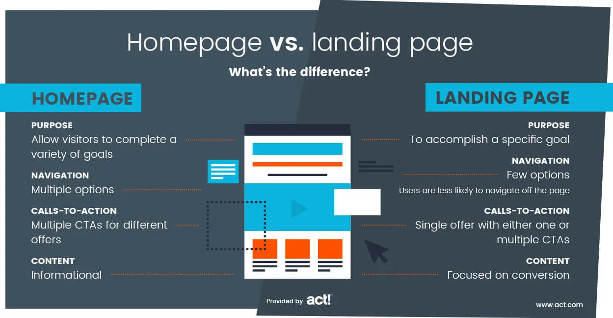
When businesses began using web design, designers crafted landing pages teeming with colours and images. MTV stood out as a trendsetter with its vibrant and quirky layout. While today’s landing pages are dynamic, back then, they were simply static, well before mobile internet took off.
Banner Ads
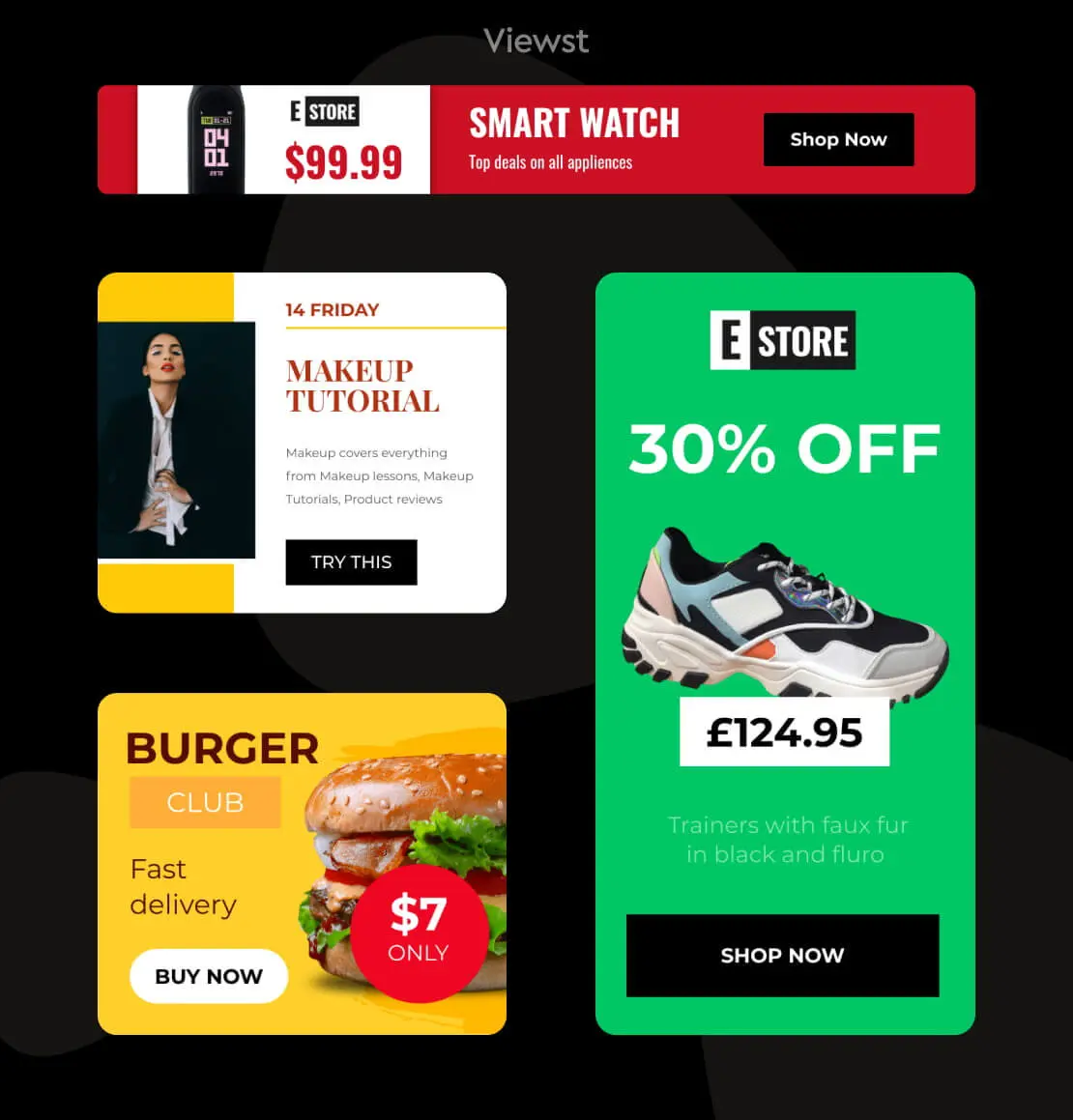
Online marketing was a thing back then, too. However, not only were these ads an eyesore, but they also took ages to load. That’s when Hotwire (now Wired) incorporated a banner ad on their website. With fewer texts and more graphics, web design was evolving and getting more complex.
JavaScript
Speaking of evolution, JavaScript introduced Responsive Design. The world’s first web programming language emphasised the distinction between web design and web development.
Using the new JavaScript Technology, a web designer could incorporate motion on a website through a “pop-up” window. But, by adding a layer on top of the website, the loading time became significantly slower.
CNN 1996 Review
Since the number of internet users doubled in 1996, CNN created a digital review of the year. The web page remains iconic even today as it portrays a balanced use of text and images, along with a few ads.
Additionally, the year saw massive growth in the number of websites, i.e., from 25,300 to 257,601.
Flash
The long-gone Adobe product, originally known as Macromedia Flash Player, was launched on January 1, 1996, allowing web designers more creative freedom. They could add objects and animate them, form-based layouts, and use multiple fonts and other design elements. These additions made pages more interactive and engaging.
However, users could experience the full potential of this software only if they had a Flash plugin installed. Plus, the complex elements took painfully long to load. No wonder Apple dropped it before releasing the iPhone in 2007.
Google Beta
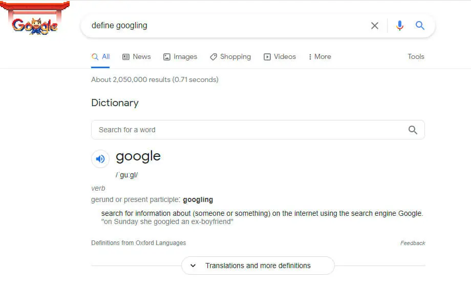
Finally, something Gen Z can relate with! In 1998, Google released a minimalistic search engine, contrary to the list view of ALIWEB. The strategy worked, considering how the word “googling” is a verb now. Don’t believe us? Google it!
Cascading Style Sheets (CSS)
The increasing number of internet users was taking a toll on the server, making loading even slower. This hurdle necessitated a more streamlined layout for enhanced speed, thereby shaping the foundation of the modern website architecture. CSS, initially proposed by Wium Lie, detached content from presentations, allowing web designers to concentrate more on graphic elements for a more appealing and organised look.
Although CSS faced its fair share of browser support issues, it soon became the most crucial coding language.
PayPal- The Advent Of Online Marketing
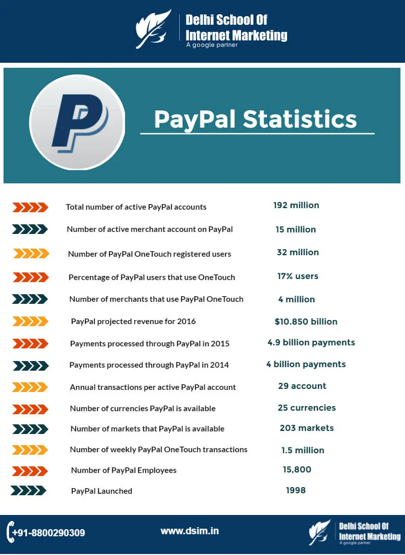
Although “The Y2K Problem” was a potential threat in the late 1990s, the year 2000 turned out to be a turning point for businesses. This is when PayPal, the leading online payment system, gained traction after a year of its release in December 1998.
After that, the requirement for a well-organised and aesthetically pleasing website design increased. Consequently, the demand for skilled and talented designers shot up, and most began shifting to neutral colours and designs. User experience became the priority while designing a website.
Additionally, businesses started offering online services, making them much more relevant.
WordPress
The following years were pivotal as they opened avenues to allow users who were “regular” or had little to no technical knowledge to play a role in web design history, courtesy of platforms like WordPress (2003). Even now, this content management system (CMS) helps bloggers and content creators publish their individual web pages through plugins and templates. You can also customise your WordPress websites with the correct knowledge and skills.
WordPress opened the internet up to dynamic, interactive websites and created possibilities to develop entire sites, thereby ushering in an entirely new industry of web designers and developers. WordPress allowed developers to quickly create websites for local businesses and helped the internet grow experientially.
MySpace
Following WordPress’ mantra, Implementing an interactive approach, MySpace (2004) allowed users to gain first-hand experience in web designing and engaging with social media platforms. Users could now create their profiles using simple HTML codes and connect with anyone.
But, with so many amateur “designers,” a.k.a. MySpace users, the site was filled with flashy designs, similar to the websites in the mid-1990s.
Launched in 2004, Facebook used to be exclusive to college students only. Two years later, the website became accessible to the public, and undoubtedly, its web design and user-friendly interface have made it a successful multinational conglomerate.
Although Facebook users were deprived of the freedom to personalise their profiles, the cohesive look allowed better branding.
Mobile Web Design
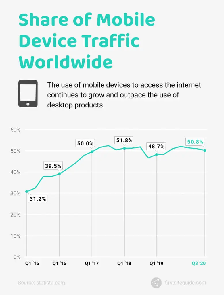
Today, mobiles are the most used electronic devices, and in 2007, the release of the first iPhone transformed web design history for good!
Understandably, most websites during that time were not compatible with mobile browsing. Although users could check the desktop layout on their mobile devices, the vast web page being squished in the wrong ratio made the experience rather frustrating.
As a result, web designers began brainstorming ways to make web pages more “mobile-friendly.” From scaling down to increasing the ability to scroll — designers finally implemented the mobile-first approach by developing the 960 grid system and the 12-column division. Additionally, the CSS framework, Bootstrap, regulated the design elements of web pages and allowed designers to create long scrolling designs, skeuomorphism, and more.
Frameworks such as bootstrap were quickly adopted and helped push the internet onto mobile phones faster than mobiles could update their browsers.
Skeuomorphism vs. Flat Design
Remember what the widgets on an iPhone screen looked like before 2013? The shiny gradient, albeit outdated now, allowed the early user to get acquainted with the never-seen-before interface. Even now, some games and drawing apps opt for skeuomorphism to replicate real-life user experiences while reducing the learning curve.
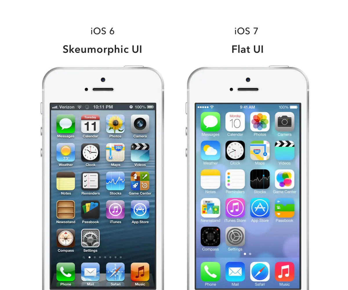
Steve Jobs advocated for the skeuomorphic design of iOS, which was soon changed to a flat design after his demise.
With the user becoming more familiar with mobile website design and touchscreen technology, there was no need for icons and widgets to mimic real-life objects. The minimalist trend further negated the need for a cluttered and inelegantly glossy skeuomorphic interface.
The crisp, flat design brought consistency and helped users focus more on functionality.
Flickr
By 2009, connecting with people online was no more a foreign concept. That’s when Flickr was announced as one of the best websites in 2009 by Times Magazine. It falls under the category of Web 2.0, which includes social media, video-sharing platforms, and more.
Also, Flickr was the first website that allowed people to share their pictures and try out collaborative tagging.
Responsive Web Design (RWD)
In 2010, Ethan Marcotte released an article on Responsive Design, which involves using HTML documents to optimise web content. The idea is to present the same content in different layouts without reducing its efficiency.
While this concept of responsive design increased the workload for the web designer, the user enjoyed a website that’s uniform, versatile, and accessible on any device.
Inbound Marketing
Ads and pop-ups are as annoying today as they were back in the day, often disrupting the flow of an internet connection with unwanted content! Thus, with the popularity of online marketing, brands realised that they must resort to other interactive measures to convert prospects into customers.
That’s when businesses shifted to the inbound methodology, a practical concept that aims to engage customers with valuable content and create lasting relationships with them. Unlike the repetitive and often spam-y outbound methodology, inbound ensures better ROI and creates a strong foundation for your business.
HubSpot is the perfect example for understanding the difference between inbound and outbound marketing and how the former is more effective and relevant in today’s scenario.
Growth-Driven Design
In 2015, Google began adjusting its algorithm to cope with black hat linking, which became common due to the increased number of websites emerging on the internet daily. Even the smallest company knew and understood the importance of an online presence, and the desire to stand out became intense.
Growth-driven design aims to understand human behaviour, make improvements accordingly, and focus on peak performance. A website created with this SEO approach adapts to the prevailing trends and the customer’s ever-changing demands.
Social Media
SNS platforms like Instagram, Twitter, Facebook, and YouTube created a demand for content, which required relevant backlinks for Google. Accordingly, the reliability and quality of the website context are analysed.
Search Engine Optimisation
While web design is essential for creating the first impression, SEO brings the viewers in the first place.
Thus, web pages must incorporate SEO best practices on images, use meta descriptions, etc. Despite the constant algorithm adjustments, this is the only way to remain in Google’s good books.
Additionally, website designers can use Google Analytics to amend various aspects of the site according to the insights, like website ranking in the search engine.
Build A Website
In 2020, companies began searching for ways to continue their business and retain their customers. The internet became their marketplace; hence, website builders like WordPress, Webflow, and Wix gained popularity.
Present Scenario Of Web Design
User Experience
Although user experience was prioritised throughout the history of web page design, today, when businesses are being conducted from home, every detail of the website must be created with the user in mind. This is when website designers and SEO specialists must work together to appeal to users (humans) and Google (the bot).
Design Thinking And Directional Design
Design thinking takes this approach and uses technology to fulfil the requirements of the user. This concept works hand-in-hand with directional design to offer a pleasant and enriching user experience.
Less is more, so websites began focusing on creating visuals that appeal to the user without being too in-your-face (unlike the early animations created on Flash)!
Micro-interactions And Micro-personalisations
Micro-interactions also play a pivotal role in enhancing user engagement. It can be as simple as double-tapping a picture on Instagram to see the heart pop up. Minor additions like these allow the brand to express itself efficiently. Some common examples of micro-interactions include drop-down menus, the scroll bar, playable game ads, etc.
Micro-personalisation is another recent concept in web design that aims to use AI to recognise user behaviour and provide a web experience accordingly. For instance, a shopping site has different sections for men, women, kids, and more. If a brand offers “free US shipping” and the user clicks on it, they might be browsing from the US.
Notice how you search for something on Google, Facebook, or Instagram, and in the next few days, the site keeps “suggesting” relevant posts, products, and more? That’s the magic of micro-personalisation! But is this advancement in technology a boon or a bane? Only time will tell...
What’s Next?
Web design and development is a dynamic domain that improves with time or even goes back in history (like fashion trends)! With newer technology, more sophisticated systems, and bustling ideas, there’s much more to explore on the World Wide Web. After all, we’ve only seen the tip of the iceberg till now.
Web Accessibility
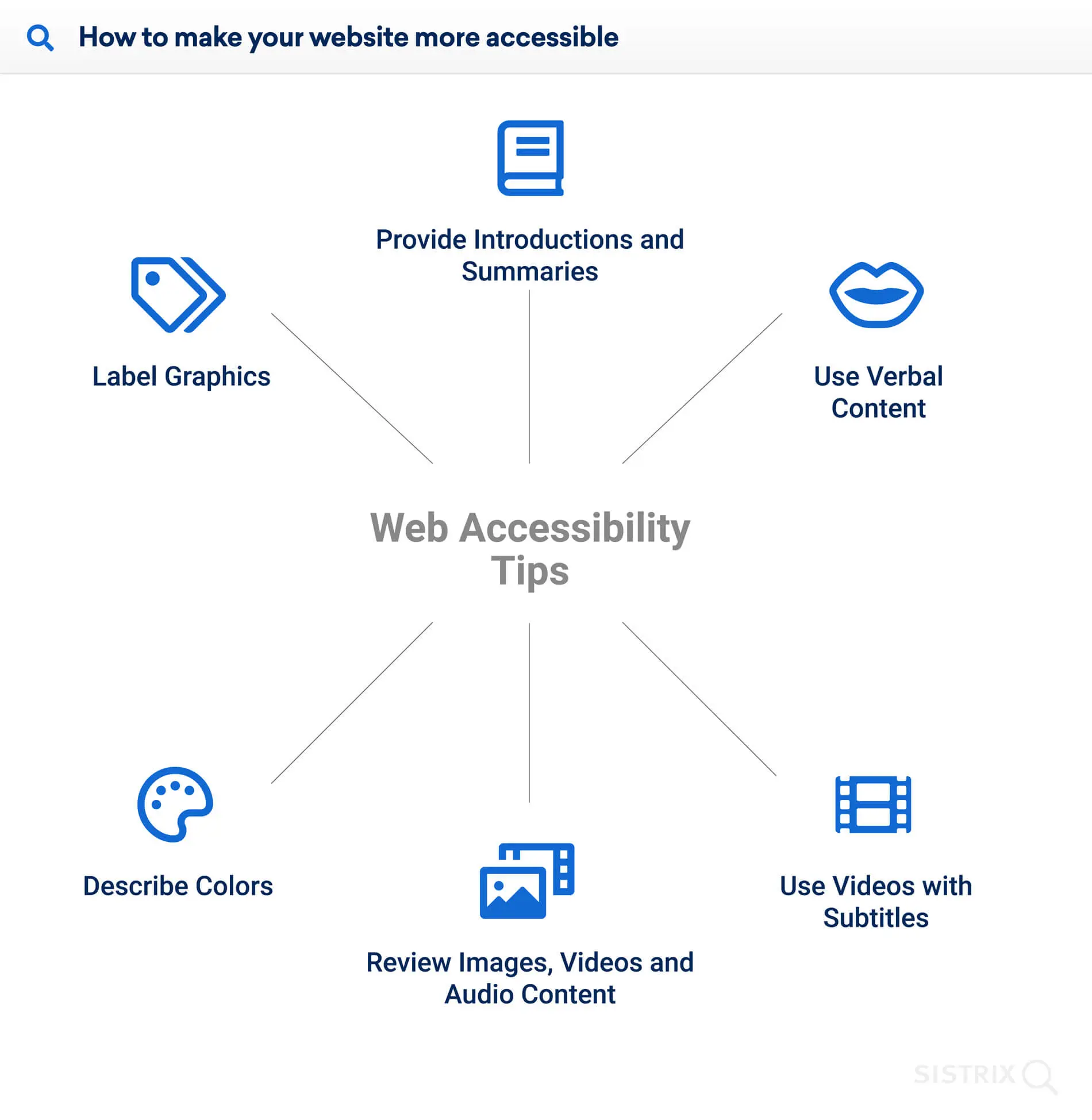
Website accessibility acknowledges diversity, encourages representation and provides a safe space for all. And looking at the progress till now, it would make sense if web design becomes more accessible to specially challenged people in the near future. For instance, it is adding captions to videos and alt text to images.
AI And Chatbots
Chatbots are expected to dominate the internet in the coming years, considering how most of us expect businesses to be online 24/7. According to Drift’s State of Conversational Marketing report published in 2020, there has been a 92% increase in the use of chatbots for brand communication since 2019.
3D Design
The journey of web design may take a turn towards the 3D route. This immersive technology has always been a fascinating concept, paving the way for VR. However, expecting VR to be adopted by websites is still a far-fetched idea.
Consequently, 3D seems to be the more feasible yet practical way. Besides 3D elements, think about websites covering the entire screen, blurring the lines between reality and the virtual world for an immersive user experience.
Micro-personalisation Or Invasion Of Privacy?
The present generation wants stuff done quickly, like finding nearby hang-out spots, booking cabs with the touch of a button, ordering food in a jiffy, etc. Micro-personalisation can be seen in many websites today, and its relevance only seems to grow with customers demanding instant gratification.
However, this web design technology can threaten user privacy if taken “too far.” Thus, as an informed user, you should check the permissions and privacy policies of the apps on your mobile and other devices.
Voice Interface
Adding to the breach of privacy are voice assistants like Alexa and Siri that use voice commands to provide desirable results. So, you don’t even need to look at the screen or pick up your device to make a call, play a song, or send an email.
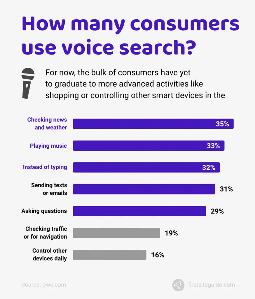
However, much anecdotal evidence recently points to the possibility of our devices constantly listening to us.
The Evolution Of Web Design
The history of website design has experienced astonishing growth, and there’s no looking back.
From complex HTML pages to template-based websites — what Tim Berners-Lee created as a research project ended up becoming an indispensable part of our lives. With these design improvements happening in merely 30 years, we can only expect the unexpected in the future!


