A well-designed UX can boost your conversion rate by 400%, and we aren’t the only ones saying that — a study by Forrester Research backs us up!
UX navigation plays a crucial role in ensuring a smooth user experience. It allows users to quickly and easily find what they’re after, all while enjoying a pleasant and intuitive interface. Effective UX navigation should be straightforward, consistent, and designed to help users reach their goals.
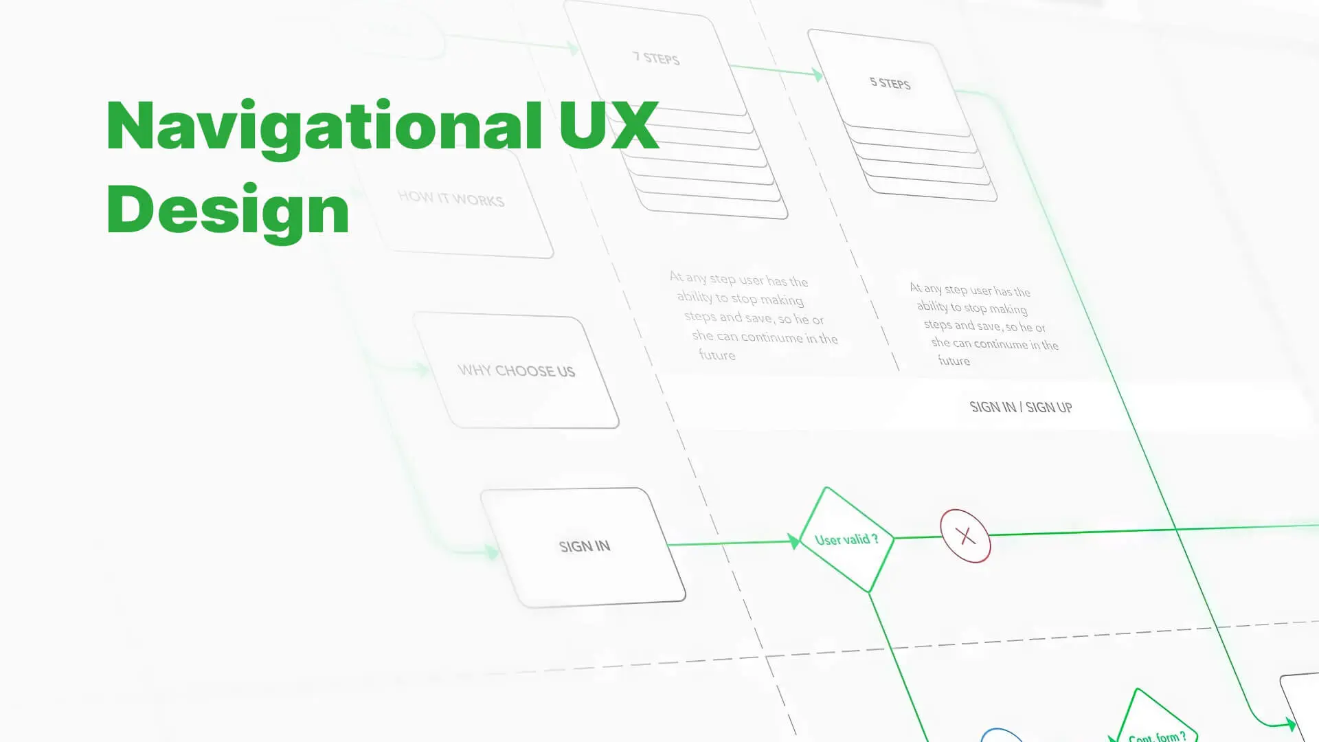
Your website showcases your products and services while sharing behind-the-scenes stories of people to give an inside look into what the brand represents. The primary navigation bar is considered the most important website element.
Just like a GPS, it guides visitors on a journey, letting them explore every corner of the website.
Strong site navigation makes it easy for visitors to find whatever they want, from products to contact information. But if your website has a poor UX, visitors will struggle to see what they need and leave the site frustrated — and that’s the last thing you’d want.
So, what best practices must you adopt to revamp your website’s navigation structure? — In this blog, we’ll explore the various aspects of UX navigation design, from user interface design to information architecture, and why it is a crucial component of your website. We will also provide tips and best practices for creating an effective navigation system.
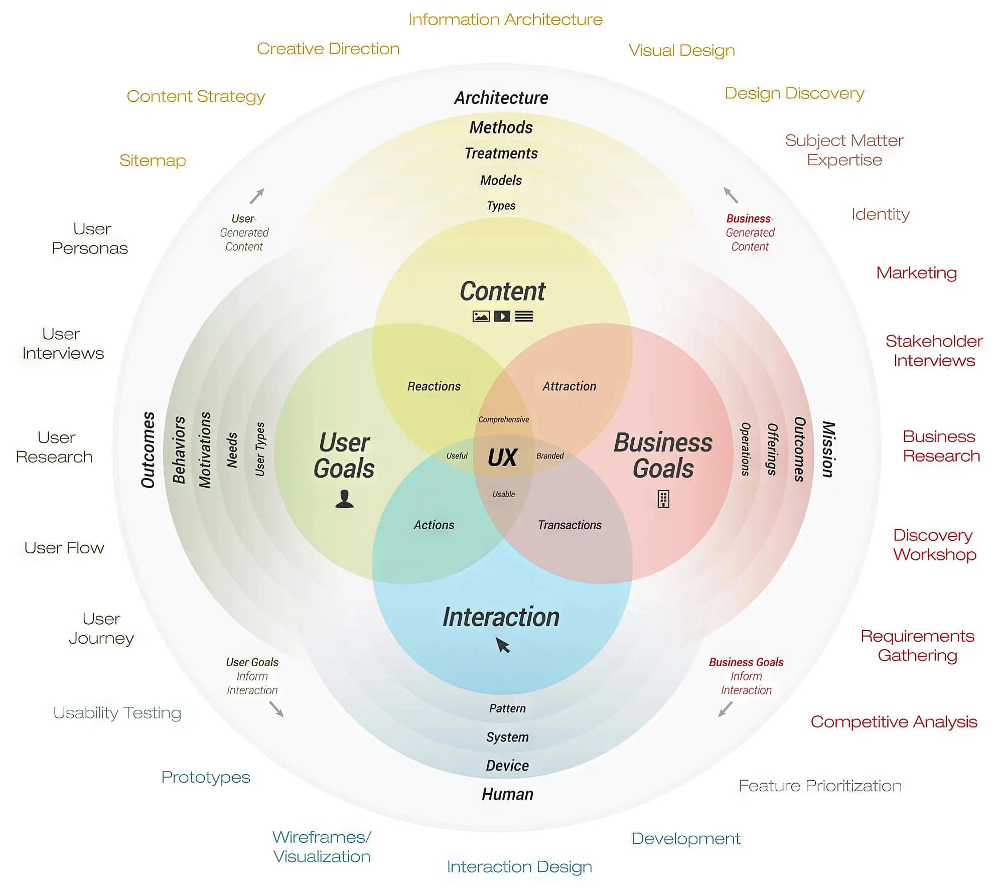
Website Navigation UX: Your All-In-One Guide To UX Navigation Design
Regarding user experience (UX), navigation refers to every functionality and visual cue visitors use to find their way around a digital product.
A well-laid website user experience is similar to a well-organised supermarket with delineated isles and prominent signage. Whatever products or services you sell, your goal should be to design a website that offers customers a smooth, intuitive user experience. This will help them find whatever they are searching for without unnecessary clicks.
Nearly 50% of consumers believe that a company’s web design is crucial to the success of the overall brand. And what’s lesser known is that poor UX increases bounce rates. Visitors will exit the store without a second thought if your website has a slow page load time or response time and cluttered layouts.
3 Reasons Why UX Navigation Is Important?
Though it may appear trivial, having well-organised and easy-to-follow web navigation can improve user experience more than you can imagine. Aside from helping people find what they are looking for, website navigation determines your ranking in search engines, increasing site traffic and conversions.
The way you construct your website’s navigation menu and label its items can significantly affect usability. We’ve covered three reasons why good navigation is crucial for the success of your eCommerce marketplace.
1. UX Navigation Improves The Search Engine Optimisation Of Your Website
UX and SEO, once seen as separate entities, now work hand in hand to provide users with exactly what they’re looking for, ensuring an optimal experience. These two aspects of digital marketing complement each other beautifully today.
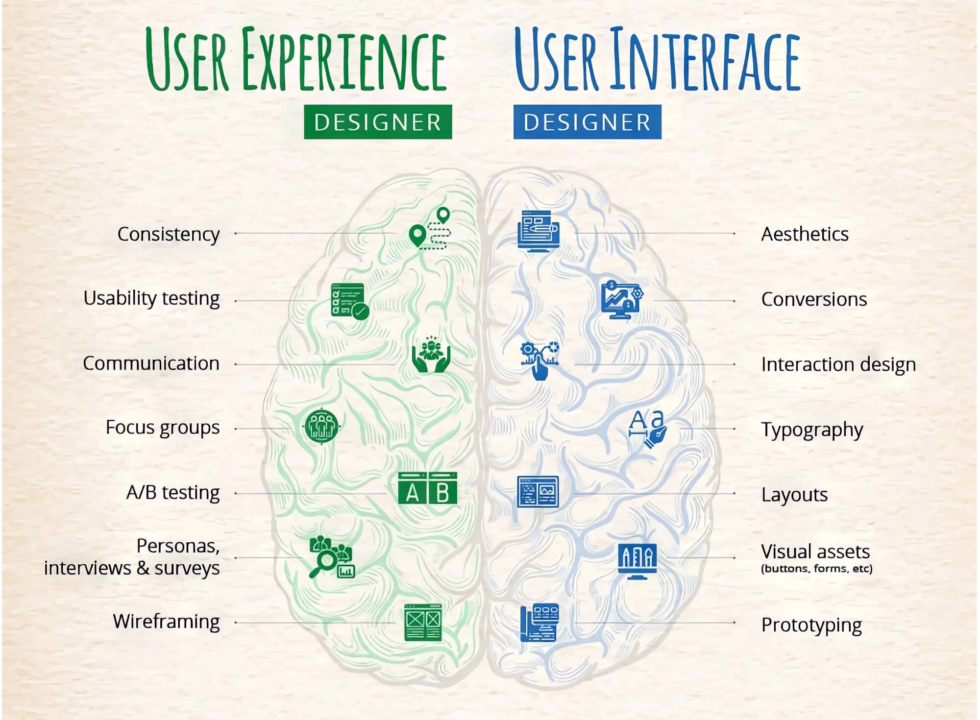
Here’s how the two work to help your eCommerce site survive in a cut-throat environment: search engine optimisation drives website traffic, and UX helps convert it into customers.
If a website boasts poor UX, search engines won’t rank it at the top of the page. In other words, running an SEO campaign will only be fruitful if your site has a great UX.

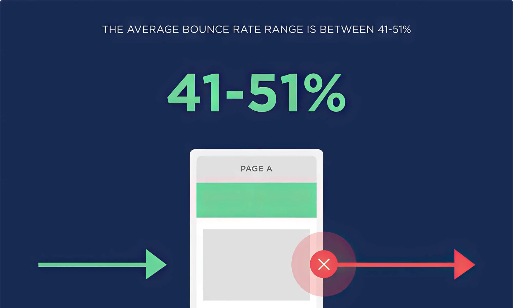
2. Decreased Bounce Rate
Have you ever tried shopping in a store where things aren’t well-organised or kept haphazardly? As nothing is organised in the store, you’ll most likely walk out of it empty-handed.
Likewise, website navigation design is crucial in attracting or keeping customers. An easily navigable website piques visitors’ interest, which means they spend more time on the eCommerce store and learn about your company.
On the contrary, poor navigation confuses and frustrates visitors who leave your website, increasing the bounce rate.
3. Good Navigation Makes The Website Mobile-Friendly
You’ve often heard the phrase “mobile-friendly website” from your design team, but what does that mean?
A mobile-friendly website is essentially a regular website that shrinks itself to adjust to the phone’s display. Nearly 58.99% of website traffic is recorded via mobile phone, so every brand owner needs to design a mobile-friendly website.
One feature most commonly found in mobile-friendly websites is the “hamburger” menu or “sandwich” icon — the three short, slightly separated horizontal lines.
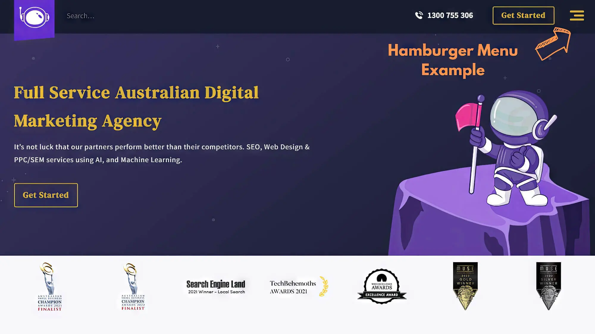
Whenever users return to the home page or navigate to other sections, they can use the hidden navigation menu to click on whichever option they want. To improve usability, you can add the word “menu” beside it so people of all ages can browse the website easily.
Types Of Website Navigation
Creating an easily navigable website should be their number one priority if any site owner wants their visitors to spend more time on their online store. This is not just for desktops; you must design a responsive website accessible through a mobile screen and a tab.
From hierarchical navigation links to the footer, a site owner needs to figure out the navigational elements that will make their website user-friendly. Simply put, the structure of a website depends upon the target audience, so make sure you keep them in mind while designing your online store.
But before starting, you must have a clear idea of all the tools available to create a user-friendly navigation system. Let’s look at some common website navigation types you can choose from.
1. Dropdown Navigation Bar
Want to put lots of information on your website without taking up too much space? The dropdown navigation structure is the perfect choice for websites with lots to share with visitors.
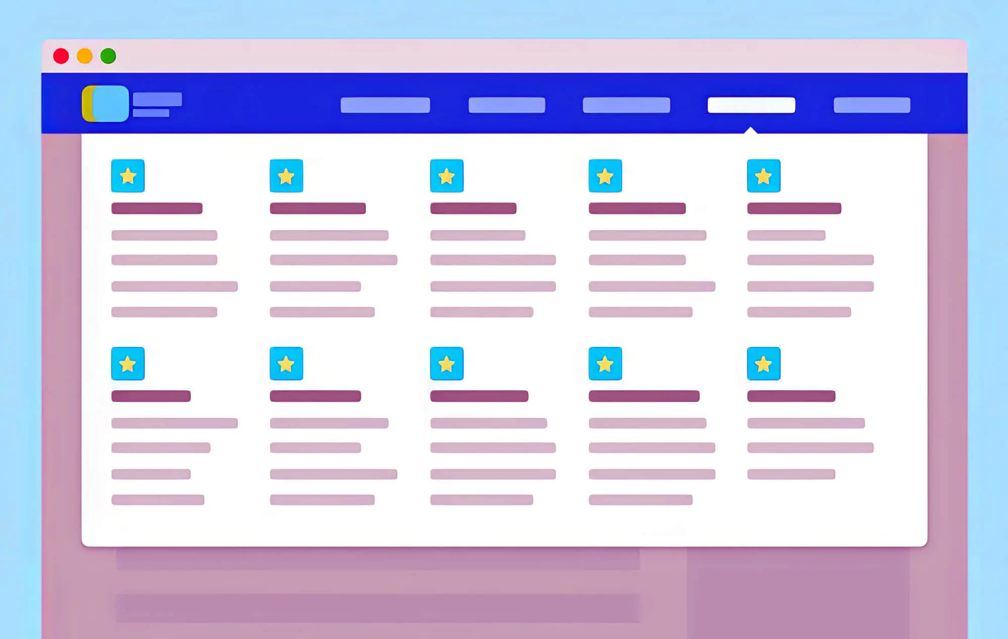
Dropdown option allows site owners to include as many text links as they want in the primary navigation menu without cluttering the landing page.
Instead of listing the items side-by-side, you can list the main elements in the top level of the web navigation bar while adding the rest in the dropdown. So, whenever a user hovers the cursor on the top-level option, the menu will drop down, and they can navigate to any page they want.
2. Horizontal Navigation Bar
Of all navigation menus, the horizontal navigation bar is much preferred by site owners. Typically, it is placed in the website’s header section, which features links to important pages from left to right of the primary content. Thus, they won’t skip important pages and can access them with just a click.
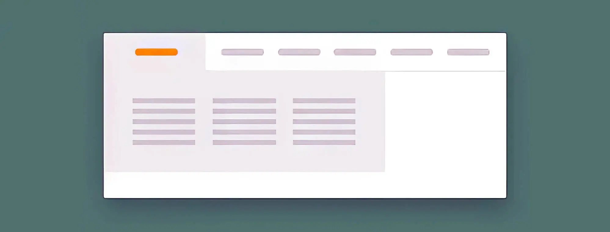
The horizontal navigation bar commonly features “About Us,” “Pricing,” “Products,” and “Contact Us” options. However, a few brands omit these sections and link to other pages to ensure their website visitors get everything they’ve been looking for.
3. Vertical Sidebar Navigation Menu
In most ways, this is similar to the horizontal ones. The two have only one difference: the former is placed on top while the latter is positioned vertically on either side of a page.
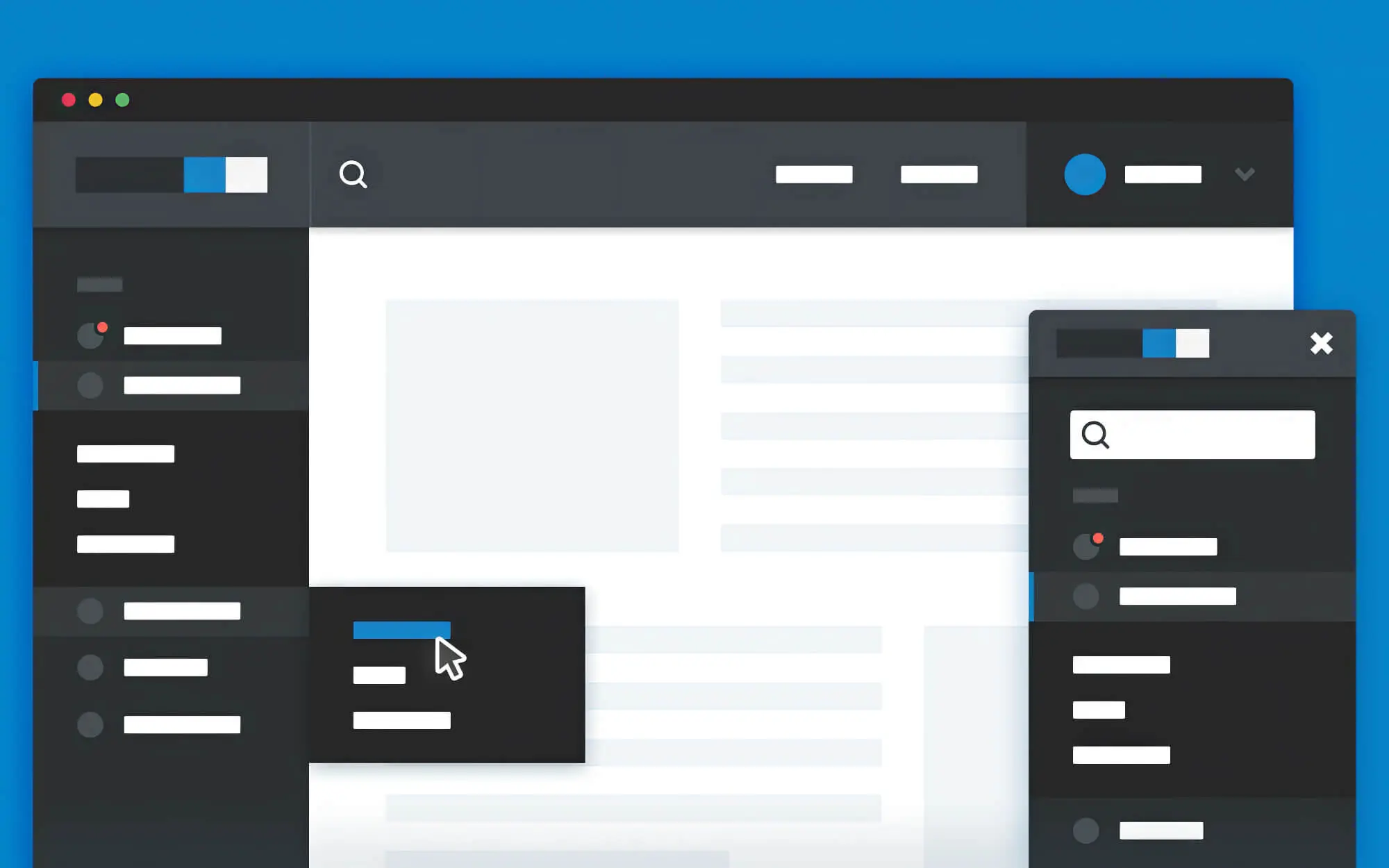
The vertical navigation bar allows you to add as many links as you want compared to the horizontal one. Despite that, many websites prefer the commonly used horizontal navigation bar.
Also, it allows web designers to be as creative as possible to experiment with colours and themes.
4. Hamburger Navigation Menu.
The hamburger menu is used when designing a website for devices so people can easily access all the pages.
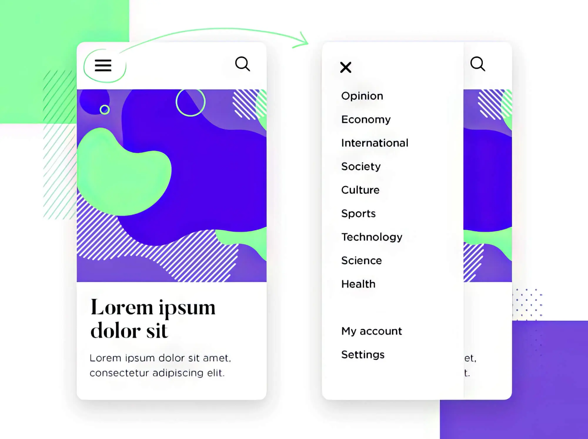
This technique shows the navigational elements horizontally on a larger screen like a laptop or desktop. But when you open the same website on a smaller device like a smartphone, the same elements collapse behind the hamburger menu.
For the best mobile-friendly website, we suggest using large fonts to ensure the text is readable. Since mobile screens’ display varies from model to model, use large buttons while keeping plenty of space between hyperlinks.
5. Breadcrumb Navigation Menu
Named after Hansel and Gretel’s crumbs, breadcrumbs are a kind of secondary navigation that helps users navigate a website by revealing their location. Not only that, but it also lets out the path they have travelled to get where they are.

Simply put, a breadcrumb layout allows visitors to trace their steps, making it easy for them to travel back and forth between pages and subpages.
6. Footer Navigation Menu
As the name suggests, the footer menu is positioned towards the end of a web page, be it landing or other subpages.
The footer menu usually consists of functional links like “Terms & Conditions” or social media accounts. Typically paired with a horizontal navigation bar, it features larger menu items than its header counterpart.
So, if you cannot find a particular menu item on the header navigation menu, we suggest scrolling down to look for them. You must design your website so visitors don’t have trouble finding the information they want.
Website Navigation: Best Practices And Tips To Improve User Experience
Now that we’ve covered the different types of website navigation bars, it’s time to move on to some of the best practices to make your website intuitive and user-friendly.
1. Keep Things Simple
One mistake many business owners make is adding unnecessary elements to their websites to make them alluring—but that’s a big no-no!
Regarding website design, we strongly believe that “simplicity is the ultimate sophistication.” Simplicity in website design doesn’t mean resorting to minimalism; rather, it hints at eliminating unnecessary elements that clutter your web pages.
Now, the primary purpose of website navigation is to help visitors reach where they want without making unnecessary clicks. Tools like Google Analytics can come in handy to help you figure out which pages of your website receive the most traffic and add important links to those pages.
Instead of flooding your landing page with numerous links, it is best to include no more than seven links in the main navigation menu. Also, avoid using the dropdown menu because search engine bots find it challenging to crawl.
However, you must use a mega menu to run a website for large organisations like universities, an eCommerce store, or corporations with multiple subdivisions. Essentially, a mega menu features a cluster of categorised links. Mega menus either fly out of the global nav bar or are typically drop-downs, making it easy for site owners to list everything they want.
Remember, the more concise your navigation, the greater your chances of ranking higher in the search engines. Simply put, your website navigation structure should allow users to find everything they need without making unnecessary clicks.
2. Short And Sweet Descriptive Labels Get The Job Done
Your visitors mustn’t get confused when they land on your website, or there’s a high possibility that they may exit without even browsing.
For this reason, keep the navigation menu clear and crisp from the start. The best way to ensure this is to write descriptive labels for every menu item.
Too creative or too generic labels are anything but informative; therefore, they don’t contribute to a pleasant user experience.
Incorporating SEO keywords while writing descriptive labels can improve your ranking in the search engine. We suggest using Google Analytics to determine the search terms that bring people to your eCommerce store. Also, make sure you use as user-friendly language as possible.
3. Arrange Links By Priority
When it comes to website navigation, the order of your links matters more than you might realise.
Experts say that many visitors pay the most attention to the first and last menu items. This is why many websites include a shop or service page first in the navigation menu and end it with a call-to-action button such as “Checkout” or “Contact Us.”
4. Don’t Sacrifice Visibility For Creativity
Visibility is one of the key aspects of website navigation design.
Though obvious, many website designers commit the blunder of forsaking visibility for the sake of a unique and creative layout. Even if you aim to pull off a non-traditional layout, you must never sacrifice usability unless it’s purely artistic.
As an eCommerce site owner, here’s what you must check to make sure that the navigation of the site is visible to visitors:
A. Placement
First, you must ensure the website navigation bar placement is correct. Most visitors look for the main menu at the top of the page, usually on the right-hand side. At the same time, they expect to find the footer menu towards the end of the page, so they scroll down for it.
B. Contrast
Another way to ensure the visibility of the site navigation bar is to check the contrast. You need to check the contrast for the links in the site content, not just the menu.
If correct contrast isn’t applied, embedded links won’t be visible to the visitors, which will be problematic for your site. To be safe, you must use a colour contrast checker to determine the accessibility and visibility of your website navigation.
5. Use Buttons Only For Calls To Action
Want to attract your visitor’s attention to important links? Or, let’s say you want your CTA button to stand out from the rest of the website content.
Irrespective of your aim, buttons can help you draw attention to CTAs and essential links. The reason is that buttons are frequently associated with crucial actions, and when they are scarcely used in navigation, they become more prominent.
Dropdown or sticky menu design — no matter which one you opt for, use buttons only for the most important CTAs, like “Book a Call” or “Contact Us.”
6. Optimise Your Site For Mobile Devices
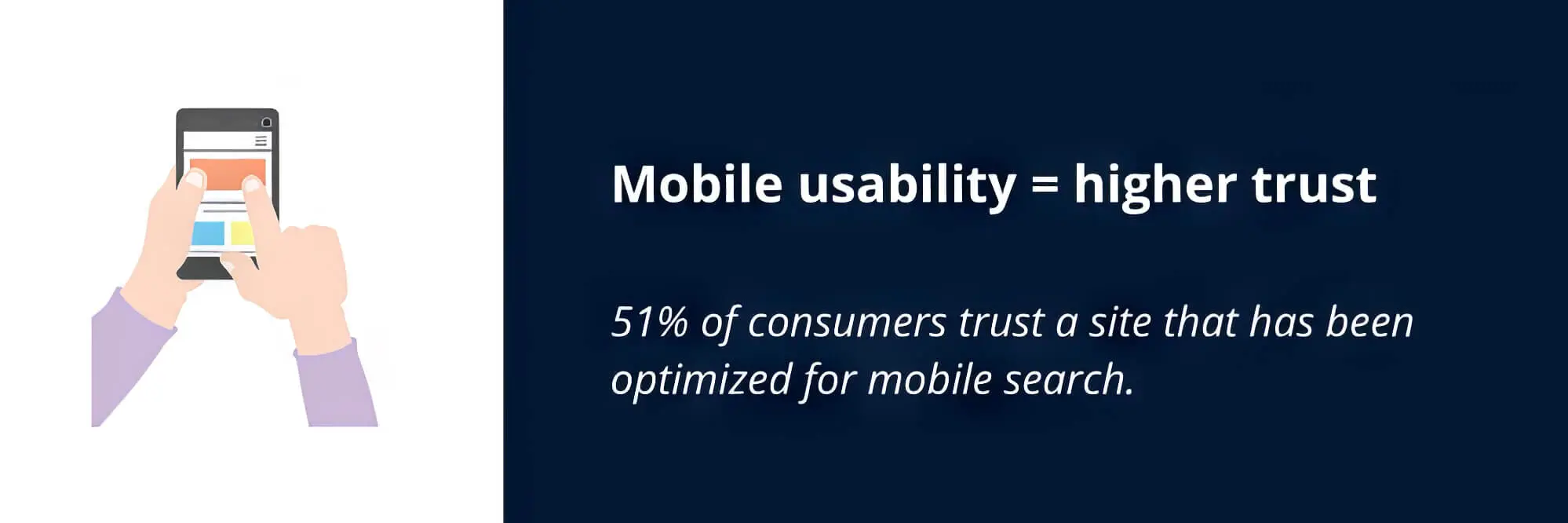
We cannot emphasise enough how important it is to optimise your site navigation for mobile phones. Most people today browse websites from their phones for greater convenience.
You already know about the hamburger icon that mobile-friendly websites feature. You may be tempted to add something different to the site than the hamburger menu to make it stand out from the rest — but you mustn’t do so.
That’s because it is accepted as the universal symbol for the menu when it comes to mobile-friendly websites. So, resist the urge to get creative and stick to the traditional button while optimising your site for mobile devices.
One more thing you need to pay attention to is that the navigational links shouldn’t be small. Instead, they must be large enough so people can tap and click on them without zooming in on the screen.
Things To Avoid When Designing The Navigation Of A Site
1. Overcrowded Navigation Bar
Too many items on the website navigation bar can ruin a site’s sleek design and user-friendliness. You must only add essential links on the header navigation bar so visitors can find whatever they are looking for without unnecessary clicks.
If you add too many links, your visitors will struggle to find links, affecting the overall appearance of your page. For less relevant links, consider placing them in the footer of the page so they don’t go unnoticed.
2. Generic Anchor Text
Remember we mentioned that being descriptive is one of the most important aspects of navigational elements?
One of website designers’ biggest blunders is using generic text for links. Remember that overly generic text will affect your website ranking in the SERPs, which you wouldn’t want.
On websites with generic anchor texts, visitors struggle to understand the content behind the link. When creating a link, avoid the following things:
- More information
- Find out more
- Click here
- Link
Do your best to describe the link accurately, depending on the space available, so users know what to expect.

3. Sprawling Dropdown Menus
Dropdown menus are a favourite of website designers and business owners because they allow them to include as many links as they want.
But do you know that visitors find dropdown menus annoying? So, keep your website navigation simple and eliminate as many unnecessary links as possible when designing the dropdown menu.
Another reason to keep dropdown menus free of unnecessary links is that too much content can confuse visitors, increasing bounce rates. Also, use sub-menus only when it’s absolutely necessary.
4. Inconsistency
When designing website navigation, remember that “consistency is key.” We mean that your website layout must be such that your visitors can understand it within minutes.
Your website navigation menu should be consistent across pages and devices, so you must set them in stone.
5. Broken Or Mislabeled Links
Clicking on a link and being directed to a page that isn’t accessible can be frustrating. Such links are often called broken or mislabeled, and they force visitors to leave your website.
Usually, this happens when website designers don’t check whether the anchor text they’ve linked takes users to the intended destination. So, building an internal linking strategy is crucial. Here are some tips to avoid broken or mislabeled links on your website:
- Don’t forget to remove links whenever you remove a page from your website
- Keep checking links on your website using link checker tools
- Whenever adding a link, double-check to ensure that it’s directing the user to the correct page
6. Wrong Tone
You won’t deny that every website or eCommerce store has a professional, friendly, straightforward or lousy tone. No matter the tone of your website, the navigation language should reflect it.
To put it another way, if your website’s tone is friendly, you should add a section called “How we can help” rather than “Services.” Be sure to let the designer know your website’s tone.
Likewise, if the tone of your website is professional or lousy, the language must reflect that.
Frequently Asked Questions
Q1. Why is website navigation important?
Website navigation is crucial because it allows users to quickly find the information they need. A well-crafted navigation system enhances user experience by making the site more user-friendly. This increases the chances that visitors will remain on the website, benefiting both the site owners and the users. Furthermore, effective navigation helps search engines grasp the website’s structure and content, which can boost its search engine rankings.
Website navigation contributes to the user experience, so your website layout must be intuitive and user-friendly. It helps visitors find the information they are looking for without difficulty, decreasing bounce rates.
Also, good website navigation can help you rank high in the search results, ultimately increasing traffic.
Q2. What are the important elements of web design that ensure a smooth user experience?
Several vital elements of web design can contribute to a smooth user experience, including the following:
- A clear and intuitive navigation system allows users to quickly find the information they are looking for and move around the website.
- A clean and uncluttered layout helps users focus on the website’s content and reduces distractions.
- Responsive design ensures that the website can be easily viewed and used on various devices, including desktop computers, laptops, tablets, and smartphones.
- Fast loading times: Users have short attention spans and will quickly become frustrated if a website takes too long to load.
- Accessibility: The website should be designed to be accessible to users with disabilities, such as those who are blind or have low vision.
- Search functionality lets users quickly find specific information or content on the website.
- Good use of colour and typography: This can help improve the website’s aesthetic appeal and make it more visually appealing to users.
The key to ensuring a smooth user experience is to design the website with the users’ needs and preferences in mind. By focusing on these elements, you can create a website that is easy to use, engaging, and effective at meeting their needs.
Q3. Are search bar functions important in website design?
Yes, search bar functions can be an important element of website design. A search bar allows users to quickly and easily find specific information or content on the website. This can be particularly useful for websites with a large amount of content, as it allows users to quickly locate the information they are looking for without having to navigate multiple pages.
Additionally, search functionality can improve the user experience of a website by making it more user-friendly and easier to use. This can increase the likelihood that users will stay on the website and continue to use it, which can benefit both the website owner and the users. A search bar can improve a website’s usability and user experience.
Unlock the Power of UX Navigation: Elevate Your Site to the Next Level!
Website navigation is essential to the success of your site, so make sure you design it carefully.
There’s no “one-size-fits-all” approach to website navigation. It’s essential to consider your business goals and target audience’s needs when planning the design.
In simple words, design a human and search bot-friendly website so none struggle to locate the information they need.
Hopefully, you’ve learned something about UX navigation and found some inspiration to revamp your website. However, hiring a professional designer would be the best if you are a beginner in eCommerce stores. sitecentre® Cairns can help you design a functional, user-friendly website that meets your UX goals.
Our experts offer a comprehensive suite of custom-designed features to help you create intuitive navigation and clear, organised content optimised to improve user experience. Additionally, we offer advanced analytics built in-house to monitor user behaviour and optimise the website design accordingly. So, let’s talk about improving your website navigation today!


