Summary / TL;DR
Website design basics focus on essential UI/UX principles that improve usability, visual appeal, and SEO performance. Effective web design requires selecting the right platform—such as WordPress or Squarespace—offering flexibility, drag-and-drop features, and plugin support. Key elements include intuitive navigation menus, strategic use of white space, high-quality images, responsive layouts, and appropriate font pairings. Incorporating visual hierarchy, clear call-to-action buttons, mobile optimisation, and grid systems enhances user experience and accessibility. Designers should also minimise visual clutter, use limited colour schemes for readability, and follow layout behaviours like the F-pattern to guide attention. Testing functionality and adjusting designs based on user behaviour are essential practices.
As more people turn to online platforms for communication, creating an effective website has become essential.
People used flyers to convey essential information years ago, but today, understanding web design fundamentals? Understanding web design essentials for beginners is key. Now, everything is available at the click of a button. However, as the internet is a melting pot of relevant data and fake facts, the need for credible sources has increased to establish trust and stay up-to-date.
Understandably, you must provide users with reliable information to boost the website's search rankings. However, having quality articles is just one-half of the story; good website design plays a crucial role, too. Using the right tool and modern web design principles to make the post stand out is crucial.
So, to help you, we have compiled a guide comprising all the essential principles of a web design project. You don't need an in-depth understanding of the web development process to read this article. For businesses seeking professional implementation of these principles, our web design services combine aesthetic excellence with conversion optimization to create sites that perform.
You are ready; let’s learn web design basics essential for effective website development!
Want to receive updates? Sign up to our newsletter
Each time a new blog is posted, you’ll receive a notification, it’s really that simple.
Basic Website Design Elements
It would help if you considered many aspects while designing a website. However, we have shortlisted the essential points below for your benefit.
1. Platform
One of the first things web designers need to decide is the platform for the user interface. Depending on the purpose of the web page, many different options are available.
Certain platforms work well for businesses, while others enhance user interaction by being more approachable. For instance, platforms like Squarespace, Wix, Shopify, or Weebly are great for beginners.
These pages are perfect for understanding the basic web design elements embraced by the design community and how to implement them; in other words, they are great for people designing from scratch.
While these sites may not be the most professional, they deliver better usability for your content, making it easier for users to interact with the website.
They are perfect for catering to small businesses. This is because they are simple drag-and-drop websites.
Understandably, they are easy to use, and a designer can choose the desired theme without any hassle. They also have certain downsides, but more on that later; let’s look at another example by reviewing the popular WordPress site under the following subheading.
2. Web Design Tools — WordPress
While WordPress seems straightforward, it’s actually a favourite among top global brands because of its extensive toolset, making it an excellent content management system.
Customers who visit the website will find that it offers over 50,000 plugins for an enhanced user experience. Most plugins are free of cost, allowing site visitors to try them out before purchasing.
Naturally, it’s useful for site design, enabling designers to incorporate patterns that make the web pages stand out. Also, there are separate plugins for different professions, ensuring website designers can create key elements like a menu or content catalogue for visual hierarchy to help figure out the user journey.
3. Navigation Menu
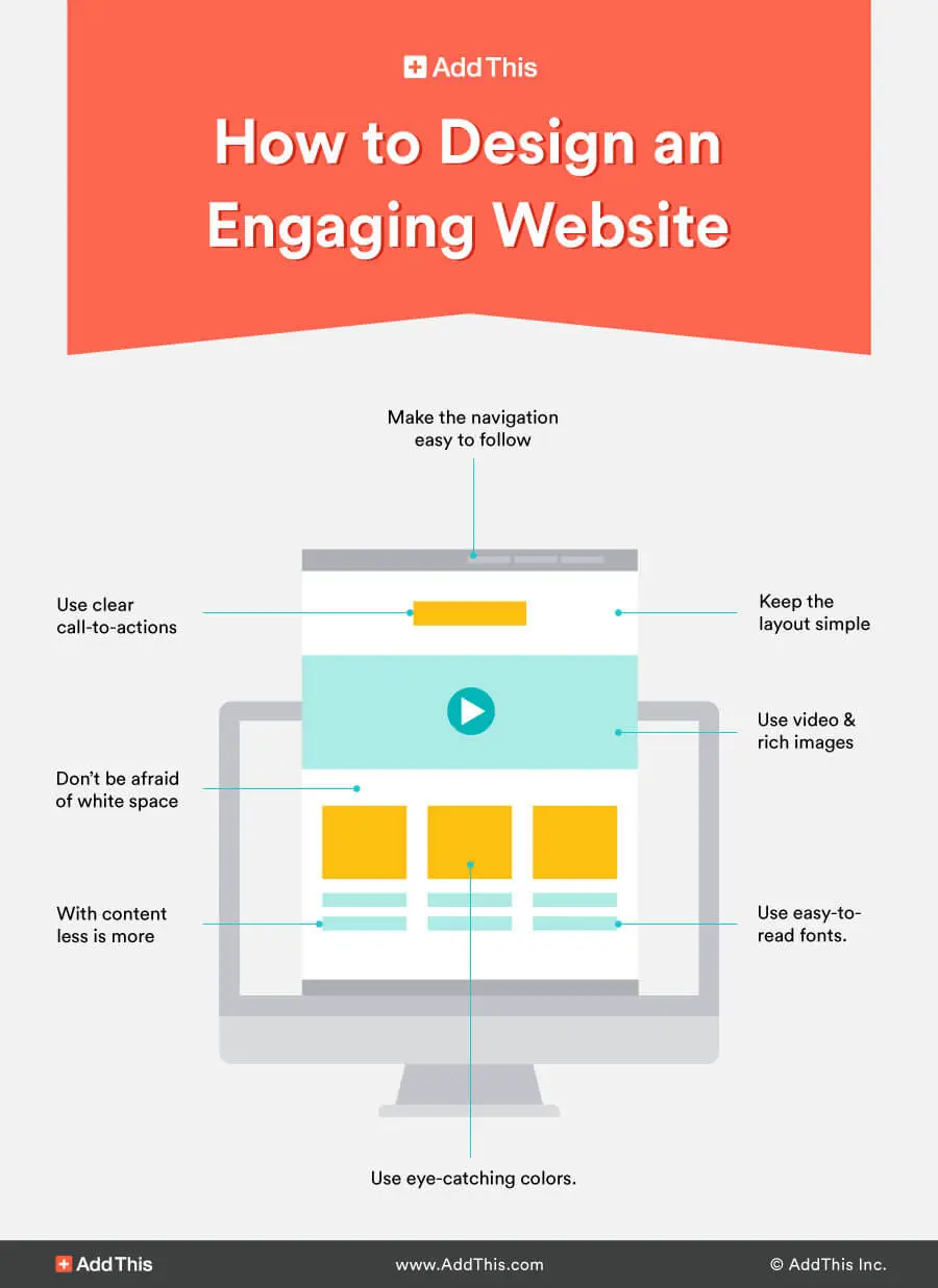
The primary purpose of the menu, contributing to the overall aesthetic, is to make the site easy to navigate for users.
One way to ensure that web visitors find what they are looking for is to keep the site design simple and make sense. So, it would be best to limit the number of options for easy and good navigation, confusing consumers and leaving them frustrated.
As a rule, web designers should restrict the search options from the drop-down menu. In addition, creating a small menu option does not take up much space.
Having a large navigation menu may not prove beneficial to the website’s content detrimental if used effectively, serving as a great example. You need to change your approach depending on the business and its requirements.
For example, if a marketing company wants to showcase numerous products, a website design expert can include all possible menu options to achieve the main goal. However, unnecessary information should not be included, as that might negatively impact your SEO strategy, making it harder for users to find what they are looking for.
The main goal is for consumers to easily find what they need without encountering misinformation. Therefore, designers should consider the user’s perspective to assess the relevance of various site tools.
It should not be on the page if it is irrelevant.
4. White Space
If you find it challenging to include all the relevant options in the navigation bar, you can change the layout of the footer to optimise negative space. This will help make the web page stand out by emphasising important elements once you start designing.
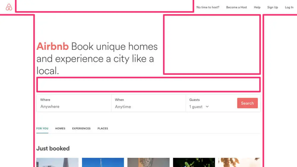
In addition, it ensures that the website has enough space to make it more user-friendly. A web designer often tries to pack in too much information rather than spacing it out for visual hierarchy.
In other words, white space allows websites’ most essential visual elements to stand out, contributing to effective web design. For instance, any good web page will divide the content into paragraphs, making it easier to read.
Even search engines will find ranking the website and navigating the information conveniently. The uncluttered appearance leaves a mark on users and helps reach the target audience.
In other words, combining content and spacing too much is one of the most efficient SEO strategies for boosting a website’s ranking.
5. Images
Taking the discussion forward from white space, we must tell you about another vital web design element: images. If the website has sufficient white space, you can arrange images to break up the content, making the article visually appealing.
Not to mention that images are a fantastic way to communicate the relevance of the content, thereby giving it the edge over other pages since most users prefer visual engagement. You must use a suitable image that will add value to the article while visible on numerous screen sizes. Take time to optimise image sizes and
Now, let’s look at two types of images and their impact on web design — header images and sliders.
A. Header Image
A header image is like a megaphone, announcing to visitors what the site is about your business. It’s the first thing users will see when they log into the website, setting the tone for the on-site experience.
Now, using header images can be tricky because of their size. They must be visually appealing to the audience on any screen, but the large size could distract from the website’s primary purpose.
You must ensure that the header image doesn’t draw attention away from a great article. So, a high-quality web designer will look to attract visitors without giving away too much information. This will create intrigue, thereby forcing them to keep scrolling.
In other words, it’s like a film trailer—revealing just enough to keep users interested and wanting to know more. However, the header image must blend with the website, so using the same shades throughout would be best to create a better on-site balance.
B. Sliders
One of the basic principles of website design is avoiding too much movement, which could ruin the user experience. Hence, It’s challenging to code sliders effectively despite their simplicity, especially if you want to include content over specific images.
In such instances, timing is key as it helps ensure visitors have enough time to read the text before the next image appears. Additionally, a mobile-friendly website is crucial, and mobile users may not have the best experience viewing sliders as the layout and the visual medium change.
There’s no denying that using sliders can be tricky and require innovative ideas. That’s why most websites have one main image rather than rolling images.
But there are certain things that you can do to avoid errors. For example, you must consider whether the images are suitable for marketing and help convey the website’s message.
Similarly, it would be best to use high-definition images to ensure a professional visual design. The number of irrelevant images on the site should also be limited, as visitors’ primary purpose is to read valuable content.
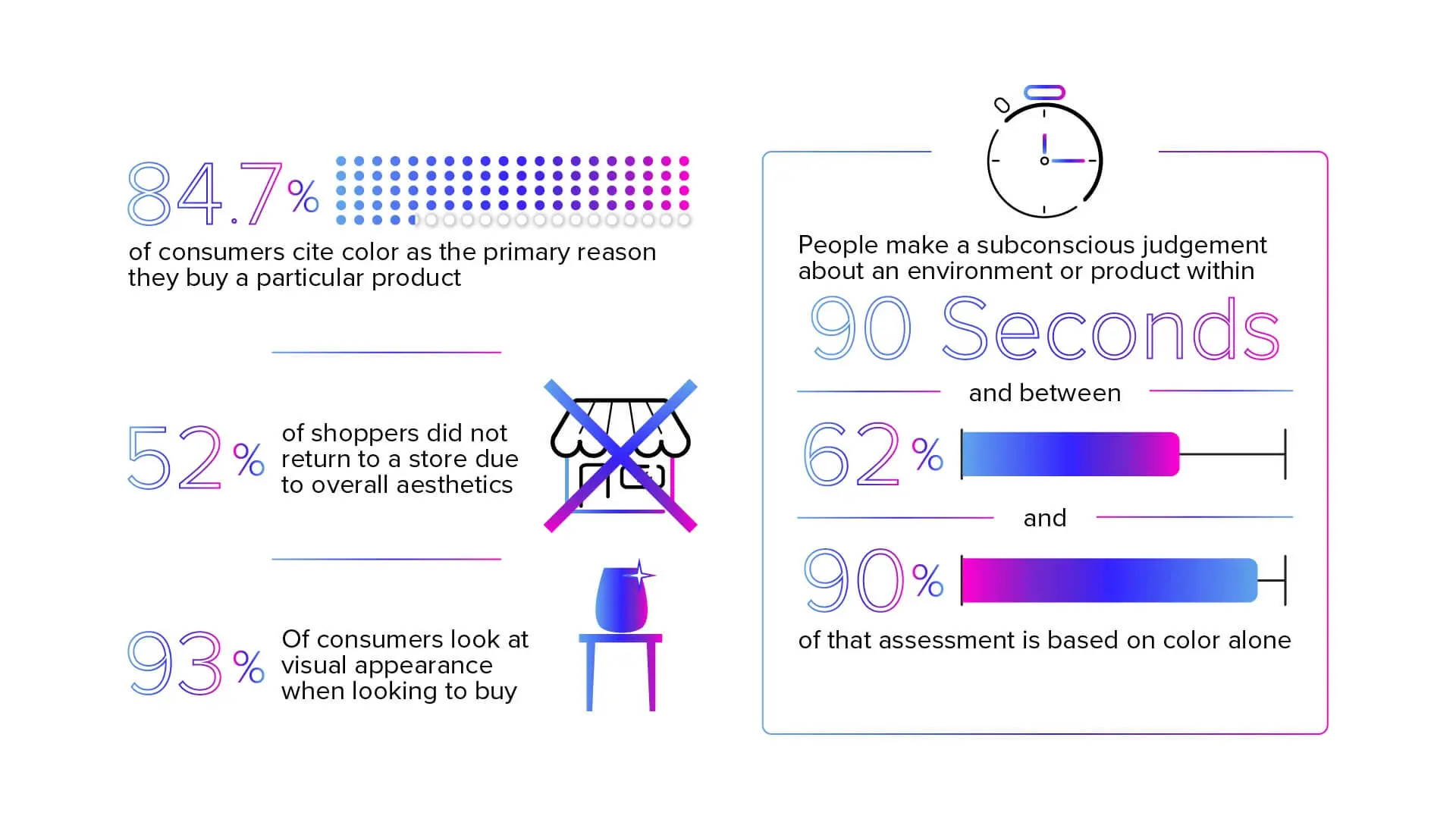
6. Colours
A website isn’t complete until you’ve chosen the right colour palette.
Remember how we spoke about white space? Another secret is that you may add colours, as white space refers to the website’s background visible on any browser, complementing the overall imagery.
However, Striking the right balance for your business with fixed layouts is challenging because too much space will lead people to think there’s insufficient information. So, rather than trying to be fancy, it would help if you used a maximum of two or three colours. This will allow users to focus more on the content than the colour scheme.
Speaking of colours, the company logo may have several eye-catching shades, so it’s essential to remember not to use all of them on the website. Instead, you should choose a suitable background to ensure the company logo stands out.
Moreover, to enhance user experience, you must ensure that all the buttons are visible. We suggest using a colour not present on the site, such as highlighting the buttons in red, which will encourage web users to explore a particular option.
Also, it would be best to avoid shades like cyan and green as they might make the text invisible and the website harder to navigate.
The key is to create contrast between features, which can improve search engine rankings and help users quickly find what they’re searching for.
For instance, light-coloured texts should accompany a dark button for better usability. However, if the client requests the design expert to use a shade that may be hard to read, they can use it sparsely to accentuate various effective website elements.
7. Visual Hierarchy
We have spoken briefly about visual hierarchy, so let’s discuss it in detail. As the name suggests, this web design technique necessitates posting important content on top as part of your SEO strategy.
This will grab people’s attention and increase online traffic. Content comprises images, fonts, and other consistent features that website designers must arrange in order of preference.
For example, the main heading should feature a more significant and bold font to highlight the page’s importance. Similarly, use fonts of different sizes to provide snippets of the content, making the site easily navigable and aesthetically pleasing to your audience.
This is especially true for websites with a lot of content that must be designed with a practical layout for improved usability. If you want something to be eye-catching, it would be best to use a large font with vibrant colours while having sufficient spacing.
The main aim is to ensure that consumers don’t miss the primary point of the website or blog post. In addition, the headings need to be catchy and relevant, encouraging visitors to read the article.
8. Commercial Purposes
Business websites don’t hold much value for people other than customers who want to avail of the company’s service. Let’s face it; not many people would like to spend their day scanning search engine results for the best e-commerce platform.
Hence, it is part of the website design essentials, allowing customers to locate different elements faster. For example, people want to know the prices of each product and service on a commercial website, highlighting them in a large font.
Consequently, from a design perspective, consumers will easily find what they are looking for, making it worth their time and effort.
9. Mobile View
When designing websites, it is best to incorporate features that will make the page accessible on all digital devices. This is the core principle of responsive design. Instead of focusing solely on how the website looks on a laptop, you need to ensure that mobile users can enjoy the same benefits, especially for landing pages.
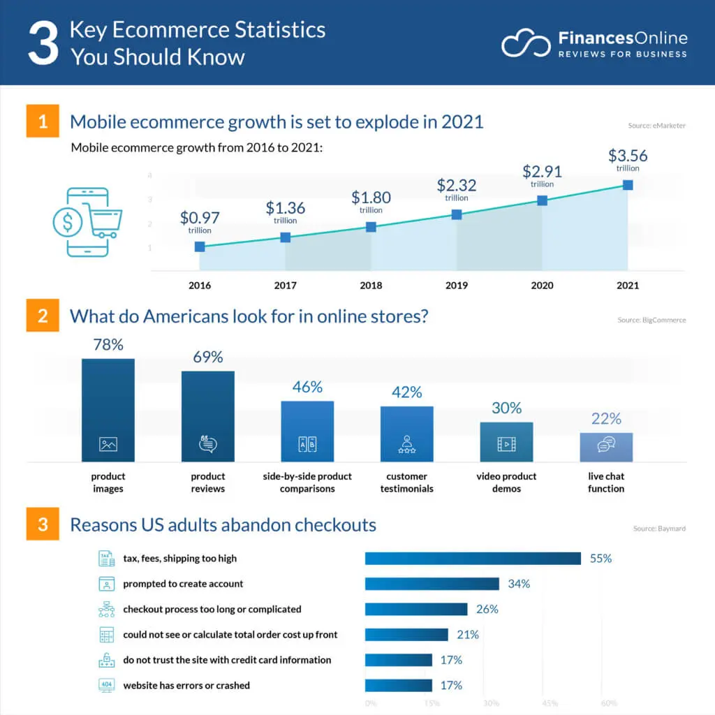
In our experience, we have often seen how a quality website can lose its value in the eyes of a smartphone user. Before you start designing, you must sit down with the designer to discuss the information architecture and research elements that will look good on all mediums.
Also, you may have to adjust and rearrange certain features to make them user-friendly across different devices. That said, it’s not essential to incorporate all on-site attributes, as the website should appear uncluttered when viewed on smaller mobile devices.
A crucial web design aspect for smartphones is having larger calls-to-action buttons for enhanced user experience because it’s difficult to press smaller buttons on a small screen.
In addition, it would help if you checked the mobile layout against the desktop version. You need to know how the website will look on multiple platforms to attract more visitors.
Try to ensure that there are no issues with the links, that all the features align correctly and design a separate menu for smaller devices.
10. Fonts
Although it may not seem obvious, choosing a quality font for the website is as essential as featuring a great article. The content must be readable for it to strike a chord with the audience.
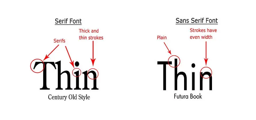
While there are numerous font types, we have highlighted the two most popular options among them:
A. Serif Fonts
A serif font has a stroke or slight extension at the end of each letter, giving it a classy appearance. Understandably, you can use them to write the headings in a newspaper. However, you will need to use a bigger font size to ensure that the text is easy to read.
B. Sans Serif Fonts
On the other hand, sans serif fonts don’t have a stroke and are relatively simple. That’s why you can use them to write the body of the article.
Choosing An Appropriate Font
Now that you know the significant fonts, we will discuss choosing the right design for your website.
You must note that fonts add flair to the page and make the website come alive. However, that doesn’t mean you should use several fonts, as it will have the opposite effect.
Any good designer uses two to three fonts; otherwise, online sites will be challenging to read. The primary purpose is experimenting with different designs to attract potential customers and then picking the most appropriate font to tie all the website features together.
For instance, a website selling kids’ toys would benefit from a groovy font. Meanwhile, an insurance company would want its page to convey professionalism to attract customers.
Hence, we suggest spending adequate time on typography to choose a unique style to make the website stand out.
11. F-Pattern
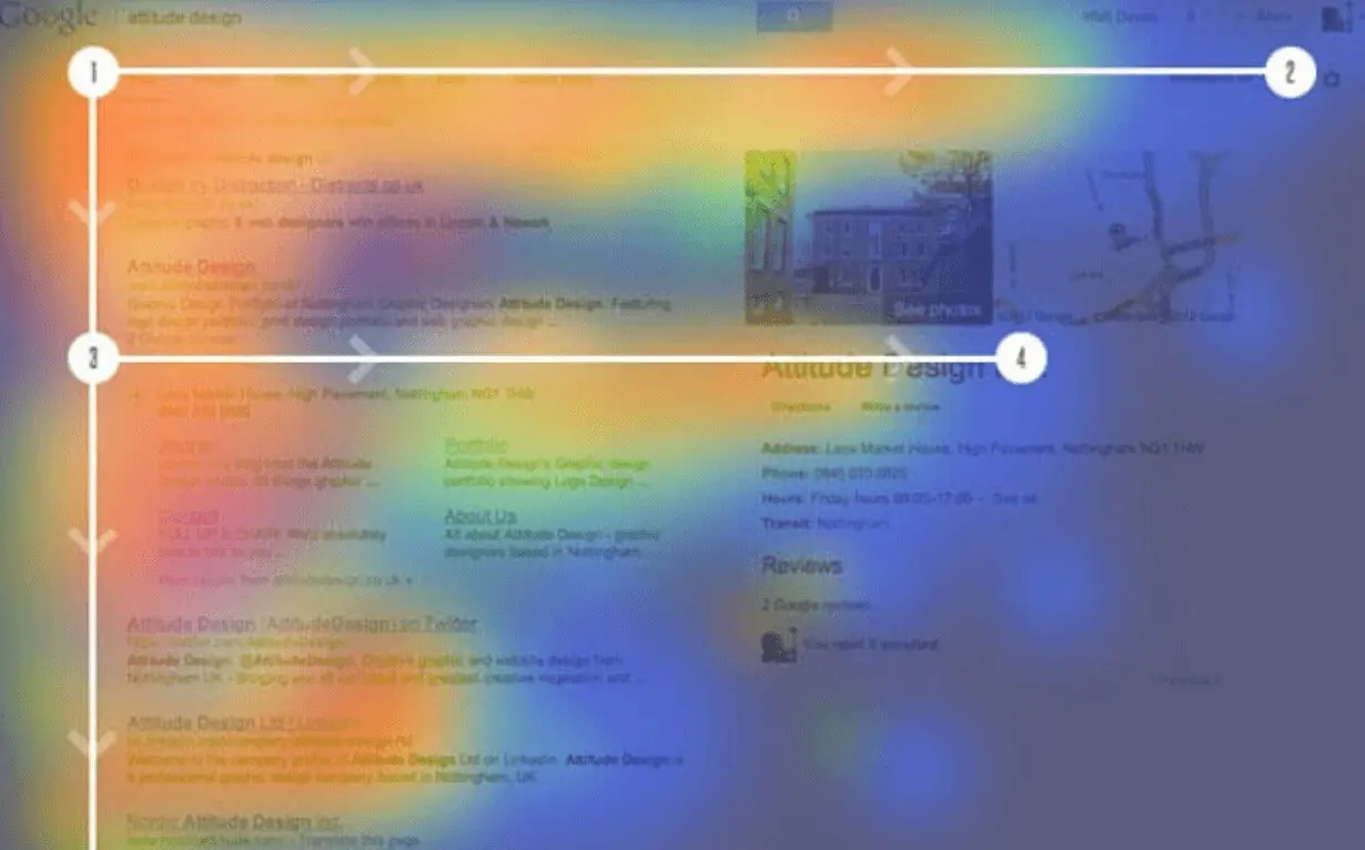
A fantastic yet straightforward SEO strategy that is most important and often ignored is using the f-pattern. This technique helps arrange content on the page in an F-shape, thereby increasing the visitors’ chances of finding relevant content.
This SEO strategy situates the critical information on the left side of the page because the human eye reads from left to right. Similarly, you can have the menu option on the left because people usually look for on-site functions.
As a result, to highlight a great article on the page, you can use this technique to attract the visitor and complement the quality write-up.
12. Call-To-Action
If we have to pinpoint one site feature that needs to be bold and eye-catching, it would be the call-to-action button. You can find this button on social media pages or e-commerce websites, making it essential to good web design.
It must stand out among business websites and encourage visitors to use its services. Whether calling customer care or ordering products, every attribute on the website must ensure it can fulfil consumers’ demands.
13. Using Grids
When it comes to web design, you need to know all the primary techniques, and one such efficient strategy is using grids. Grid-based web designs help organise the website better, giving it a structured appearance.
Using HTML, you can also change the size and arrangement of the grids depending on how you want the website to look. For instance, it is possible to have different image sizes without drawing attention from the articles.
In other words, it offers a blueprint of how the page will look on various screen sizes. You can also experiment with a grid based layout and the text boxes to deliver a more balanced look or create a unique design structure that intuitively guides users’ attention in an f pattern to leave a mark on visitors.
Now, designers can change the size of columns based on the importance of the articles to reflect the brand personality. You can break the grids further, but it would be best to get professional help to know when anything on the page looks out of place.
Additional Tips
We have covered most web design basics but would like to provide additional tips before designing.
A. Have A Contact Form
All professional websites have a contact page to interact with customers and adapt their SEO strategy based on user experience. Even if you’re not part of an eCommerce site, learning how to design a form will help customers reach out in times of need.
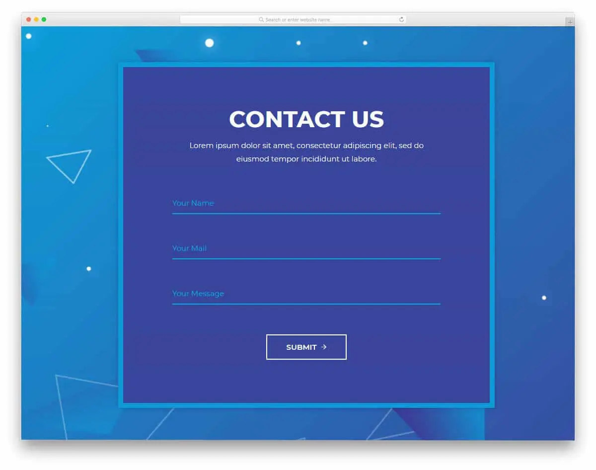
A form makes it easier for people to let you know their requirements, whether booking flight tickets or making a purchase. However, designing it is a little tricky, and there are specific guidelines you need to follow.
For starters, use simple colours (not more than two) for a refined look; it doesn’t need to be catchy, but the form must be noticeable. Also, it would be best to limit the number of options as hardly anyone would like the hassle of filling up a long line of information. Align your writing style and ensure you use complementary colours throughout the website.
You need to think about the data that will be most relevant to rank the website higher. Ask for that in the contact form, marking additional fields with an asterisk to indicate that they are optional.
B. Time Is Money
How often have you heard the phrase — time is money? It’s safe to say that this is a favourite of clients, especially when designers fall behind the deadline.
We understand that launching a website takes time, and there are last-minute issues to iron out, but clients lose money every minute and remain non-functional. Hence, designers must manage time well without compromising efficiency for both parties and visitors.
C. Test The Site
You need to test all the features to ensure the website runs smoothly. The deadline is a little challenging, but a preliminary check is vital to prevent the page from collapsing.
You can also inform the client if you’re running late and work out the next course of action. Launching a low-quality website will require you to take it down again to correct the errors.
Correctly performing user testing can help identify better opportunities for conversion optimisation, broken clickable elements and other visual bugs that should be resolved; having a testing strategy is vital for success.
D. Research User Behaviour
You must note that the job doesn’t end once the website is live; it is just the beginning. Once the page starts bringing in traffic, monitoring the information can spark ideas based on user feedback and understanding what articles are performing well.
If a particular article fails to pique readers’ interest, it would be best to eliminate it. Instead, you can view related articles on similar websites to include relevant information consumers find helpful. That said, be careful that you don’t plagiarise.
E. Make it Easy to Scan
People don’t have the time to ponder and decide, which is especially true for business websites. And it would be naive to expect a customer to read all the information.
Instead, they are looking for signs that will direct them to the relevant article. You must ensure that all the information is easy to skim and read so buyers can decide what they want within a couple of minutes.
This will also help build a mobile-friendly target audience pool that might recommend the website to others, increasing online traffic. Long story short, try to make it easy for people to find answers; a well-designed interface doesn’t leave them frustrated by packing the pages with irrelevant information.
F. Effective Writing
You must realise that writing for a website differs from writing a newspaper or any other medium. Here, the information is broken down into numerous shorter paragraphs to look great visually.
The sentences are precise and straightforward, ensuring readers can understand them easily. There is no need for expressive language; the website’s message must be easily understandable to the consumer.
Another underrated technique is everyday terminology that people will understand instead of evocative sentences.
G. Simplicity
Simplicity is the key. That’s it.
See how easy that was to understand? We conveyed everything with two short sentences rather than a monologue on how confusing web designs can undermine the credibility of user experience.
This shows that you should not leave room for ambiguity that might allow customers to misinterpret the information. No one likes to be confused, at least people who spend valuable time on the website in exchange for relevant facts.
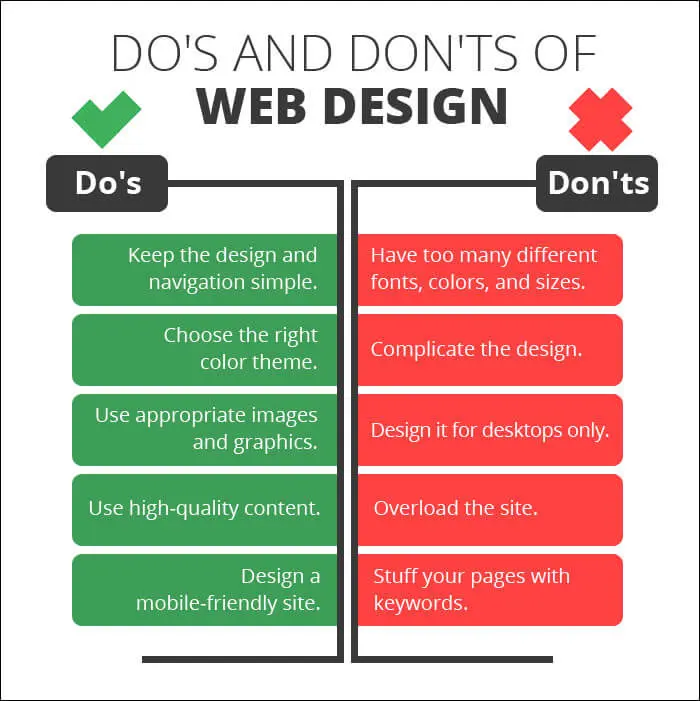
Knowing the basics of responsive layouts and Web Design
That’s all there is to know about crafting the ultimate web design and how to manage the different site features.
We suggest you remain patient and keep in touch with the client to develop an effective design strategy. Also, remember that the speed of your website is essential, and whenever in doubt, you can refer to our guide to create a unique website that will stand out on various platforms. Once you understand the basics, you can build a more responsive layout with interactive elements to boost user engagement.
If you would like to speak to someone about the design process, contact our Sydney web design team. We are highly experienced in custom-designing websites compatible across multiple devices and will be happy to assist you.
Most of all, enjoy designing and don’t be afraid to experiment. Until next time!


