Building a quality website takes plenty of planning, dedication, and perseverance.
Although success isn’t guaranteed, essential UI/UX design principles can make the website stand out. We’re talking about UX design principles, helping designers curate websites crafted to what users prefer.
At times, a website might appear fantastic, yet users find it cumbersome to explore its features. Emphasising UX principles equips designers to give users the ability to navigate and adjust the site according to their needs easily.

Today, we’re diving into crafting better websites by leveraging strong UX design principles. We’ll also touch upon the basics of web design. Let’s jump right in.
Want to receive updates? Sign up to our newsletter
Each time a new blog is posted, you’ll receive a notification, it’s really that simple.
What Are The Principles Of UX Design?
There are several UX design principles, but we’ve narrowed down the five most important techniques, anticipating what users expect your product or service to stand out on the site.
1. User Experience
UX website design principles deal with user experience and how the site encompasses user experience UX benefits. Be it navigation or relevance, users must find what they are searching for, enhancing the user’s experience to make your website stand out.
For example, online stores keep the design simple while increasing the product’s image size to grab users’ attention. Moreover, the description is to the point, meaning it takes seconds to decide if you want to purchase it.
2. User Testing
User testing is quite similar to the earlier point, but the idea is that you must test which web elements work and which don’t. This UX design principle allows you to constantly change and adapt the website to meet users’ demands.
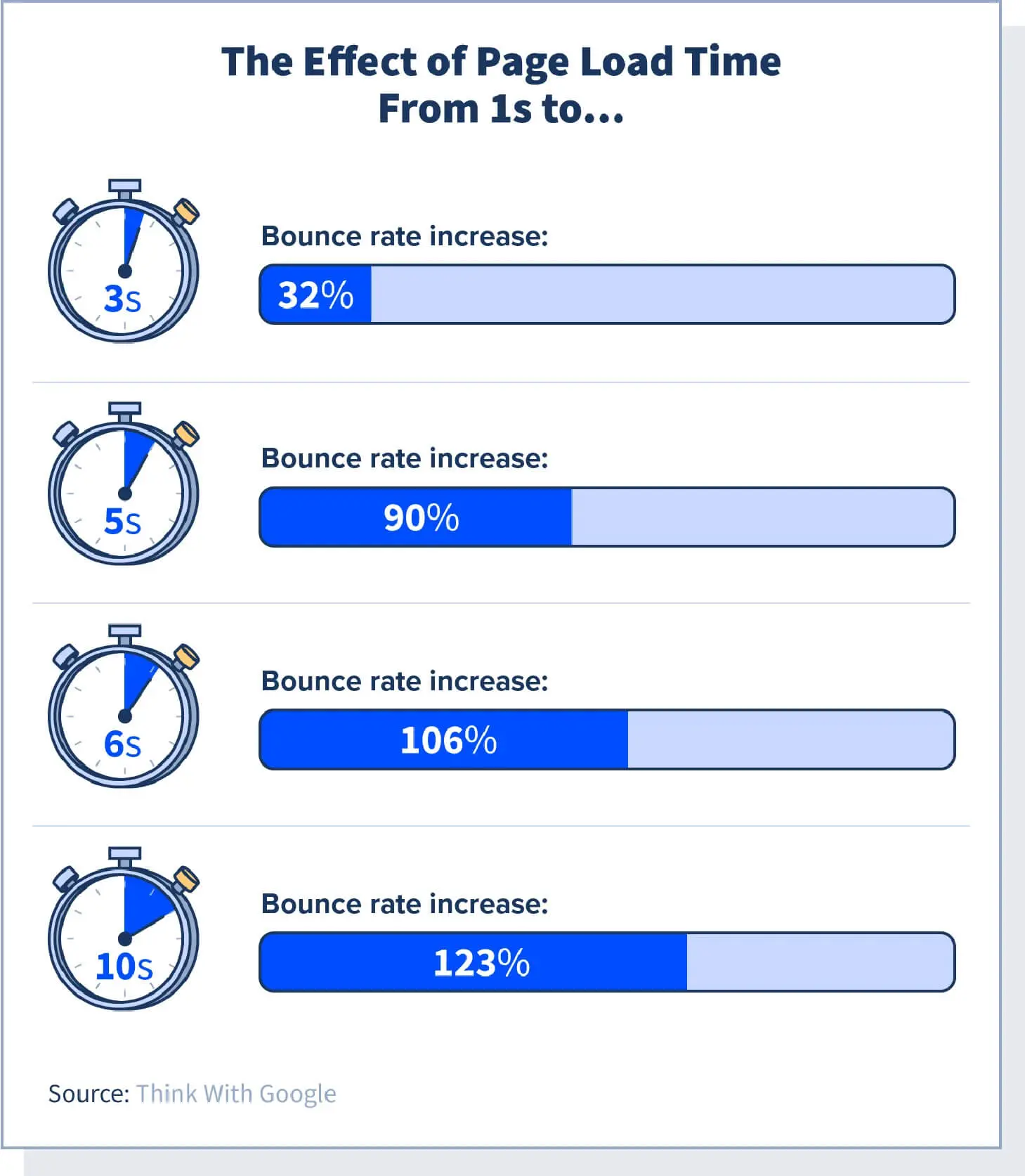
In other words, your job doesn’t end once the site is live; it’s just the beginning. You may have to add new interactive elements that could affect speed and load time, so it’s essential to keep refining the site. This will improve usability and generate more traffic.
3. Easy Skim Content
When folks visit a website, they’re often not keen on reading word-for-word; instead, they prefer scanning for relevant posts or articles.
That’s why breaking up text with clear headings and subheadings is crucial. They act like road signs, guiding users and ensuring they can follow along easily, helping you also keep content aligned with current user trends.
Additionally, incorporating videos and images as part of visual communication helps grab attention and is a fantastic way to have quality information on the site.
4. Flexible Design
An oft-ignored UX design principle is flexibility. People may access the site on their phones, laptops, or other digital devices. You must ensure the user interfaces and UX design render all on-site elements visible on any device.
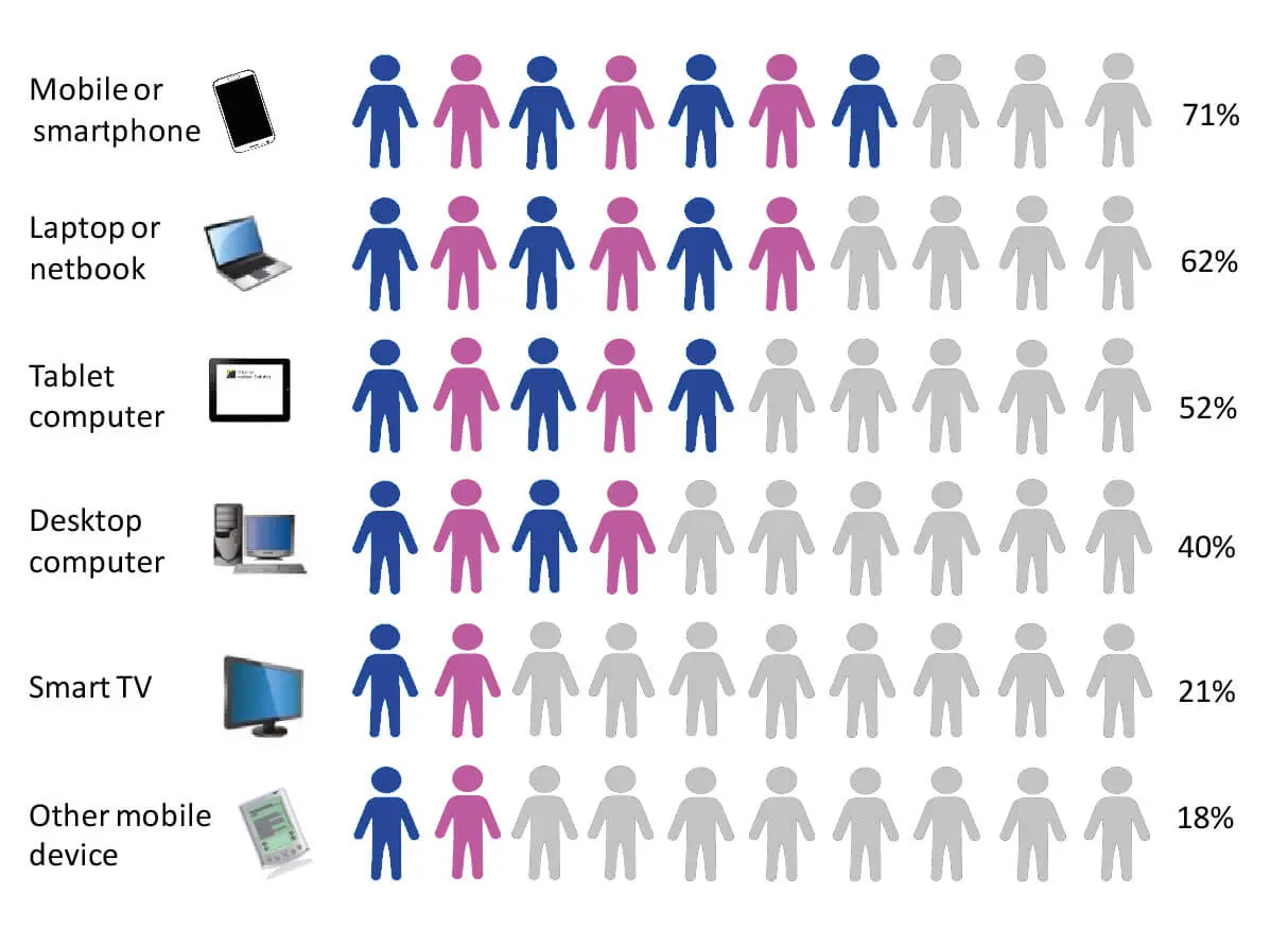
Additionally, a flexible UX design speeds up the website, improving usability. It contains several layouts, and a user’s site browser determines which layout works best. This also gives your site the edge compared to all the other sites, which tend to be slower.
So, flexibility allows the device to adapt according to user experience principles, guaranteeing accessibility for people with disabilities and overall site visibility.
5. Consistency
Your website design should reliably draw visitors daily, as people tend to gravitate towards familiar products and topics while steering clear of unknown elements.
All great websites use the foundational UX principles of design to ensure the web pages are in tune with the target audience. It would also help to use pre-designed templates curated based on user experience.
You can conduct thorough research and tweak design elements according to consumers’ needs through usability testing. Long story short, your site must contain enough user-friendly elements to generate traffic.
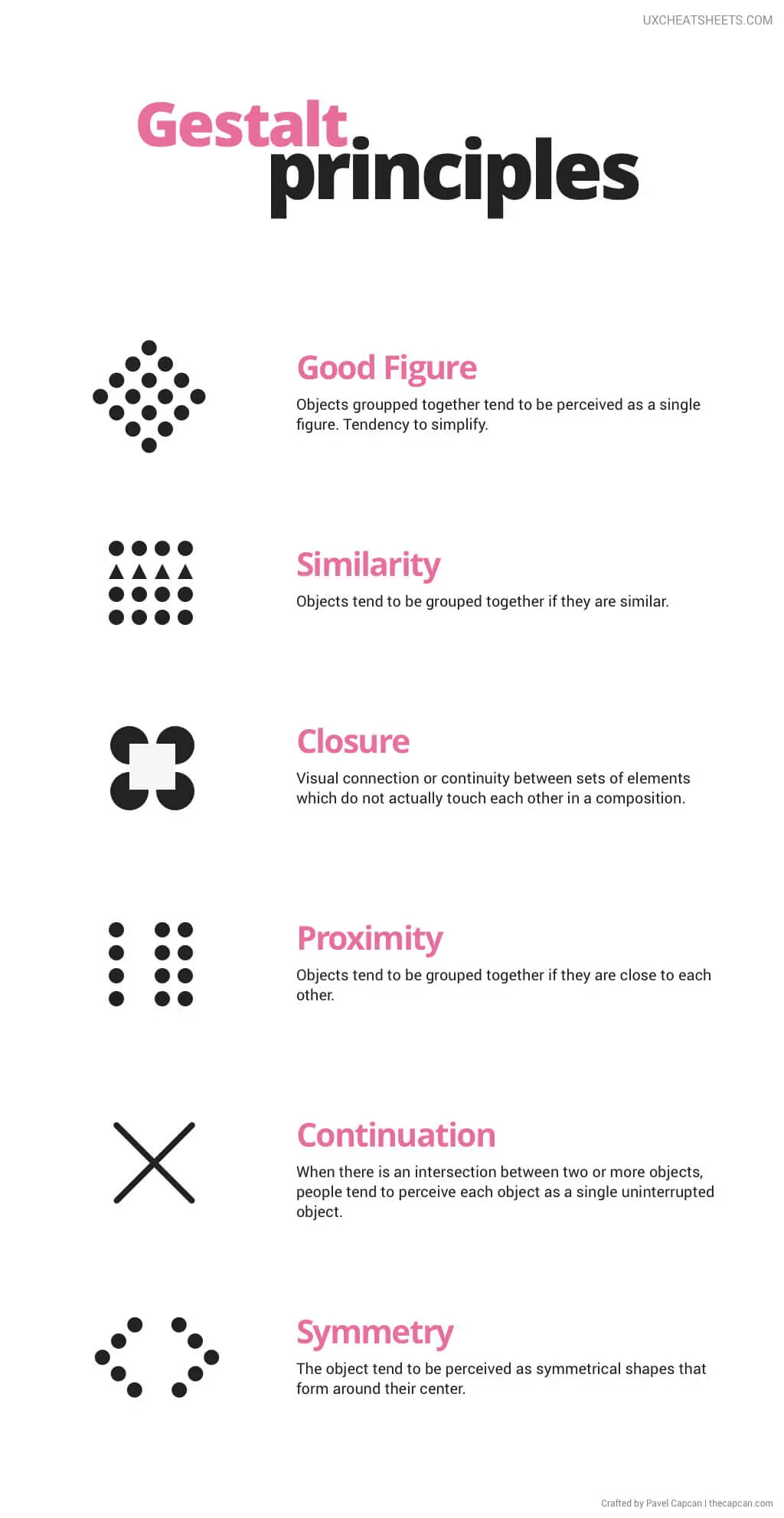
We’ve mentioned six sub-laws below, part of the original Gestalt principles, relating them to web design to make the site consistent.
A. Common Fate
Common fate dictates that our eyes follow lines or objects having a similar trajectory. So, if elements on your website point upwards, it’s natural for users to look in that direction.
Using this law, you can direct users’ attention to a specific post on the website.
B. Similarity
The law of similarity is one of the most essential elements that helps group objects of the same colour, shape, and size. Hence, you can keep articles with the same topic separate from other posts.
This makes the website easy for visitors while improving its rank compared to rival pages.
C. Symmetry
People look for symmetry in everyday objects, making it easier to group different elements. If you use similar shapes at equal distances on the website, users will consider them one, focusing on the central point.
It would be best to use symmetrical objects for web design, carefully thinking about texts, images, and columns that enhance the user experience.
D. Continuity
One of the design principles involves using lines on the website to direct user attention. It’s similar to common fate, but this principle deals solely with lines, even those that intersect.
Interestingly, the human brain chalks out its future trajectory if a line ends at a point. Hence, it would help to use this technique to improve usability and time spent on the website.
E. Closure
Closure is essential in a relationship concerning shapes and objects. For example, even if you don’t join all corners of a rectangle, leaving gaps between the lines, the human brain completes the shape for you.
Combining this technique with design principles, creating eye-catching logos and other elements is possible, ensuring that the website stands out.
F. Proximity
Another grouping technique is the law of proximity, which is simple and easy to use. Keeping various web elements together leads to the belief that they are similar even when not.
Hence, you must separate a dissimilar post from other content to avoid confusing people. On the other hand, options like the navigation menu, footer, etc., must be close to creating a user-friendly website.
Want to receive updates? Sign up to our newsletter
Each time a new blog is posted, you’ll receive a notification, it’s really that simple.
What Are The 8 Basic Web Design Principles?
You need to keep in mind the eight basic principles of web design. So, it would be best to note the following points for future reference.
1. Hick’s Law
If there are several options to choose from, users will take more time to navigate the website. In other words, Hick’s Law states that the time required to make a decision is directly proportional to the choices on offer.
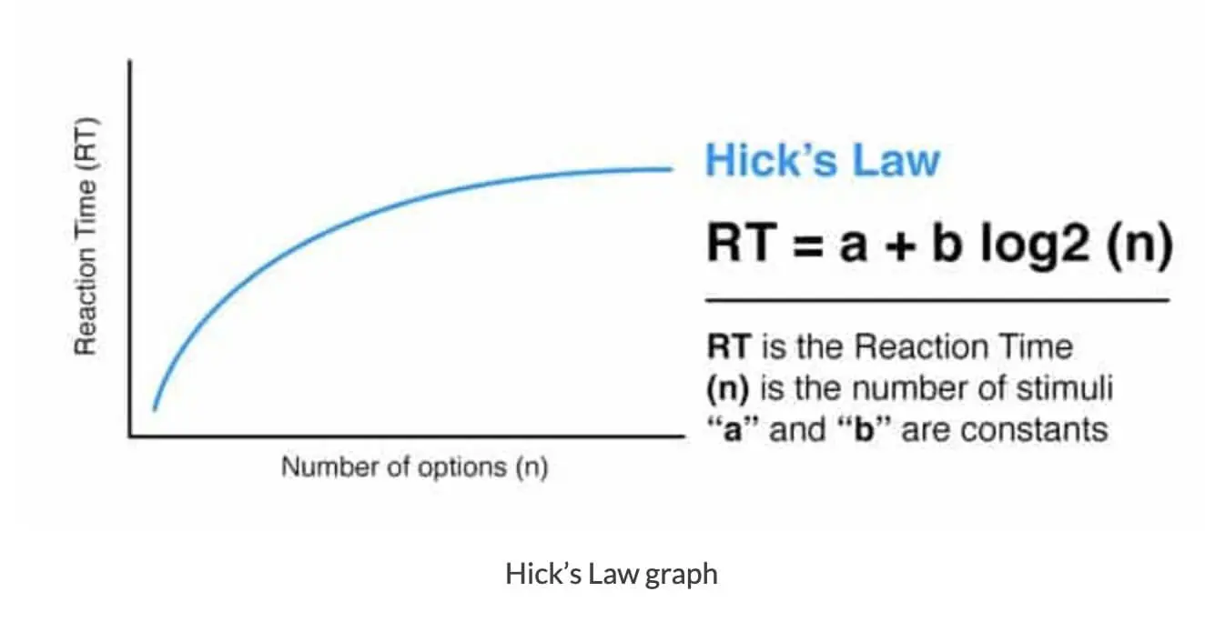
For example, deciding which book to buy will take longer if you like books and visit a bookstore. On the other hand, If options are curated to meet the needs of as many people as possible, it becomes easier to pick one. This is also known as the Paradox of Choice.
The same holds for website design. You must ensure the website is easy to use, so providing fewer options is essential. If the drop-down menu or the website UX design consists of more options, it might distract the visitors from the relevant information.
Hence, user-centric design refers to improving user experience by limiting choices, which is vital in web design. Don’t reduce the availability of products on the website; instead, provide better filters to make navigation easier.
The top websites have innumerable articles, but filters make it convenient for people to find the appropriate content.
2. Visual Hierarchy
Visual hierarchy, rooted in visual design principles, is one of the most effective tools in website design as it helps rank content according to relevance. In other words, it’s the UX design process of arranging the content based on what the eye sees first.
For example, if you visit an eCommerce website like Amazon, you’ll find that the “add to cart” and “buy now” options are highlighted in bright colours to grab visitors’ attention. Similarly, if your web page has images, it’s essential to identify the relevant and high-quality photos, giving them preference over others.
You must note that not all web page parts hold the same value. So, it’s essential to ensure that people focus on the best post or article. With a visual design, you can decide where visitors click first, using design elements to make the top post stand out.
3. Rule Of Thirds
One of the best ways to enhance the user experience is by using images. But randomly adding photographs to websites won’t serve the purpose, so you need to follow the rule of third.
Rather than placing the subject bang in the centre of the shot, try shifting it to one side, creating a visual appeal. The best images consist of nine equal parts formed by running two horizontal and two vertical lines through the photograph.
Following the design process, you can place the subject slightly to one side, leaving room for other visual elements. This makes it easy to grab visitors’ attention.

4. Golden Ratio
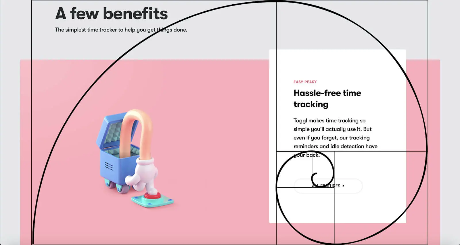
The following essential aspect of web design involves the golden ratio. Long story short, it has a value of 1.618, which makes web pages more appealing to people.
Unsurprisingly, ensuring user-friendly websites has become integral to the design principle. So, if your web page comprises 600px, dividing the total area by 1.618 would be best, which amounts to 370.8px. You should assign this space for the content while the remaining area can hold the sidebar.
With UX design principle trends, you can similarly proportion the title of the web page, distributing various site elements accordingly.
5. Fitt’s Law
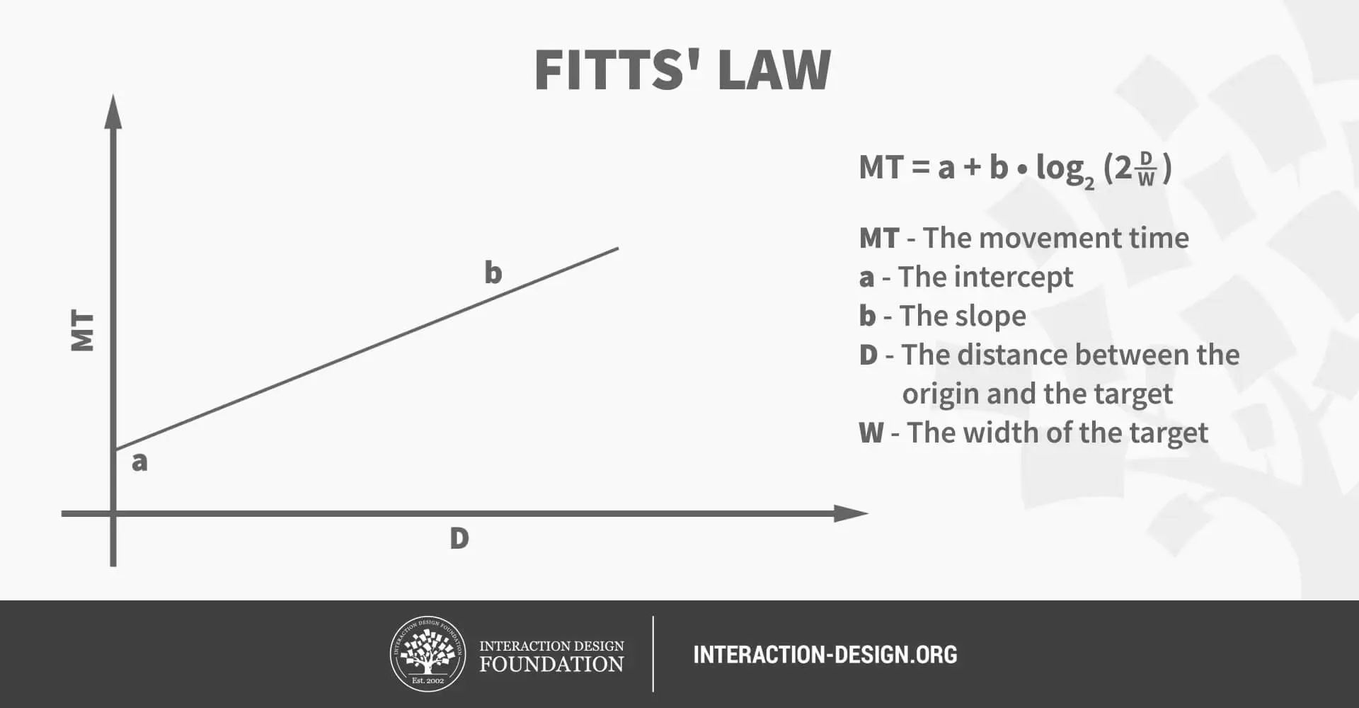
Another design principle that helps develop a great website is Fitt’s Law. It states that the time people take to use a specific function on a website depends on the button’s size and distance from the user.
This is why music apps have an extensive play button — most users want to listen to music. That said, increasing the size of the button doesn’t guarantee success. On the other hand, navigation becomes difficult if an element occupies a large portion of the page.
The objective should be to place the button in a specific part of the page, making it easier to access visitors. In mathematical terms, the usability of the function is a curve rather than a straight line.
Using mouse tracking tools can provide insights into which buttons users click most often. This data helps you decide the optimal size for these buttons. For instance, slightly enlarging a small button, say by 15%, might be more effective than resizing larger ones.
6. Occam’s Razor or Hypothesis
In technical terms, Occam’s hypothesis encourages users to choose a simple theory among many prevalent hypotheses. Hence, the trick is to keep the website free of clutter to engage more visitors.
Many web pages have too much information on the home page, impacting the user experience. So, it might help to keep only necessary options like’ subscribe’ while removing all distractions to make navigation easy.
A simple website may not be successful, but it’s better than having a complicated page that users find challenging. Hence, the design process should account for simplicity for the best user experience.
7. Keep The Page Clean
The challenge in web design is to have all the relevant information without compromising the user experience. One of the critical elements of site structure is to have enough white space, leaving room between an image and an article.
In other words, space makes the website visually appealing by maintaining space between lines, columns, and margins. It determines how you use visual hierarchy to arrange the information, including typography and colours.
Having fewer white spaces makes the content cluttered and the website less user-friendly. That’s why simple websites that incorporate empty spaces in the design principle rank higher because they look clean.
You need to use the white space to communicate information about the page, just like a blog post. Throughout the design, try to leave enough space, ensuring the users’ eyes go to the critical article.
Overall, it improves usability, helping people with visual impairments navigate the site.
8. Gestalt Design Principles
Although we’re discussing web design, understanding Gestalt psychology will improve the website. It states that the human eye perceives an object entirely before looking at individual elements.
For example, if you look at a join-the-dots sketch of a car, the brain will recognise that it’s a vehicle without considering the dots individually. Similarly, the first time a user visits a website, their eyes will process the site structure rather than looking at its different elements.
Factors To Consider While Designing A Website
Now, look at some website design principles that might help you increase usability to achieve a good rank.
1. Performance
Performance is an integral part of the user experience that keeps users returning to the website. It would be best to ensure that all pages, images, and blogs load within seconds to make the page user-friendly.
If it takes time to load, it doesn’t make a good first impression on users. You can use speed-checking tools to know what areas to improve for smoother usability. Usually, optimising the size of content or images is a great way to improve loading -speed.
2. Having A Suitable User Interface
It would be best to consider the users’ demands while designing the user interface. It allows visitors to engage with the content, ensuring they spend more time on your page. That said, it’s easy for users to find a relevant article by removing useless information.
The design must be crisp and clean, ensuring users can intuitively navigate and make the website visually appealing. However, it would be best not to use many shades; instead, apply one solid colour throughout the site.
Also, try to think from the audience’s point of view while designing to ensure they have a great experience scanning the website.
3. User Feedback
To improve usability, it’s important to take feedback about the website. You can have a dialogue box where users leave comments and suggestions to make the experience more fulfilling, called usability tests.
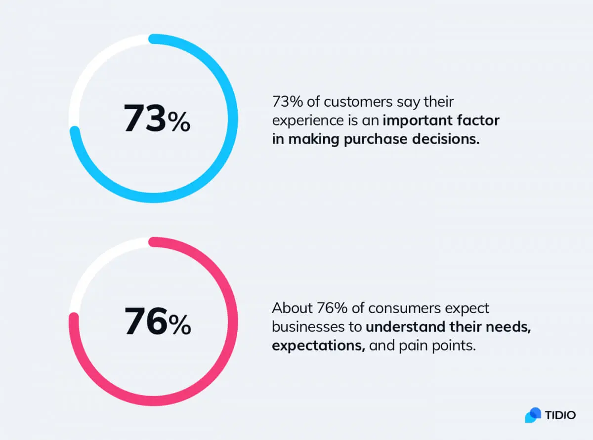
Feedback isn’t a one-way street, and using appropriate web design principles makes the site attractive. Hence, you need to share that information with visitors if there are unavailable products.
You can also have a progress box, showing the loading speed and making it easy for users to understand the iterative process. Long story short, provide all the on-site information to users and ask them to suggest improvements.
4. Navigation
Website navigation is one of the first things users notice about a site. To build a great website, it’s essential to keep things simple, reducing the number of clicks for easy navigation.
During website design, you must ensure that the navigation bar only has the necessary features and that the drop-down menu isn’t too long. Another tip is to use everyday user language rather than complicated technical jargon so that people can understand.
Overall, try to ensure that users find the relevant content after a few clicks.
5. User-Appropriate Content
Regarding content, you need to integrate UI UX best practices to filter irrelevant information from the site so that users get what they want. Researching what content receives the most clicks to separate posts that aren’t generating traffic is essential.
This will help determine what articles work for your website, aligning them with the broader theme. Plus, your design principle must allow users to quickly find what they are looking for so that the website stands out.
It also helps search engines rank your website higher, making it easy to relate the content to the search query.
Do UX Designers Build Websites?
Although they share overlapping principles, UX design and web design are two different concepts. Web designers curate the website per the client’s demands, utilising user experience design principles, while a UX designer solves problems for the user.
Web designers find out the source of the problem before working on the solution. Once they implement the important UX design principles and make the necessary changes to the website, they test the new elements and release the site. But even after the site is live, web designers keep adapting and trying new website design principles to improve the site.
In contrast, UX designers focus on user research to gather relevant information about the site and its products. This helps them find users’ problems and correct them to develop a prototype. If the new changes improve usability, UX designers can include them in the main design before launching the site.
UX and web designers must create a heat map of user behaviour, ensuring they know which areas need improvement.

How To Design A Good Website?
Designing a good website involves a lot of research on user behaviour to determine what content should be on the site. Once you get user feedback and check which articles receive more hits, you can design the website per user trends.
Remember to keep things simple, ensuring that navigating the site is easy. Also, using UX design principles is no guarantee of success; you must be patient and regularly enhance the user experience.
So, don’t forget to incorporate SEO principles to improve website architecture, making it easier for search engines to find relevant content.
Understanding UX Principles
That’s all there is to know about creating websites using UX principles; it’s time to take your leave.
Make sure to improve the website daily and gather user feedback, making it more relevant. You can rest assured that your site will consistently rank among the top pages.


