The world of UX design can be quite complex. But you will find beauty in this complexity if you make an effort.
One key aspect to consider is wireframing. If you’ve dabbled in UX and web design, you’ve probably heard the term ‘wireframe’.
It’s foundational to creating a cohesive layout for websites and applications.

It is a crucial part of the web design process, which is why UX designers and web developers throw it around a lot. For someone who understands the process, it serves as a tool that helps create an intuitive website.
But for a novice, it may seem fairly complicated, as we have stated at the beginning. So, if you are not as savvy in these matters, you may now wonder — what exactly is a wireframe?
We’ve covered everything you need to know about wireframing in this guide. Dive in and explore!
Want to receive updates? Sign up to our newsletter
Each time a new blog is posted, you’ll receive a notification, it’s really that simple.
What Exactly Is A Wireframe?
A website wireframe can be simply defined as the skeletal structure of a web page. It is a two-dimensional wireframe example that represents the basic layout of a site. It is similar to architectural schematics and blueprints, which is why it is also known as a page schematic or a screen blueprint.
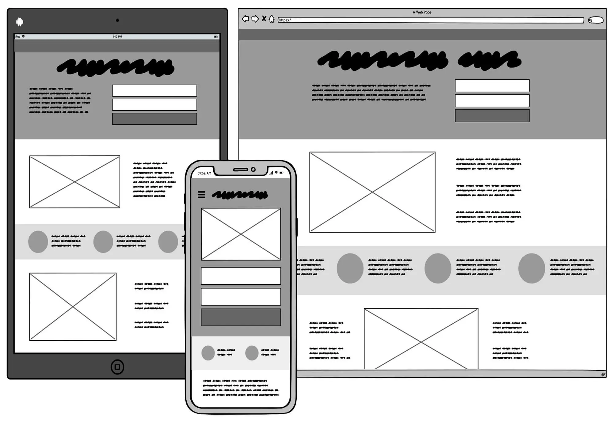
Wireframes are more than just outlines; they’re essential tools. They assist UX designers in crafting detailed user flows during development. They also define the site’s behaviours, functionalities, and components to enhance user experience.
Usually, wireframes are quite barebones in nature, as they lack any visual design elements, such as colours, graphics or styling. Once the wireframe has been finalised and approved by the UX design team and the website stakeholders, the coders can start their work on the website. That is when additional website elements are added, and the final UI slowly starts to take shape.
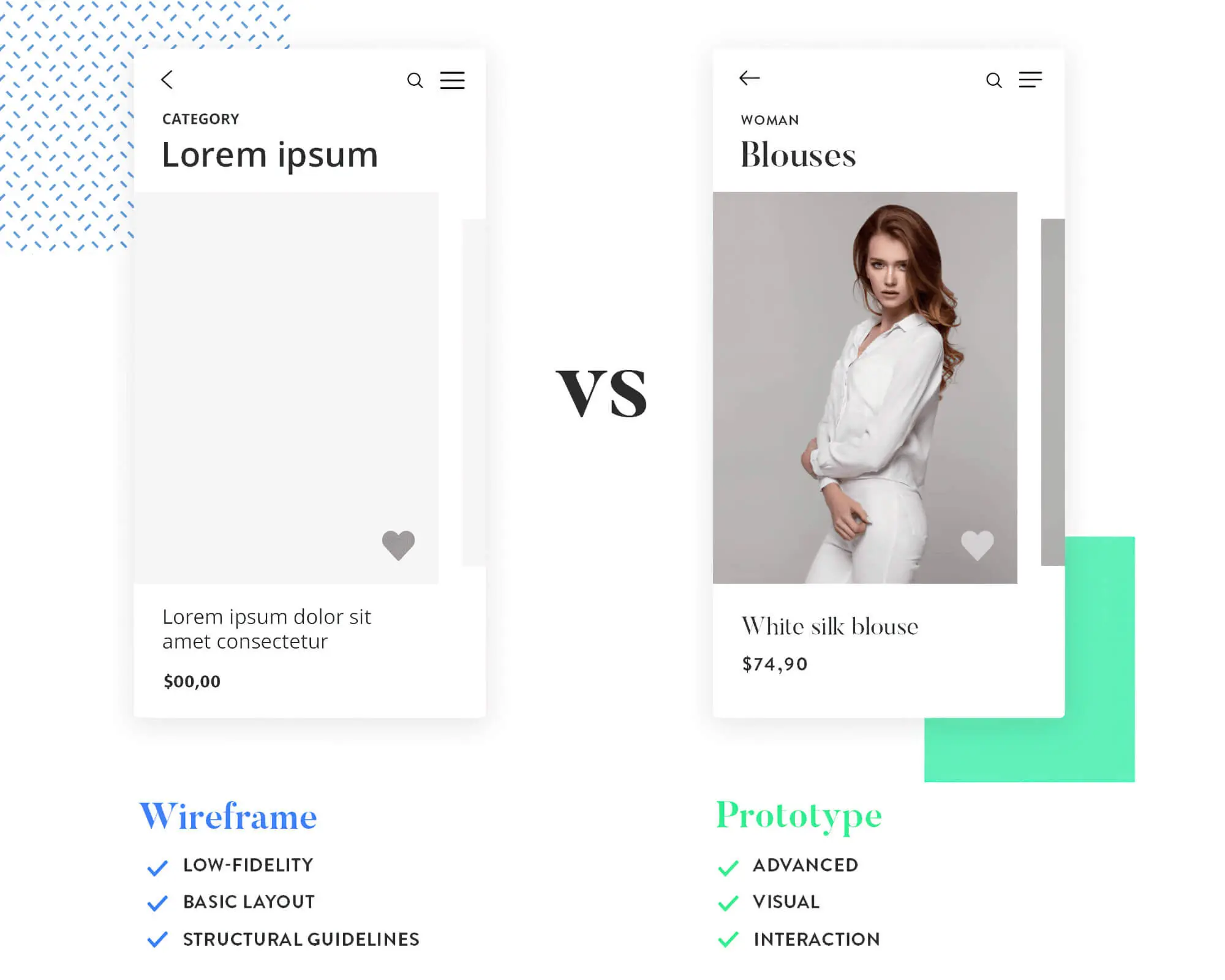
In this regard, many people may confuse a wireframe with a prototype or a mockup. However, a website prototype is not the same as a website wireframe. A wireframe depicts the site’s information architecture on a fundamental level. So, it is an excellent way for web designers to communicate ideas about the website to users, project managers and other stakeholders.
On the other hand, a mockup or a prototype depicts a site at a much later stage of development. It is created after the wireframe has been approved and the programmers have coded most of the visual and interactive elements.
When Is Wireframing Done?
The website wireframing process is done right at the beginning of a product or website development cycle. You can say that it is one of the first tasks undertaken by the development team. During this phase, they develop the project vision, generate the scope of the website, brainstorm ideas, evaluate the business requirements, conduct user research, and gather feedback.
The designers create the first version of the wireframe per the insights gathered from these activities. However, their work is still not done, as it is an iterative process over several phases.
Based on user feedback and suggestions provided by the project managers, the designers develop successive iterations of the wireframe. Each iteration improves upon different aspects of the existing website’s functionality, which enhances the user experience wireframe design.
How Do You Create Wireframes?
UX designers have various wireframe tools and techniques at their disposal, which help them create detailed wireframe designs. Nowadays, you can utilise various digital tools, such as Sketch, Adobe XD or Figma. Their design elements include vector shapes, artboards, wireframe templates, and layers, all of which help develop a wireframe in greater detail.
Alternatively, you can use the conventional method of sketching hand-drawn wireframes. If you ask us, create a wireframe, especially a detailed hand-drawn sketch, is highly effective for the early design phase. For the later iterations, we suggest using digital wireframe software, which offers more flexibility.
Besides, if the final design is created digitally, the web developers and coders will have an easier time integrating it with their code. And it will help to organise the different UI design elements better.
Why Are Wireframes Important?
Wireframes serve a crucial purpose in the overall development process of a website. Not only do they help in creating a direction for the design process, but they also help in refining and fine-tuning the website so that users have a good experience. In this regard, some of the most important aspects of the wireframing process have been described below.

1. Help In Accelerating The Project
Deciding to proceed with a website development project without generating wireframes will drastically slow down the development cycle. Plus, you will make a lot of errors, which will increase the project costs.
On the flip side, a wireframe lets you map out a clear path for the development cycle. It provides everyone involved—project managers, users, stakeholders—with a lucid vision of what’s ahead.
It will also promote collaboration between stakeholders and project personnel right from the beginning so that you can incorporate any feedback into successive wireframe iterations. This can save you a lot of time and money in the later stages of development.
2. Helps To Clarify Website Features
Using a wireframe in the early design and development phases helps in fleshing out the overall website design. Compared to a traditional sitemap, a wireframe helps the designers and website developers visualise the page layout, user interface elements, links, graphics, visual layers, and other associated page elements.
This helps in clearly communicating to the stakeholders about the functionalities and behaviours of the website. There is little to no scope for confusion during the later phases. Likewise, the coders get a clear idea of what type of coding tasks they will need to do.
3. Prioritises Usability
Wireframes provide a lot of emphasis on the aspect of usability. This is because it is considerably easier to conduct usability tests on wireframe pages than on fully developed pages.
Usability testing involves evaluating the user flow between pages. In other words, it helps UX designers see how the web pages can fit each other so that the users can easily navigate the site.

As such, the results of the tests can be factored into developing successive wireframe iterations. If the website design seems to be lacking in terms of interactivity, then the designers can implement the necessary changes conveniently during the design phase itself.
However, if wireframes are not used, these issues will often come up during the later stages. At that point, they are a lot more challenging to implement. Besides, it will increase the project time and costs as well.
4. Enhances Scalability And Flexibility
The process of developing a website can be long and complex. If done conventionally, several drafts must first be made for the different website features if done conventionally. Then, based on the data gathered from user testing, suitable changes need to be introduced to these drafts.
This is why wireframes are essential in the collaborative process. Compared to traditional drafting methods, a wireframe is significantly more flexible and easy to update than traditional drafting methods.
On top of that, a wireframe design is highly scalable. You can scale and expand on the initial wireframe designs with minimal effort. For instance, if you want to scale up a website to accommodate twice the number of pages or products, you can easily do that. It would help if you made some alterations to the original wireframe, and you will be ready.
What Are The Different Types Of Wireframes?
Now that you know how vital low-fidelity wireframes are in the overall development process, it is time to know about the different types. Designers use three major types of wireframes today. We have discussed these wireframe examples below:
1. Low-Fidelity Wireframes
A low-fidelity wireframe is the most basic wireframe design used by designers. It is a simple illustration of the website’s overall layout without additional layers of website elements.
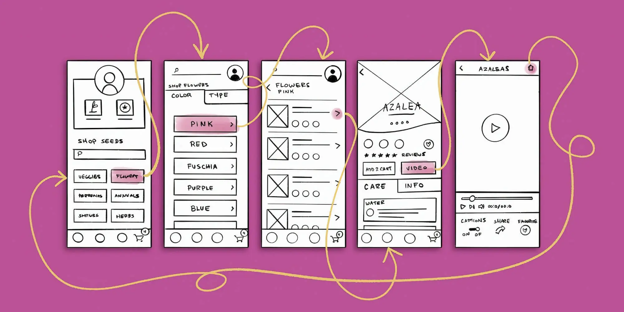
Typically, a low-fidelity wireframe is not accurate or drawn to scale. Instead, it uses simple images and text, a rough sketch, crude shapes, and mock content.
Because of this reason, you can develop low-fidelity wireframes pretty quickly. UX designers generally create low-fidelity iterations with stakeholders and project managers during the brainstorming or planning phases.
The designers can initiate the planning process through this low-fidelity wireframe and provide a rough idea for developing the website. You can create multiple low-fidelity wireframes to help the development teams and stakeholders quickly decide on which one they want to pursue.
These types of wireframes can also help in deciding the simple navigational aspects and mapping the basic user flow. You can create subsequent iterations, further refining each of these aspects.
2. Mid-Fidelity Wireframes
Mid-Fidelity wireframes are relatively more detailed than low-fidelity wireframes. They are the most common type of wireframes used by UX designers. These are usually true to scale, providing a more accurate representation of the layouts and visual elements.
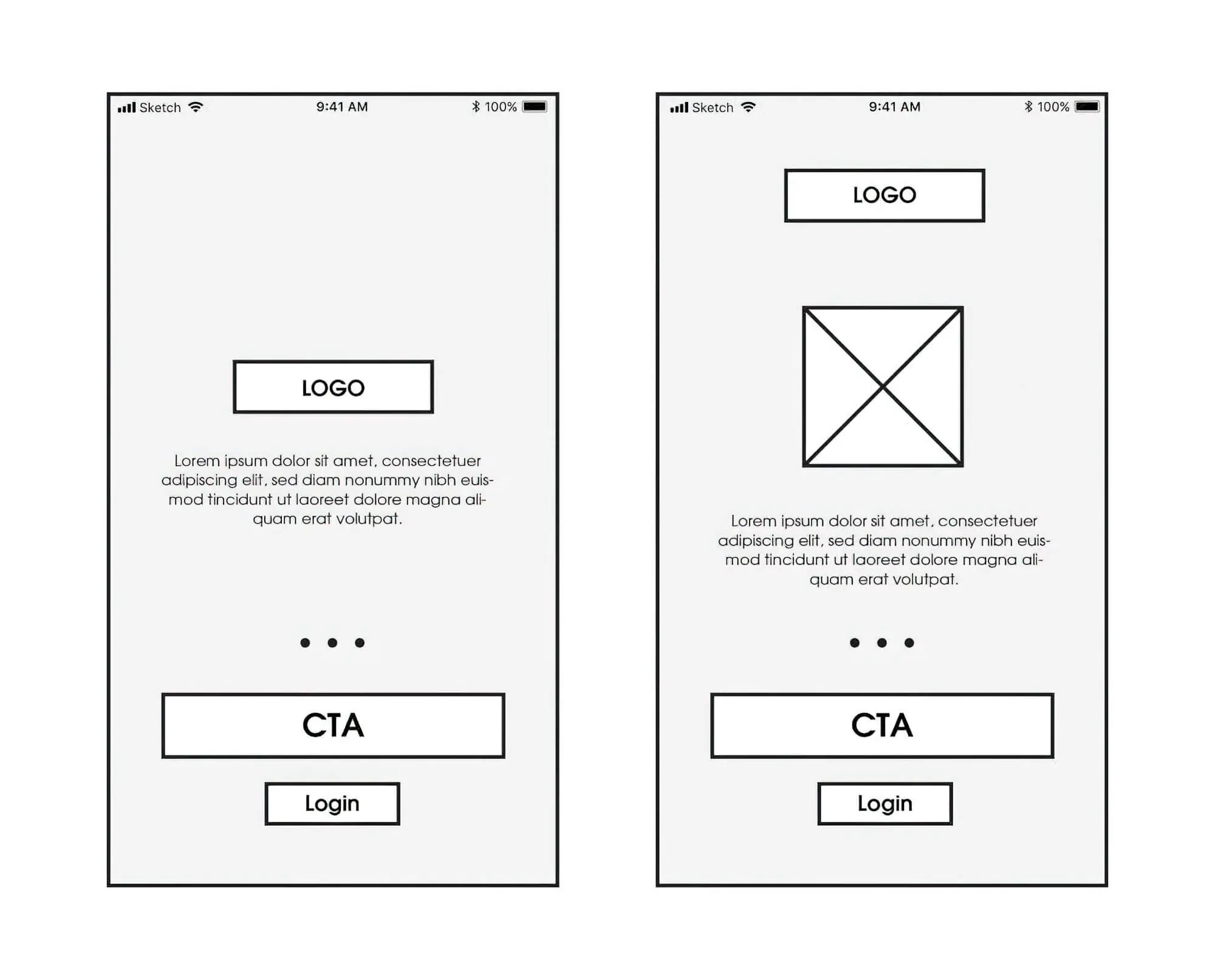
However, they lack graphics and colours and use black-and-white text and body content. Like low-fidelity wireframes, images and graphics are depicted with boxes marked with “X.” Likewise, to indicate typography, these wireframes utilise a generic font and Latin placeholder text.
The main goal of these wireframes is to highlight the visual importance of different elements. They also showcase basic webpage behaviours, providing a clearer understanding of the layout.
3. High-Fidelity Wireframes
These are the most detailed wireframe examples used by designers. A high fidelity wireframe uses pixel-specific representations of a webpage. Unlike the previous two types, a high-fidelity wireframe can use specific texts and images. They also use more shades of grey to emphasise the different visual aspects, forming comprehensive interactive wireframes.
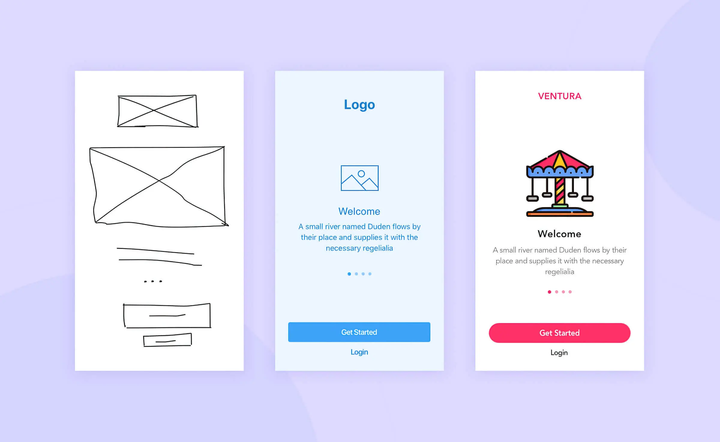
Given the detailed nature of such wireframes, you can use them to explore more advanced features and concepts. These include menu systems, information architecture, graphical interface design or other interactive features.
The high fidelity designs represent the final wireframe created by the designers. And the coders usually start working on these wireframes to develop the website further.
In this regard, the designers should preserve a copy of the high-fidelity wireframe. If the website needs to be upscaled or expanded in the future, they won’t have to start the design process from scratch.
Wireframes For Different Devices
With the advent of so many smart devices in recent times, it has become necessary to expand on the wireframing process. Nowadays, designers need to create wireframes for each major type of smart device. To be more precise, website wireframes must be created for mobile devices like smartphones, tablets, and desktops.
On top of that, many businesses today have separate mobile apps, so creating wireframes for them is also necessary. In that context, the primary points of difference between the mobile and desktop wireframes have been discussed below.
1. Size
The major point of difference between mobile and desktop wireframes is the size. Usually, mobile devices, such as smartphones and tablets, have a smaller screen size, so the wireframe needs to consider this aspect. The same can be said for mobile app wireframes as well.
Thus, keeping the smaller size in mind, the mobile wireframe needs more compact page layouts. The text and image sizes also need to be adjusted so that users can decipher each element without straining their eyes.
On the other hand, a website wireframe for desktops can be much larger in size. Correspondingly, the individual elements, such as images, texts, and headers, can be larger, too.
2. Orientation
Another crucial point of difference between a mobile and website wireframe is the orientation. Regarding a desktop, the website wireframe is designed in only one orientation, which is landscape. So, the technical implications for creating such a wireframe are relatively simple.
On the other hand, a mobile wireframe needs to be designed in both portrait and landscape orientations. UX designers need to develop a dynamic wireframe for mobile devices.
This wireframe needs to be created to adjust all the content on the same page when the orientation changes. Also, it needs to ensure that the content of the website is clearly visible and not positioned oddly after a change in orientation.
Long story short, developing such a wireframe is much more complicated than a desktop wireframe.
3. Behaviour And Interaction
The behaviour of a mobile website or app is noticeably different from that of a desktop website. The users interact with the website in a mobile environment using a touch interface. They touch or tap on a website element, which helps them navigate the pages.
The mobile wireframe needs to be modelled to respond to how the user interacts efficiently. The links, images and buttons must be well-spaced so that users can properly tap on them and navigate to other parts of the site.
Conversely, desktop users interact with websites using pointing devices like mice or trackpads. In this case, the navigation is done by clicking or scrolling. There may also be additional features, such as hovering over an element to reveal more information, drag-and-drop functionalities, etc.
The wireframe needs to account for these behavioural differences on a desktop. However, implementing advanced features like pointer hovering is much more difficult than standard features.
They increase the complexity of the wireframe as well, which, in turn, increases the work of the coders in the later phases. But the final result is truly worth it, as it helps enhance the user experience considerably.
Build Your Website Using Wireframes — Save Time & Money!
That is all we have to say about wireframes. So, if you want to start wireframing for your website, you can use the information we have provided here.
Of course, if you’re a beginner, you must tread cautiously when creating wireframes. We advise you to start small by creating low and mid-fidelity wireframes before attempting high-fidelity wireframes.
Also, we suggest you get familiar with free wireframe tools like Adobe XD or Sketch. That way, you can create simple yet practical wireframes for your business website.
It would be best if you never skipped or rushed through this process, as that can have negative consequences later. If you are working in a team, collaborate with other team members. If you correctly follow the guidelines, you can develop a great website that the users will love.
We are an award-winning website design, SEO, and content marketing company in one place that strives to help small businesses succeed online. If you are looking for Australian web developers, sitecentre® is your team. We can design and build a custom-coded website that meets every aspect of your brand. Call us today for more information!
So, jump into creating your company’s website wireframe. We’ll be back with more tips soon!


